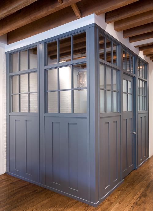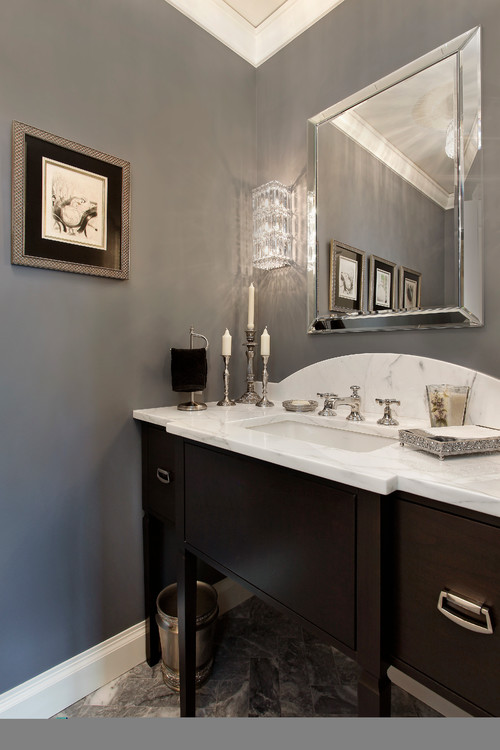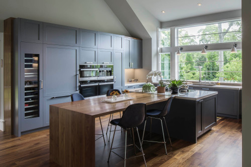
A mysterious blue-gray paint, Benjamin Moore Ashland Slate is a dark-toned hue that clearly symbolizes strength and power.
There are tons and tons of homeowners who prefer this daring tone in their homes.
However, let me tell you the truth – as exciting as this paint is, some fear that it might look overwhelming when used in their home.
So, if you are looking to use this paint in your home – here is a little guideline to help you make informed decisions.
I understand the color is not only dark, it brings with it a deep quality – but it can also look fabulous and amazing when used in the right ways.
Don’t worry!
I’m going to unravel this color from inside out to help you decide if this is one for you.
And to get started, let’s discuss the majestic undertones of this color.
Even though I mentioned that this is a blue and gray paint color – well, the truth is that this color is defined as having slightly purple undertones.
And you have to be very careful while paring tones like this.
Now it’s time to sit back and relax…
In no time – you will be an Ashland Slate expert!
Benjamin Moore Ashland Slate 1608 Details and Specifications

Do you know what makes this color so mesmerizing and unique?
Well, frankly it is the deep underlying theories and specifications that sets this color apart from the others.
Know that every color is unique – and even though they tend to look similar – they are originally quite different.
So, let’s cook some of the details here!
First and foremost, look towards the end of your Benjamin Moore paint swatches to determine the Light Reflectance Values or the LRV’s of the paint color.
This value helps in determining how light or dark the paint is – and you must know this value to make informed decisions.
Remember, the lesser the value – the darker the paint and vice versa! (On a scale of 1-100, 1 being the darkest!)
So, the LRV of Benjamin Moore Ashland Slate is 14.52.

And that means it is a comparatively darker-toned blue-gray paint color.
Most often, it’s best to sample a paint color in your home to confirm it’s going to work how you expect. You can do this easily using Samplize. Grab one now for Ashland Slate!
Secondly, other important associated terminologies are the RGB and HEX Values that further tell us what the color is made of.
Red = 105
Green = 109
Blue = 114
HEX Value = #696d72
Since we have discussed the technical and scientific information, let’s get started with the practical aspects of this organic gray Benjamin Moore paint.
How Does this Color Feel in a Space?

Ashlynn’s nursery reflects the tones of Benjamin Moore Ashland Slate
Benjamin Moore Ashland Slate tends to make a space feel luxe, confined, modern, and absolutely sleek and crisp.
This cool-toned color casts a sense of saturation that makes you keep gazing at the beautiful walls.
When talking about climates, I wouldn’t restrict any specific area!
In general, you can use this paint in tropical as well as continental and cooler climates.
In colder climates, this color will enclose your space and tend to bring together the walls.
In warmer climates, it will exhibit a cooler vibe – hence, both ways are a win-win solution.
I would also suggest that you don’t use this paint in the smaller spaces since it will create a suffocating environment.
How Does Light Affect the Color?
Light comes into major play here!
Since this color has very low reflectivity – it is important that your room receives ample natural as well as artificial daylight.
Hence, here is something you must take care of – always observe the amount of incoming natural light in your room.
If it is ample and your space is large enough – you can absolutely use this paint – and as an accent.
Furthermore, you can always pair with artificial lighting in the form of majestic chandelier and pendant lights in the case of lesser natural light.
On the other hand, you must assure to use this color in the east or west-facing rooms – due to the tranquilization of incoming heat with this cool-toned base.
Again, I really recommend you try out some wall samples because colors will look different in every location.
What are the Best Coordinating Colors?
Now that we have discussed the basic details and specifications, let’s talk about what colors would best complement it.
First and foremost, you could either choose from a contrasting or a monochromatic color palette – depending upon your preferred interior design style.
In the case of contrasts, you can pick from creamy whites, beiges, lemon, sky blues, mustard yellows, and crisp whites.

So, check out these few colors I would recommend for a monochromatic palette!
- 1604 Silvery Moon
- 1606 Cobblestone Path
- 1607 Englewood Cliffs
On the other hand, here are a few of the colors I would recommend for a contrasting color palette!
- 2053-70 Morning Sky Blue
- OC-65 Chantilly Lace – see my full guide on this one here
- 369 Mulholland Yellow

Remember to pair these with BM Chantilly Lace on the trims, moldings, and other decorative architectural features to let the color stand out!
BM Ashland Slate Vs Similar Colors
There are quite some notable examples here!
However, always remember that even if they tend to look similar, they either vary in reflectivity or the undertones.
So, to name a few, the two most similar-looking color options are HC-178 Charcoal Slate and 1602 Gunmetal.
Ashland Slate Vs Charcoal Slate

Another notable gray and blue paint, Benjamin Moore Charcoal Slate tends to share a lot of similarities.
With an LRV of 12.71, this paint feels extremely dark and daring – so be careful and pair it with only lighter tones.
An accent wall would simply play flawless.
Find out what works best in your home’s environment and lighting by putting up some temporary samples and observe – Get some wall samples from Samplize.
Ashland Slate Vs Gunmetal

The timeless gray with green undertones – Benjamin Moore gunmetal is an extremely beautiful paint.
This paint has an LRV of 15.1 – thus, being the lightest of them all – and yet very dark.
I would suggest you pair it with emerald greens for a seamless look.
Order a wall-stick sample of Ashland Slate here to help you compare these colors in your own space.
Where to Use Ashland Slate?
Benjamin Moore Ashland Slate makes a great backdrop everywhere in your home – whether it is the hallways, exteriors, kitchens, living and formal rooms, bedrooms, or even home offices.
Furthermore, you can absolutely incorporate this paint in the mid-century modern, contemporary, modern, bohemian, country, farmhouse, and Hollywood glam interior design styles.
Let’s see where and how to incorporate this beautiful gray paint color in your home.
Ashland Slate in Living and Dining Rooms

Why not?
You should definitely use this paint in your living and dining rooms – as an accent wall!
However, to truly enjoy the beauty of this paint – I recommend using it if you receive ample natural light or the space is large enough to play with such great depth.
Furthermore, try blending the paint with creamy or crisp whites and neutral-toned linen or velvet upholstery to create a striking balance.
Using in Bedrooms and Bathrooms
I suggest you paint the backdrop or the headboard wall in this paint and let the neutral beige or gray fabrics speak the tonality of your space.
I also recommend choosing brass or gold-tinted chandelier and table lamps in this case – mainly as an accent!
Also, try incorporating this on the bed frames and nightstands.
About flooring, wooden parquets or wall-to-wall carpeting can both work well with this gray paint.
Ashland Slate in Kitchens
That would be my absolute favorite!
Especially for the open concept kitchen, you can absolutely incorporate this on the cabinetries and the wall – or vice versa.
Try pairing it with a stark, white-veined marble countertop, glossy backsplash, and nickel or brass-tinted fixtures and pull handles.
Avoid matte black since everything is already so moody and dark.
Using on Exteriors
Benjamin Moore Ashland Slate on exteriors will further make the color look lighter than it actually is.
I recommend using this paint on the Mid-Century Modern, Modern, Craftsman, and Modern Farmhouse-styled homes.
Pair it with white, gray, beige, or even off-white shaded trims and moldings!
Yes – that way you make a great contrast in your home exteriors!
Also, you can do the other way round, by using whites on the decorative moldings!
So, how do you want to use this color in your homes? Interiors or Exteriors?
My Favorite Way to Sample Colors
I can’t say enough about how easy it is to use a peel-and-stick paint sample to give a color like Ashland Slate a try. The absolute best way is to order a sample from Samplize.
You can check it out right on your wall and move it around. Also, try it along with a another couple of colors to test pairing possibilities.
This is WAY easier than having to open up little cans of paint and rolling/brushing on. Forget the mess and use these helpful temporary sample squares to test location, lighting options, etc.
Now that you have all the secrets – are you excited about painting your home in Ashland Slate?
Should there be any questions or thoughts, let me know in the comments below!


Leave a comment