Creamy whites are quite popular in the interior design industry.
Not just because of the warmth and welcoming they bring, but also how easy it is to pair with other paint colors, materials, patterns, and textures.
And today, let me introduce you to one such paint color that is also one of the most admired!
Behr Swiss Coffee is a creamy, soft, warm white paint color that is quite versatile and has a neutral touch with no specific yellow, pink, blue, or green undertones.
Yes, it’s that perfect off-white to be used in the home.
Well, the moment you coat a fresh layer, you will love the feel and look of it.
However, whites are equally challenging to work with! Since they have a high reflective value, it’s important to keep in mind a few considerations.
Don’t worry – it’s all covered in this color review!
Lastly, it’s important to note the differences between Benjamin Moore Swiss Coffee and Behr Swiss Coffee. (We are strictly talking about Behr at the moment)
So, let’s get started and watch out for this as the ideal white for your home.
Behr Swiss Coffee 12 Details and Specifications

When talking about the ‘whites’ or ‘off-whites’ color category, it’s super important to have an eye on the details and specifications.
Well, there are just a few neutral warm or cool whites with undertones that don’t align with a specific hue (pink, yellow, green, blue)…
So, first and foremost, let me introduce you to the concept of Light Reflectance Values or the LRVs that determine how light or dark the paint color is.
You can easily find that value on the Behr website.
Here, in this case, the LRV of the Behr Swiss Coffee is 84.
And that means it falls on the lighter end of the scale – and quite light to play a perfect base or neutral.
(Remember, the greater the value, the lighter the paint – on a scale of 1-100)
Also, just in case you wonder where to find the Behr decks – well, simply visit your nearest Home Depot store!
Secondly, other important associated terms are the RGB and the HEX Values.
- Red = 241
- Green = 237
- Blue = 224
- HEX Value = #f1ede0
And yes, this color is similar to Benjamin Moore’s Swiss Coffee paint color!
Now that we’ve checked out the technical and scientific information, let’s get started with the practical aspects of this creamy white Behr paint.
How Does This Color Feel in a Space?

Behr Swiss Coffee is a perfect soft white paint color to make your room a warm and welcoming haven.
It’s creamy and can delightfully induce a homely, airy, and lively vibe.
Well, you wouldn’t regret this color if you incline warmer neutrals.
Plus, this color has the potential to make your space look larger, enhanced, and cozy – by simply pushing away the walls.
However, depending upon the compass directions and the view of the outdoors, the appearance of this ‘off-white’ varies.
So, what’s the size of your windows? What are the compass directions? Do you see a lot of trees outside? Is there a backyard or an accessible road?
All these factors can affect how any white will appear in your room!
How Does Light Affect this Creamy Color?
View this post on Instagram
Most of the incoming natural light will be reflected away when it hits the walls of Behr Swiss Coffee.
So, making the room appear larger, spacious, and quite airy.
However, you must note that this paint color in the west or south-facing rooms will appear warm with a slightly yellow undertone. (But that’s not very dominant so you’re good to go)
I highly recommend using this paint color in the north-facing rooms since the hidden warmth will perfectly neutralize the cool, incoming air.
If for some reason, you’re restricted to using a particular paint, you can always make use of artificial lighting to create a dreamy aura.
What are the Best Coordinating Colors for Behr Swiss Coffee?

This is one easy color to work with!
And I say that with absolute confidence.
You simply can’t pair any random hue with the other. And moreover, if you have a great command of the color wheel, it’s like a cherry on top.
So, Behr Swiss Coffee can be best paired with browns, warm grays, steely blues, darker sage greens, bronze, dark gray, and black.

However, you must remember to be very careful when pairing them – so as to avoid making a mess!
Also, if you’re planning to introduce material and metallic accents through floating shelves, a chandelier, artwork frames, and furniture frames – remember to add tinges of matte black, chrome, or brushed brass. (Brushed brass is quite a trend)
Discussing further, you have the option to choose from either a monochromatic or contrasting color palette!

Here are a few of the colors I would recommend for a monochromatic color palette!
- N270-1 High Style Beige
- N270-2 Lentil
- PPU4-07 Mushroom Bisque (or even Creamy Mushroom from Behr!)
Here are a few of the colors I would recommend for a contrasting color palette!

- PPU26-19 Chance of Rain
- 750C-3 Sandstone Cliff
- PPU11-14 Zen
For your ceilings, trims, and moldings, you can use Behr Ultra Pure White as it is a true white paint and will further protrude the original adjacent hue.
More Behr Swiss Coffee Coordinating Colors


Behr Swiss Coffee Vs Similar Colors
Picking similar colors isn’t challenging as far as you know what exactly you want!
They won’t be exactly the same – however, will differ in the undertones or reflectivity.
So, the two closely related colors are BM CC-40 Cloud White and SW 7654 Lattice.
Let’s see how all of them differ.
Swiss Coffee Vs Cloud White

These two colors share a ton of similarities – and of course, the soft, calm, and feathery look.
However, the latter paint color feels more inclined toward the yellow undertones.
This subtle and sophisticated paint color has an LRV of 87.35, making it lighter than the former paint color.
Swiss Coffee Vs Greek Villa

SW Greek Villa (see my color study for this one!) is an equally warm paint color with a deep yellow undertone (that can be detected in the south or west-facing rooms).
It’s creamy and delightful – hence, if you’re looking for a warmer version of Behr Swiss Coffee, this paint color would make a great example.
With an LRV of 84, they’re almost equally bright, light, and airy.
Where to Use Swiss Coffee?

Behr Swiss Coffee is a soft and warm paint that can magically make your room appear more welcoming and cozy.
So, with the utmost versatility of this paint, you can consider using it in every corner of your home.
Whether it’s the kitchen, exterior walls, bedroom walls, trims, moldings, or even the wall paneling, this color would play flawlessly.
So, let’s see where and how to incorporate this color into your home.
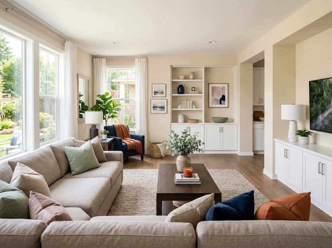
Swiss Coffee in Living and Dining Rooms
If not on all the walls, you can consider using this paint as a base on the adjacent walls, in juxtaposition with the strong beige-hued accent wall.
Especially for traditional, French Country, transitional, and modern farmhouse-style living rooms – this color is a number one recommendation.
Furthermore, if an all-white living room is too boring for you, it’s time to splash a sense of vividness with the help of throw pillows, furniture, curtains, rugs, and artwork.
Generally, blue is a great color combo – but you can even use a blend of blue and green! (You must use cooler tones for a ‘wow’ color palette)
Lastly, in the case of a fireplace, you can use natural stone cladding or even luxe marble!
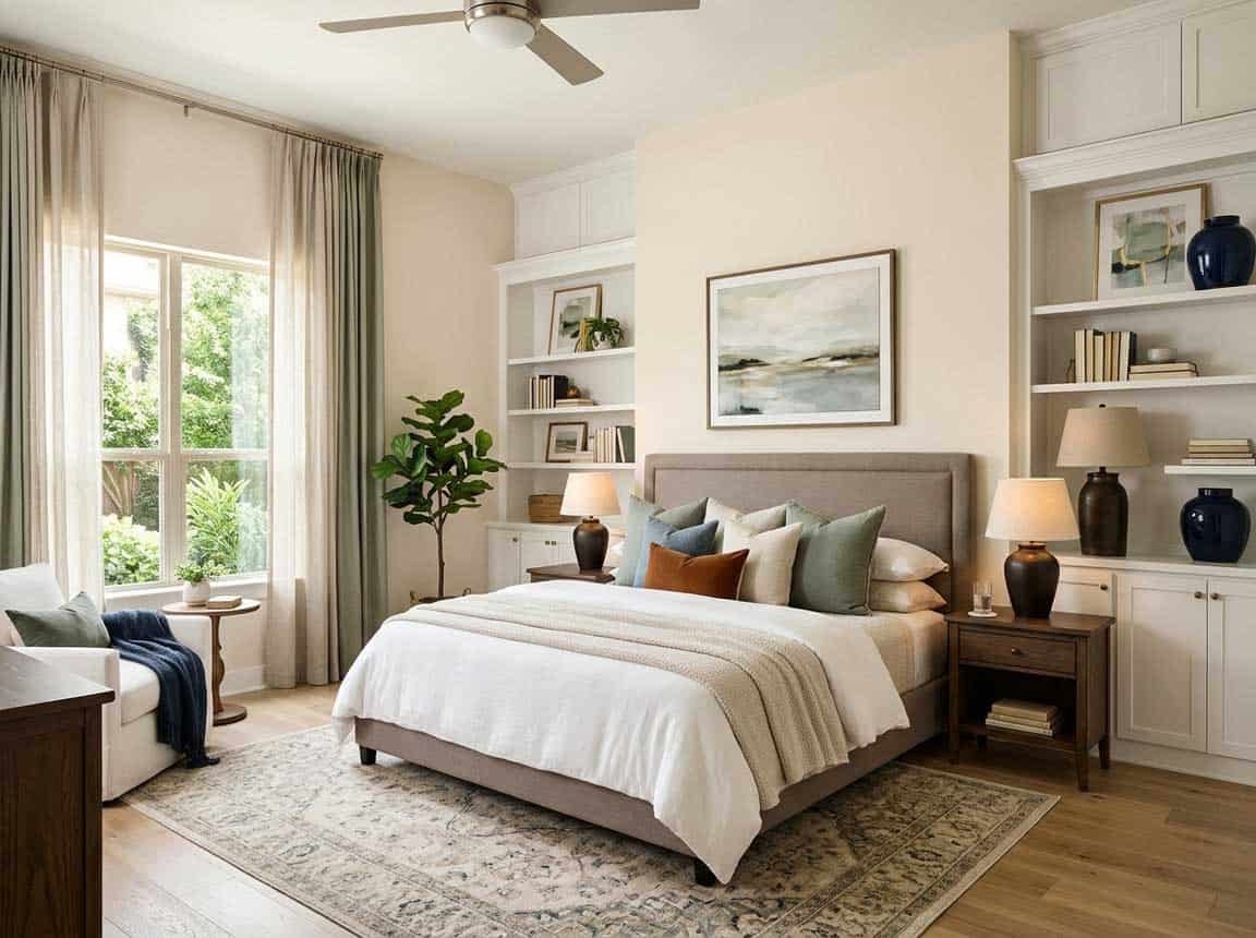
Using in Bedrooms

I would love the feel of this soft and warm neutral in the bedrooms – and especially if you crave a vibe like this!
For smaller bedrooms, this trick is something to look forward to! And you can further add blues as accents to give your bedroom a perfectly complete look.
I would encourage adding natural textures like rattan, wicker, jute, and cane in the form of woven baskets, rugs, and planters.
Lastly, adding two or three fresh indoor plants would truly go a very long way!
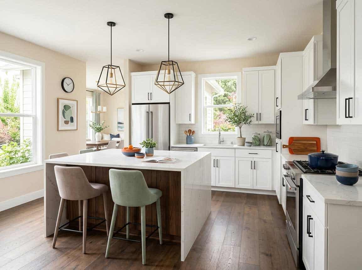
Swiss Coffee in Kitchens

It’s time to give a friendly makeover to your kitchen.
With the help of Behr Swiss Coffee on the walls, you can achieve an utmost welcoming and delightful aura – especially if cooking is your passion.
I highly recommend adding clean whites with the help of backsplash tiles, countertops, and backdrop paint.
Lastly, don’t hold back from rustic wooden textures with the help of floating shelves, island table finish, and artwork frames.
Using on Exteriors
This color can be used in most of the exterior design styles – whether contemporary, modern, colonial, ranch-style, and mid-century modern exterior design style.
You can either add bold grays, blacks, or even a tinge of greige to complete the exterior palette.
For the exterior doors, windows, and shutters – you can pick a bold brown, taupe, or greige paint color that can easily blend in.
Otherwise, for a contrasting touch, add pops of electric blues, red, or bronze on the entryway door.
In the case of columns on the patio and porch – you can use natural stone wainscotting to add an authentic detailed character to this facade!
My 7 Key Tips for Behr Swiss Coffee
1. Test Swiss Coffee in different lighting
Swiss Coffee can look creamy and warm in natural light but sometimes takes on cooler tones under LED or fluorescent bulbs.
I always paint a small swatch on the wall and observe it at different times of day!
This helps prevent surprises and ensures the color feels just right in every room.
2. Pair Swiss Coffee with warm wood flooring
This color looks amazing with medium-toned hardwoods like oak or maple.
I love how it creates a soft, inviting backdrop without feeling too stark against the wood.
Avoid very dark or reddish floors, as they can make Swiss Coffee appear dull or yellowed.
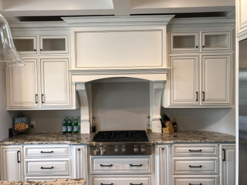
3. Coordinate with cabinetry finishes
Swiss Coffee pairs beautifully with white or soft gray cabinets in kitchens and bathrooms.
I usually suggest matte or satin finishes for cabinetry to keep the look balanced and timeless.
Steer clear of overly glossy cabinets, which can clash with the subtle warmth of this paint.
4. Ideal for bedrooms and living rooms
Swiss Coffee really shines in spaces where you want a calm, cozy feel.
I often use it in bedrooms, living rooms, and reading nooks to enhance natural light and create a welcoming vibe!
It’s also great for open-plan areas where continuity of color helps unify the space.
5. Use it on exterior trim and details
This color works beautifully on window trim, shutters, and porch details for a soft, classic exterior look.
I’ve found that Swiss Coffee contrasts nicely with medium to dark exterior siding, giving a polished yet understated curb appeal!
Avoid pairing it with very bright or neon exteriors, as it can get washed out.
6. Prepare your walls for a smooth finish
Swiss Coffee highlights imperfections more than darker colors, so proper wall prep is key.
I always patch holes, sand rough spots, and use a primer if painting over a bold or uneven color.
A smooth surface ensures the creamy tone looks flawless and even throughout.
7. Test accent combinations carefully
Swiss Coffee pairs well with soft pastels, muted blues, and gentle greens.
I like adding pops of color with pillows, rugs, or artwork to enhance the warmth without overpowering it!
Avoid very dark or neon accents, which can make the room feel off-balance with this subtle creamy tone.
So, how do you plan to use this color in your home?
Kitchen cabinets or focal console tables? Living room or bedrooms?
Well, trust me! You would never regret using this color in your home. It’s timeless and versatile!
Should there be any questions or thoughts, let me know your thoughts in the comments below!


Leave a comment