

A very cheerful and fun paint color to play with – Sherwin-Williams Tidewater is a beautiful aqua blue that tends to add a fresh vibe to your home.
This color definitely reminds me of my visits to the Gulf of Mexico on the west coast of Florida!
The blue and green hue in this paint also conjures up Caribbean homes by the beach or even those tower houses that exhibit a perfect beachy vibe!
So, whether or not you live by the coast, you can absolutely incorporate this paint in your home.
I would say – especially for all the continental states, it is summertime all year round with this one on your walls!
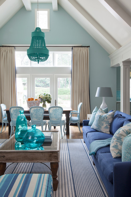
If you’re craving those beachy and coastal vibes, this color is a must as you consider your palette.
When I see this paint, I immediately think of pairing it with seashells and sandy accessories, and I’m off to the tropics.
SW Tidewater has deep green and blue undertones – making it align towards the cooler side of the scale.
So, if you are looking to add a jolly feel, even a pinch of this color added to your living space will bring joy.
However, considering its saturation and brightness, it can be slightly challenging to pair it with a compatible hue.
But in this article, you’re going to find out all the hows and wheres of this color as we explore it together.
Let’s get started!
Sherwin-Williams Tidewater SW 6477 Details and Specifications

You know the reason that makes this paint so whimsical and eye-catching?
Well, this section will answer that.
So, every paint is different – even though very close shades tend to look similar!
With tons and tons of blues out there on the swatch, what makes this one so unique and distinctive?
And that is why you need to first understand how the color is made, its properties, and what it truly has to offer.
To make it easier for you, here are a few terms that you must keep in mind.
First, look at the back of your paint swatches to get the Light Reflectance Values or the LRV’s of the paint color.
This value helps give you a scale for how light or dark it is.
Remember, the greater the value, the lighter the paint and vice versa!
So, the LRV of Sherwin-Williams Tidewater is 65. And that means it falls on the lighter end of the scale.
Oh, if you want to just try Tidewater so you’ll know just how it’ll look, you can easily do so with a peel-and-stick sample from Samplize. Order some samples now!

Secondly, other important associated characteristics are the RGB and HEX Values that further tell us what hues the color comprises.
Red = 195
Green = 215
Blue = 211
HEX Value = #c3d7d3
Now that we’ve looked at the technical and scientific information, let’s get started with the practical aspects of this pretty blue Sherwin-Williams paint.
How Does this Color Feel in a Space?
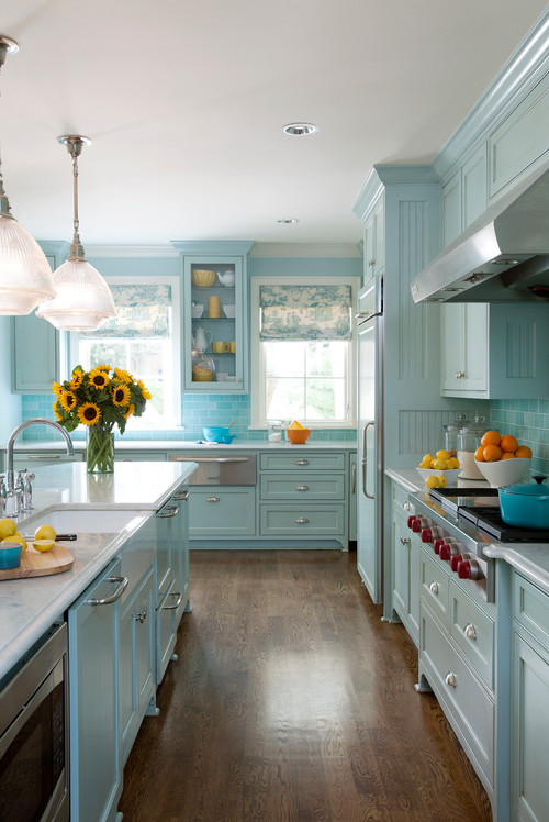
Sherwin-Williams Tidewater feels different in different rooms!
In the north-facing rooms, it will feel quite cool, calm, bold, relaxed, and crisp – whereas, in the west, the same hue feels creamier blue and slightly lighter as the sun washes away the hue.
When talking about climates, especially for the warm and tropical states, this color is absolutely good to go!
It will help foster a cool and tranquilizing aura that will make you feel calmer after a long hard-working day!
Moreover, you can also incorporate this paint in smaller spaces to create an illusion of a larger space, as they have high reflectivity.
How Does Light Affect the Color?
Like I always say – light tends to play a major role in the paints, overall!
Here, in this case, I want you to do a little exercise!
Firstly, look around and observe – what is the compass direction of your room and how much time do you intend to spend there?
In case you use the room is North or South and you mostly spend the evening or morning there, you are quite likely to feel cooler and calmer!
On the other hand, In case you use the room is West or East and you mostly spend the evening or morning there, you are quite likely to feel warmer and lighter!
You see – that’s a little game the same paint plays in the same room – throughout the day!
In case of little to no lighting, make use of artificial lighting to play a character in your space.
To truly see what your home’s environment and lighting will do here, try out a real paint peel-and-stick sample. It takes out the guesswork!
What are the Best Coordinating Colors?
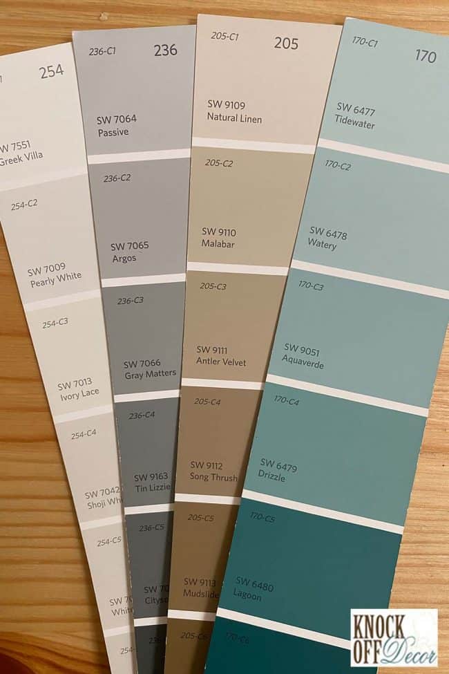
These sparkly blues are quite a challenge when it comes to picking the best complementary hues.
Well, it all comes to creating a sense of balance and harmony with the incorporation of such a saturated hue.
Remember, if you mess up with these palettes and schemes, you end up messing with your home.
And you don’t want that, right?
Hence, I will recommend a few options that you could consider pairing up with this quirky blue paint.
First and foremost, you could either choose from a contrasting or a monochromatic color palette – depending upon your interior design style (whether minimalist, or any other)!
In the case of contrasts, feel free to pick from creamy whites, deeper blues, mustards, blacks, grays, and even mid-toned beiges.
So, check out these few colors I would recommend for a monochromatic palette!
- SW 6478 Watery (Check out my SW Watery review here!)
- SW 9051 Aquaverde
- SW 6479 Drizzle

On the other hand, here are a few of the colors I would recommend for a contrasting color palette!
- SW 9109 Natural Linen (see my Natural Linen review here!)
- SW 7067 Cityscape (see my Cityscape review here!)
- SW 7009 Pearly White

You can use SW High Reflectance White or even SW Extra White to further complement your color palette.
SW Tidewater Vs Similar Colors
Sherwin-Williams has curated quite a few blues for the homeowners to have ample choices from. Similar is the case for these aqua blues, which have quite a few counterparts!
To name a few, the two most similar-looking color options are SW 6484 Meander Blue and SW 6470 Waterscape.
Tidewater Vs Meander Blue

A more saturated paint option, SW Meander Blue plays a great alternative to SW Tidewater.
With an LRV of 66, this paint falls on the lighter end of the scale, making it a great option to be used!
However, be careful when choosing complementary shades, as this is more saturated than Tidewater and you might need some subtle tones like muted beiges to create a sense of balance.
Order wall-stick samples of these two colors to help you compare colors in your own space.
Tidewater Vs Waterscape

Aligning more with the greens, SW Waterscape is a pretty aqua blue paint that plays a more subtle cousin of SW Tidewater.
It has an LRV of 62 – so, it can be absolutely used in smaller spaces and east or west-facing rooms!
Do yourself a favor and grab some stick-on samples of these two colors and see what looks best in your home.
Where to Use Tidewater?
Check out the laundry room reveal for the Pedraza House
Living rooms, bedrooms, bathrooms, home gyms, exteriors, kitchens – and the list goes on and on!
This bright paint color is a great recommendation for interior design styles such as Coastal, Caribbean, and Floridian styles!
Let’s see where and how to incorporate this beautiful blue paint color in your home.
Tidewater in Living and Dining Rooms
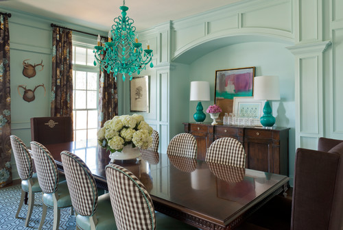
Why not?
You can paint all the walls in this paint or simply use the upper half of the paneled wall to make the most use of this breezy paint!
Use creamy whites on the ceilings, door and windows and bold grays and blues as the accents.

I further recommend using hardwood floors, white wooden or black metal furniture, and probably airy furniture that allows the room to further upscale its aura.
Remember to incorporate tons of wooden textures here for a refined palette!
Using in Bedrooms and Bathrooms
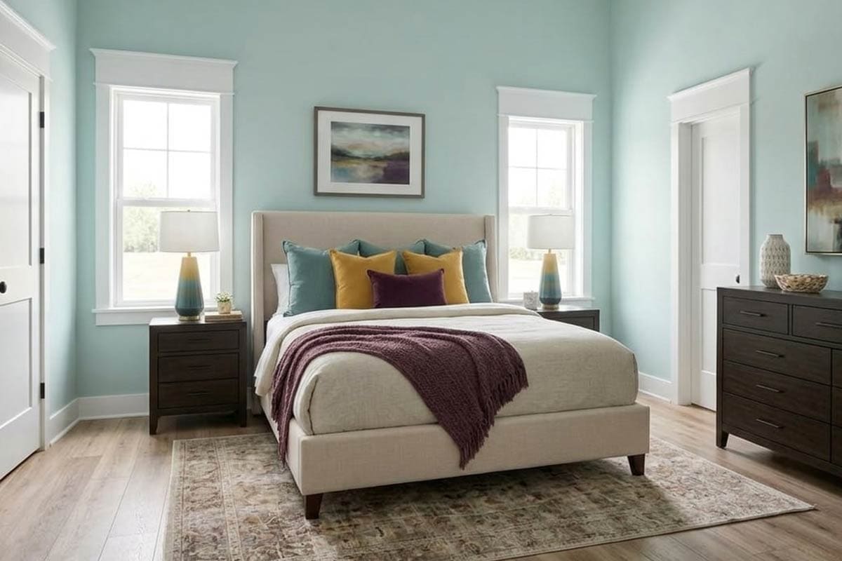
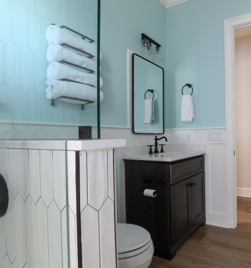
Whether painting a focal in SW Tidewater or all the walls, this color will definitely add a playful vibe!
I also recommend you use this paint in your kids’ bedrooms and play areas to feel charming and bright.
Pair it with cheerful colors like pinks and yellows as accents on the pillows, upholstery, and curtains – along with rugs and some toys!
Moreover, to create a cohesive touch, you can also continue this hue in the bathrooms and pair some authentic stainless steel light fixtures to go!
Tidewater in Kitchens
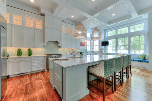
Living by the coast or not – this color in the heart of your home will definitely create a captivating vibe!
You can either paint the cabinetry systems in this paint or prefer to choose vice versa!
Remember to avoid brass and pick more like stainless steel fixtures for this kitchen.
Using on Exteriors
Especially for Cape Cod, Caribbean, and Coastal styles, this color is a great option for your exterior walls.
You can either pair it with white or gray accents through trims, moldings, and door and window frames.
You can also use natural stone wainscotting for the patio columns and surroundings!
Great Paint Sample Tip!
Here’s my favorite tip when it comes to testing out a color like Tidewater – go and order a peel-and-stick sample from Samplize.
These guys figured out a great way to sample colors much more easily. Simply stick it up instead of having to get a small can of actual wet paint.
For a few bucks you get a large-sized “paint chip” to throw up temporarily anywhere you want to “try” on a paint color and any possible coordinating hues you like. Too cool!
What Not to Pair with This Color
Color Pairings That Undermine Tidewater’s Calm Character
Tidewater’s soft, cool aqua-green base makes it surprisingly sensitive to warm-toned colors placed near it.
Heavily saturated oranges, warm reds, and golden yellows create an instant tension that pulls this color completely off course.
Even warm beiges with strong yellow undertones can make Tidewater look murky and uncertain rather than fresh and serene.
3 Decor Styles That Fight Against Tidewater
Rustic farmhouse, warm Mediterranean, and heavily traditional styles consistently clash with what Tidewater brings to a space.
Those styles depend on warm, aged textures and earthy tones that work directly against this color’s cool, watery nature.
I’ve seen Tidewater look completely out of its element surrounded by the warm wood tones and distressed finishes those styles rely on!
Trim and Accent Colors to Keep Away from Tidewater
Warm white and cream trims are some of the most damaging choices I see paired with this color.
The yellow quality in warm whites creates an uncomfortable pull against Tidewater’s cool aqua base that makes both colors look off.
Stick with crisp, cool whites or soft greige tones for trim to keep this color looking its best.
Furniture That Doesn’t Belong in a Tidewater Room
Heavy espresso furniture and warm honey-toned wood pieces create a disconnect with this color that’s hard to ignore.
Overstuffed furniture in warm caramel or burnt orange fabrics will fight directly against Tidewater’s cool, airy personality!
7 Finishes That Never Work with Tidewater
Warm brass, oil-rubbed bronze, terracotta tile, warm teak decking, amber glass, golden hardware, and warm-tinted stone all clash with this color’s cool base.
Tidewater’s aqua undertone makes it fundamentally incompatible with anything pulling toward yellow, orange, or heavy warmth in a finish.

Leave a comment