
Sherwin-Williams Waterscape is a perfect mint green paint color that is neither too childish nor too bright – instead, it serves as a perfect example of soothing paint color.
So, if you are looking for a paint color that is tranquilizing and at the same time sophisticated, Waterscape would be a great alternative.
This paint color is cool-toned with slightly chilled green undertones, making your space feel cool and calm at all times.
I wouldn’t classify it as a pastel or something saturated completely – rather, it’s defined as a paint color that is a perfect blend of both!

The cabinets above make this workspace feel so refreshed, don’t you think?
I would highly recommend this paint color in homes that are craving a creative and lively environment, since this aqua mist paint color is absolutely cherishing!
Many homeowners across the world are now preferring to use aqua in their homes – and especially in the children’s bedrooms, nurseries, and play areas.
And why is that so?
Well, mainly because this paint color tends to exhibit a soothing and wholesome vibe in the interiors of your home.
Apart from the color psychology of this paint, it is also aesthetically appealing and extremely eye-catching.
So, do you want to know more about incorporating this aqua in your home?
Keep reading ahead!
Sherwin-Williams Waterscape SW 6470 Details and Specifications

Before you choose a paint color, it is crucial to understand its roots and basics.
Let me make it easier for you – every color has a story to tell – and that every color is unique!
So, when you are picking colors for your home, you need to ensure the basic underlying facts to understand what the color offers.
Remember, ignoring this information can mess up the color scheme of your home.
So, most importantly, the LRV of this paint color is 62.

LRV is the light reflectance value that helps in determining how light or dark the paint color is!
On a scale of 1 to 100 = the higher the value, the lighter the paint color!
In this case, now that we know the color falls somewhere between medium to light, we know that it can be used in smaller spaces of our homes.
What I like to do is sample Waterscape under different lights where I’m going to use it. I use Samplize stick-on samples. Get some samples now!
Secondly, other associated terms are the RGB and HEX Values –
Red = 191
Green = 210
Blue = 201
HEX Value = #bfd2c9
Now, let’s discuss how the color appears in a space and the effects of light on the paint color.
How Does this Color Feel in a Space?
The beach-style bathroom above displays a subtle use of SW Waterscape.
Sherwin-Williams Waterscape feels absolutely refreshing when painted on the walls.
Due to high reflectivity, this paint color tends to make your space feel enlarged, enlightened, and much more spacious than it already is.
It really proves to be a great hack to make a room look larger.
I would recommend hot and warm climate states to incorporate most of this paint color, as it would make your homes feel cool and calm when it is 100 degrees outside.
This color sometimes tends to give chilly vibes so, if you are not a fan of that, you can pair this color with some warmer tones through upholstery and decorative items.
Long story short – don’t hold back from using this paint color as it is a definite charm addition to your home.
How Does Light Affect the Color?
SW Waterscape can make your bedroom look cool and provide just the right stimulation.
With aquas – light has a major role to play!
Keep a note – with excessive lighting – this paint color will feel and look lighter than it is. It may appear a very light tone of mint green as opposed to a bright aqua like SW Spa reviewed here.
Whereas, on the other hand, in the absence of light, it appears much darker – mainly something like SW 6472 Composed.
You could even play with the aura of your space by picking a warm-white artificial light to add a touch of warmth in your space.
Secondly, I would recommend using this paint color either in the east or the south-facing rooms to neutralize the saturation of the incoming light with the existing paint.
As I mentioned before, you can try out this color with real paint (but without the mess) using stick-on samples from Samplize.
What are the Best Coordinating Colors?

Now comes one of my favorite topics to talk about!
The utmost beauty of a paint color can only be felt if it is paired with the best paints. So, with this aqua, you could incorporate off-whites, whites, browns, tans, and greys as a base and probably a gleaming yellow as an accent.
Don’t worry – I am going to be listing down the best paint colors.
So, first, for a monochromatic scheme, I would recommend incorporating the following:
- SW 6471 Hazel (see my guide to using Hazel here)
- SW 9050 Vintage Vessel
- SW 6472 Composed

On the other hand, in the case of a contrasting color scheme, I would recommend the following:
- SW 6441 White Mint
- SW 6379 Jersey Cream
- SW 6101 Sands of Time

For trims, moldings, and ceilings – choose SW Pure White for a creamy texture, or SW High Reflectance White for a crisp texture!
Sherwin-Williams Waterscape Vs Similar Colors

Looking for an alternative is the norm – especially if your requirement clashes regarding the brightness and undertones of the paint color.
But remember – no two colors are alike – and that is why – I am going to suggest two very closely related paint colors – SW 6463 Breaktime and SW 6456 Slow Green.
However, to understand the true difference, I would recommend buying real-time swatches and paint samples from the nearest store and experimenting with them in different light conditions.
You could also place it against the plain white sheet of paper for an even more accurate result.
Waterscape Vs Breaktime

Sharing the most similarities – SW Breaktime is a green paint color that is slightly lighter than the former. It is more crisp and cool, and it makes a great alternative for meditation halls and activity centers.
Breaktime has a more childish touch to it, unlike the waterscape, which is more soothing and subtle.
If you want to test the subtle differences in your house, get some wall samples of each here.
Waterscape Vs Slow Green

SW Slow Green is slightly off the track. It is a pure green paint color that appears creamy in certain natural light conditions.
Sharing almost similar LRVs, this paint color can be perceived as warmer, welcoming, and inviting when used in the common areas of the home.
Test these colors side-by-side to see the differences in “real life” INSIDE your home, with some wall-stick samples. Order here!
Where to Use Waterscape?
Since it is one of my favorites, I would recommend using this color ANYWHERE and EVERYWHERE!
And regardless of that, this paint color truly looks refreshing and beautiful in homes.
Mentioning the specific interior design styles – I would recommend Coastal, Scandinavian, and modern interior designs to incorporate most of this paint color.
Let’s discuss how to make the most use of this paint color.
Waterscape in Living and Family Rooms

SW Waterscape is revealed exquisitely in interiors in a new house tour (above).
If you want a cozy touch in your living room (regardless of the climate), I wouldn’t recommend the paint color unless you blend in some off-whites and beiges in the scene.
In case of renovation, I would recommend hardwood floors and pale natural stone around the fireplace.
Moreover, remember to pick neutrals like beiges and greiges for upholstery and white sheer curtains with this paint color.
For a dramatic appearance, I would recommend adding yellow accents through pillows and décor items.
Using in Kitchens and Laundry Rooms
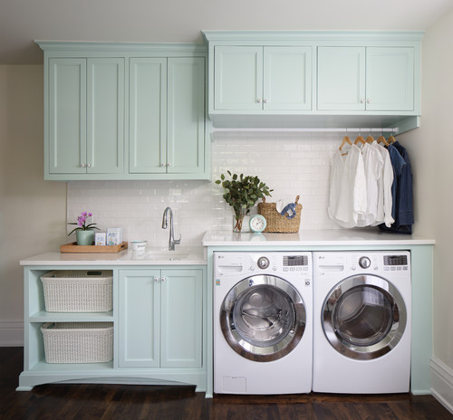
Just out of a fairy tale, SW Waterscape looks calming and stress-relieving on the cabinets in the above photo.
Especially if you have a taste in Cape Cod or Coastal – I would recommend this paint color!
You can either paint the cabinets in this paint color and let the backdrop be white or vice versa. In the case of countertops, choose white granite with veins and hexagonal glossy backsplash tiles.
Let the tiny accessories such as pull handles and drawers, be either chrome or brushed steel. Avoid golden oak cabinets or too many bold colors.
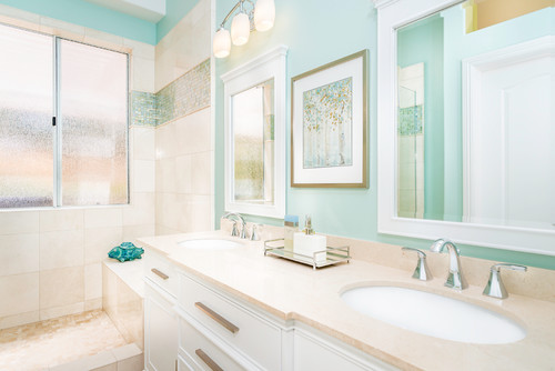
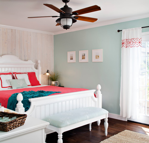
Waterscape in Bedrooms, Nurseries, and Bathrooms

SW Waterscape is one of the best options for a nursery or kids’ bedroom
Ever dreamt of a soothing nursery, bathroom, and bedroom?
Well, this paint color can be your answer.
If you plan to choose it in your bedroom, make sure to use it on the accent wall and let the rest be white, off-white, and greys.
In the bathrooms – it is definitely recommended – especially if you add some candles, plants, and decorative toiletry holders.
Make sure to paint the cabinetry and door frames in either white or off-white.
Remember to choose a funky shower curtain with this paint!

Using in Balconies and Patios
SW Waterscape painted on the ceilings of the balcony, exhibits an equally tranquilizing effect.
Absolutely yes! It is time to style your balconies with a refreshing mint touch!
Make sure to pair it with some bold colors as decorative accents!
To top it all, add rattan furniture to further feel natural throughout the day!
Waterscape on Exteriors
SW Waterscape looks mesmerizing when painted on the entry porch door
If you have a specific touch – why not?
Make your homes feel bright and enlightened even from the outdoors. However, make sure to pair it with either greys or whites through trims, wainscotting, and opening frames.
How to Best Sample This Color?
I need to share my favorite tip for testing out a color like Watersape – go over and order a peel-and-stick sample from Samplize.
These folks are nifty because they figured out a convenient way for us to sample colors way more easily. Just stick up a temporary square sample and forget the small jar of actual wet paint.
For only a few dollars you’ll receive a perfectly sized square you can stick up temporarily anywhere you want to “try” on a paint color and any possible coordinating hues you like. It’s the best!
What NOT to Pair with This Color
Color Pairings That Ruin the Look of Waterscape
Waterscape is a soft, watery blue-green, and pairing it with overly warm or saturated colors throws it completely off balance.
Deep oranges, terracotta, and rust tones fight directly against its cool, tranquil nature.
Bright, saturated yellows are another pairing that pulls this color in a direction that feels jarring rather than cohesive.
Decor Styles You DON’T Want to Pair with Waterscape
Industrial-style decor with heavy raw steel, dark concrete, and distressed metal tends to clash with Waterscape’s soft, airy feel.
Ultra-modern, high-contrast black and white interiors strip away everything this color is trying to do.
Heavily ornate, dark traditional decor is another style that fights against Waterscape’s light and breezy personality.
Trim and Accent Colors That Do NOT Work with Waterscape
Stark, cool bright whites on trim can make Waterscape look washed out and unexpectedly dull against the contrast.
Beige or yellow-toned trim colors pull out the wrong qualities in this color and create an uncomfortable visual tension!
Avoid deep, warm browns as accent colors since they conflict heavily with the cool undertones in Waterscape.
Never Put This Furniture in a Room Painted with Waterscape
Heavy, dark espresso-stained furniture is one of the worst pairings I’ve seen with this color.
It creates a weight imbalance that makes the room feel unsettled rather than calm.
Orange-toned oak or honey pine pieces are equally problematic since they clash with Waterscape’s cool blue-green base!
Indoor and Outdoor Finishes That Never Work with Waterscape
Warm-toned brick exteriors paired with Waterscape create an immediate color conflict that’s hard to overlook.
Indoors, yellowed or orange-toned hardwood floors intensify the cool undertones in this color in unflattering ways.
High-gloss finishes in warm metallic tones like brass or gold tend to feel mismatched with Waterscape’s soft, muted character.
So, are you excited to incorporate some freshness in your homes? Do let me know your thoughts in the comments below!


Leave a comment