
Are you planning to use Sherwin-Williams Morning Fog paint for your home interior walls, cabinets, exterior or furniture painting project?
I have some details you’ll want to check out before committing to this mysterious, yet inviting color.
One thing I know is how confusing it can get to choose the perfect gray(s) for your space.
Cooler or warmer? Light-toned, medium-toned or dark-toned? It gets overwhelming.
Well, I’ll tell you know…
If you’re looking for a medium-toned gray with clean and subtle cool undertones, Morning Fog is it.

It’s hard to pick a color that is not too light, yet not too dark. This is where this gray comes into play.
When used with a perfect set of accent colors, bases or neutrals, this gray can beautifully flaunt its magic to stay consistent with itself.
Read on to discover TONS more about Morning Fog – I promise you’ll be an expert on it in no time (and will know if it works for you!).

Timelessness offered by Morning Fog. Try it on a wall and observe how it transforms the space into a subtle haven.
Designers and homeowners across the country highly admire this shade of gray.
If you look at model homes or read magazines about décor you’ll likely run into this color.
As it is inclined more towards the cooler side of the wheel, I highly recommend using in spaces that you want to make seem larger and more spacious.
This whimsical color definitely gives you a benefit to be used anywhere and everywhere, interiors or exteriors and any interior design style.
But before discussing the design style and inspiration, let’s talk in detail about the color and its characteristics.
Sherwin-Williams Morning Fog Details and Specifications

Being a mid-toned shade, the Light Reflective Value of the color is 42 – not too dark and not too light.
This is important to know as it helps your success in where you’re going to use it, i.e. It will look different in a bright kitchen or bathroom, versus a master bedroom that’s on the north side of the house.
In this case, it’s pretty neutral, so you’re fairly safe unless you plan to really brighten a space or want to bring it down to create a more cozy, intimate setting (go with a lighter tone with an LRV of 75 or more).
When designing your bedrooms, living rooms, and dining areas, I highly recommend considering this value.

Is your room north-faced, south-faced? What time of the day do you use that room?
Yes, that all needs to be considered when applying paint!
Isn’t it interesting how colors have deep stories and theories hidden within them? And we are here to unravel them all.
Want to try this color out without having to paint your wall? Use some nifty peel-and-stick samples: Pick one up now from Samplize!
Diving deeper into further details, they have associated RGB and HEX values.

For this gray shade, they are: Red = 168, Green = 174, Blue = 177
The assigned HEX Value = #a8aeb1.

Effects of Light on Morning Fog
Once you start applying Morning Fog to your walls, you will observe both a crispness of the color and a calming smoothness at times.
When there is ample natural or artificial light falling, it might turn out to be even lighter.
Jenna Kate at Home shows off just how beautiful this paint color can look in a bright, airy doorway. Almost convinces you it’s in the blue family, right?
Let’s say like Olympus White (see my review of Olympus White here) or Lazy Gray (learn more here!) colors.
Unlike darker hues, you get the benefit of using this shade in mid-sized as well as larger-sized rooms, as they will eventually make your space seem brighter.
However, remember not to use it in very tiny or very large spaces. Generally, for the smaller spaces, you might want to go for lighter shades that have a much higher Light Reflectance Value.
And very large spaces create an illusion of a much bigger space than required, so it’s a big no-no if you want to use this color.
It is still light and bright enough to make your room feel airy.
Softness is highly exhibited when sunlight falls! And that’s why it makes a preferable option to being used in the exteriors. Right?
Now you see, light is another important factor when specifying a color!
SW Morning Fog Vs. Similar Colors
It is quite likely that you might confuse Morning Fog with its similar-looking hues.
Let’s have a look at a few of the most common:
Morning Fog vs Uncertain Gray
One such classic example is Sherwin-Williams Uncertain Gray (SW 6234) and Colonial Revival Gray (SW 2832).

And I totally understand the confusion!
To make it easier for you, let’s start with SW Uncertain Gray. It is another Medium light-toned shade with LRV very close to the one with Morning Fog – 43.
Yes, it seems quite similar and confusing. But you know what the biggest difference is.
Morning Fog is more inclined towards the cooler side of the scale, unlike the Uncertain Gray.
They might look very similar on the screen, but the biggest secret is to order samples of the color and then assess the brightness and tones in the environment you’re painting in. Pick peel-and-stick samples now from Samplize!
You could even visit the nearby store to actually have a real-time look.
Trust me, it can get deceiving sometimes!
Morning Fog vs. Colonial Revival Gray
Moving on to the next is Colonial Revival Gray.

With a Light Reflectance Value of 48, this is a much brighter shade than both Morning Fog and Uncertain Gray.
This color is a smoother and mid-toned shade exhibiting the properties of cooler white when there is excessive natural light falling.
It is quite likely to get confused but remember this shade is more inclined towards mainstream gray without any hassle involved in variant tones.
Morning Fog in excessive light might display blue-gray characteristics.
Buy some wall samples of each of these colors to easily compare them in your home.
SW Morning Fog Vs. BM Silver Dollar

If you want to know more about how this color aligns its properties with other manufacturers, Benjamin Moore Silver Dollar is the one to be discussed!
Looking very similar to Morning Fog, Silver Dollar is comparatively a little brighter with an LRV of 44.42.
But it’s the definitive cooler undertones that stick out in this comparison.
There have been questions and doubts arising many times on online forums about the differences in these two shades, and frankly, until you line them up together, you can finally see that Morning Fog shows off its blue undertones, making it’s BM counterpart appear to be more “true” gray.
Morning Fog Coordinating Colors

Sherwin-Williams Morning Fog is a blue-gray paint color that can be tricky sometimes!
Yes, of course, due to the dual undertones, but also how light reflects a major role here.
So, when choosing the coordinating colors for SW Morning Fog, always ensure that you choose a palette – lively and airy! (Since this color can be dominating and bold)
To name a few, you can best pair this blue-gray paint color with clean and cool whites, lighter beiges, darker grays, black, lemon yellows, and shades of peach.
In terms of metallic accents, choose the tones of satin brass or matte black for the lighting fixtures, artwork frames, and furniture frames.
Here are the following two color palette suggestions – monochromatic and coordinating (quirky and bold)!
Monochromatic Color Palette
The complementary colors for the monochromatic palette are as follows –

- SW 6256 Serious Gray
- SW 6257 Gibraltar
- SW 7615 Sea Serpent
Whether you have a coastal-style design or contemporary, this dramatic mood created by the blend of various shades of blue-grays is something you simply can’t ignore!
Although you have to allow ample natural light to enter if you’d love to create this palette in your space.
In terms of metallic accents, choose satin brass or polished chrome to go with it.
Contrasting Bold Color Palette
The complementary colors for the contrasting palette are as follows (bold) –

- SW 7006 Extra White
- SW 6993 Black of Night
- SW 2739 Charcoal Blue
If you prefer the moody and dramatic feel but fear the touch of warmer colors, this is a color palette that will help you create the desired aura.
The black and white will create a contrast and ultimately break the monotony!
Meanwhile, don’t feel shy about styling with satin brass and antique copper on the artwork frames and furniture frames.
Contrasting Quirky Color Palette
The complementary colors for the contrasting palette are as follows (quirky) –

- SW 7006 Extra White
- SW 6057 Malted Milk
- SW 6250 Granite Peak
If you like the vibe of a contrasting palette, merge the blue-gray with quirky hues like blush pink, mustard, and dark blue to create an utmost contrast and striking appeal.
Here, you can choose the decorative accents, such as throw pillows and blankets in the brighter hues.
For the metallic accents, choose satin brass or antique brass!
Now that you may have decided to choose this timeless color, it is important to understand what colors best go with it, right?
Choose a creamy white or deep navy and charcoal!
You could be a monochromatic admirer, but the best shades to complement the color are Extra White ( SW 7006) – could be the trim or molding color, Sedate Gray ( SW 6169) – could be a base or an accent, Ice Cube ( SW 6252) – best for accessories and furnishings

You could also try pairing with:
Sea Serpent – SW 7615 and Charcoal Blue – SW 2739 (see my article on this one here) – If you want a bold room!
From the interior designer’s point of view, I highly recommend considering neutrals and off-whites to complement this color.
Say a big no to bright warmer shades.
More SW Morning Fog Color Palettes


Coordinating Decor

Sherwin-Williams Morning Fog has cool undertones – which is why you must be careful around what you pair it with!
Generally, this color will work best with interior design styles like contemporary, modern farmhouse, and coastal.
If you’re planning to install hardwood flooring, ensure to choose walnut, oak, or even pine.
Try to avoid hardwood floors with a red or mahogany base, since that can contradict your SW Morning Fog walls.
Other than this, you can always use lighter-hued carpet tiles and off-white ceramic or porcelain tiles.
Apart from the flooring, let’s now discuss some major metallic finishes that have an impact on this paint color.
If you’re aiming for a modern and farmhouse look, choose matte black for the knobs, pull handles, and lighting fixtures.
Otherwise, choose satin brass if you’re aiming to achieve a luxe and elegant look.
Generally, it’s ideal to choose this paint color for all the walls of your room!
That way, you can best add shades of off-white and light or dark gray on the furniture fabrics and accents.

Here are the links to the furniture that works well with SW Morning Fog –

Here are the links to the flooring that works well with SW Morning Fog –
- European Oak Hardwood Flooring
- Porcelain Stone Look Wall & Floor Tile
- Oak Laminate Flooring
- Carpet Tile

Here are the links to the decorative accents that work well with SW Morning Fog –
Where to Use SW Morning Fog
Using in Bedrooms
As one of the most desired SW blue-gray paints, this color has a magic to it that makes it flexible enough to be used in any space of your house.
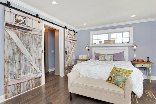
How amazing does this look with the farmhouse theme, with a rich wood floor and weathered barn door?
Morning Fog in Bathrooms
I would highly recommend specifying this color for all of the walls in a large room. Try not to accent it but you could use basic pure or extra white shade for trims and moldings.
With a room specifying darker hues like charcoal and midnight blue, you could probably use this shade for trims and intricate moldings.
It definitely will give a dramatic effect in the area you use it.

Laura from Elegant Nest reveals what the SW Morning Fog color did to her bathroom walls. Truly lovely!
Using in Living Rooms
Let the light reflect and make your house bright without having to use too much white – if that’s not your thing.
If you have a room with very high ceilings, I recommend using this shade as it will tend to make the ceilings lower. But note, this is only applicable if your walls are brighter than the ceiling.

Morning Fog in Bedrooms
I love to share these tiny details and tricks to enhance the space!
By the way, you’ll see a lot of builders and homeowners specifying this shade for interior doors, window frames and even classic style paneling in historic or preserved homes.

Morning Fog on in a spare bedroom doesn’t feel foggy, it adds a sense of cheer. See more of this house here.
You really start to see how universal this color is, right?
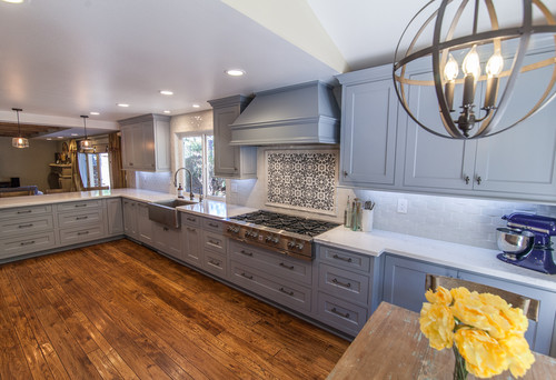
Using in Kitchens
In the end, how can I not mention how glamorous your kitchen will look if you plan to specify this color on the cabinets?
It will make your kitchen seem brighter and more stylish.
Perhaps this fits your style? Personally, I like this one a lot! Maybe consider trying?
Using on Exteriors
And looking at an exterior example, you can see how the color might work in tandem with a slightly darker color.
In this photo, you really see the “blue” tone it takes on in the bright outdoor sunlight.

The Best Way to Sample Morning Fog
As an interior designer, I used to “try” out paint like everyone else:
Buy several small cans of various colors, pouring them each into small trays and rolling them onto different sections of a wall.
I haven’t done this in some time now, ever since Samplize came up with their awesome way of sticking up a temporary sample that’s true to the color.
I just order a peel-and-stick sample and let the next phase of the color selection process begin. It’s so easy.
I love these 12″ x 12″ squares because I can move them around and see what happens in different lighting and what dialogue they’ll have with the other colors in a client’s home.
You can order yours now for Morning Fog and any others you’re considering – they even have a coupon for first-time buyers!
Test in Every Corner and Surface
You’ll want to place your sample on walls that get direct sunlight, since Morning Fog can shift from a soft blue-gray to almost purely gray depending on how light hits it.
I’ve seen this color look completely different in darker corners or narrow sections compared to large open walls where its airy quality really comes through.
Don’t forget walls across from windows where reflected light bounces in, and definitely test it near your trim, flooring, and cabinetry since those elements will influence whether it reads warmer or cooler.
Watch It Through the Day
Morning daylight will show you Morning Fog’s softest, most blue-toned side, while bright afternoon sun can pull it toward a warmer neutral!
Cloudy days will reveal how it reads when light is flat and diffused, which is important since this color can feel heavier without natural brightness.
Evening lighting matters too, because warm bulbs will mute its cool undertones while cooler LEDs will keep it feeling crisp and airy.
Consider What’s Around It
Wood flooring and natural cabinetry can bring unexpected warmth that softens this color’s cool character.
Rugs, furniture fabrics, and even greenery visible through your windows can all reflect into the room and shift how you perceive it against your walls.
Go Bigger Than a Chip
Tiny swatches simply can’t show you how this color behaves across different locations and lighting conditions in your actual space.
Larger movable samples like Samplize (link above) let you test every critical spot with ease.
Give It Time
Leave your sample up for a couple of days and observe it during your normal daily routine before you commit!
Morning Fog Undertones
Morning Fog’s Primary Undertone: Soft Gray-Blue
Morning Fog’s dominant undertone is a soft, muted gray-blue that gives it that calm, collected quality people love so much.
In rooms with cooler natural light or north-facing exposures, this blue undertone becomes noticeably stronger and can make the color feel genuinely cold.
I’ve seen this undertone surprise people who expected a straightforward neutral gray on their walls.
The Secondary Undertone That Changes Everything: Green
This is the undertone that consistently catches people off guard with Morning Fog.
A subtle green undertone sits underneath this color’s surface and activates in specific conditions.
Rooms with lots of outdoor greenery visible through windows can pull this green quality forward significantly.
Warm afternoon light also has a way of exposing it in ways that feel unexpected if you’re not prepared!
The Third Undertone Worth Watching: Subtle Violet
In certain lighting conditions, particularly under cool LED bulbs or in shadowed areas, Morning Fog can reveal a faint violet quality.
I’ve seen this undertone appear most noticeably in spaces with very little warm light balancing the room.
It’s subtle, but it’s absolutely worth knowing about before you commit to this color.
How Lighting Activates Morning Fog’s Undertones
Each of these three undertones responds differently depending on the time of day and light source in your space.
Warm incandescent or soft white bulbs tend to neutralize the blue and green, pushing the color toward a cleaner gray.
When sampling this color, checking it under every lighting condition in your specific room is non-negotiable!
My 7 Key Tips for SW Morning Fog
1. Pair Morning Fog with warm wood floors for balance
Morning Fog has a cool undertone, so pairing it with honey oak or medium walnut flooring keeps the room feeling inviting instead of chilly.
Avoid combining it with very light gray floors, as the space can start to feel flat and washed out.
I love how the subtle contrast between warm wood tones and this soft gray makes a room feel both modern and timeless!
2. Use a satin finish in high-traffic areas
Morning Fog looks stunning in a satin finish for hallways, kitchens, or bathrooms.
This sheen resists fingerprints and scuffs better than flat finishes, keeping your paint looking fresh longer.
Plus, the soft glow from satin helps the color reflect light beautifully without being overly shiny.
3. Consider crisp white trim for definition
Morning Fog pairs effortlessly with pure, bright white trim like Sherwin-Williams Pure White.
This creates a clean, tailored look and keeps the color from feeling too muted.
The contrast adds a little extra charm, especially in spaces with architectural details like crown molding.
4. Use with shaker-style cabinetry for a classic feel
This color is gorgeous on walls when paired with white or pale cream shaker cabinets in kitchens or laundry rooms.
The combination feels fresh and bright but still has enough contrast to make the cabinetry stand out.
If you have darker countertops, Morning Fog helps soften their heaviness and tie the space together.
5. Test it in north-facing rooms first
Cooler light can make Morning Fog appear slightly bluer, so always swatch it in the actual room before committing.
In north-facing spaces, balance it with warm accent decor or wood tones to keep it from feeling too cold.
I’ve seen this small step save homeowners from repainting headaches more than once!
6. Try it as an exterior main color with stonework
Morning Fog looks incredible as an exterior body color paired with natural gray or brown stone.
The color’s soft tone blends beautifully with outdoor textures, creating a welcoming yet polished look.
It’s especially effective in neighborhoods with traditional or craftsman-style homes.
7. Avoid pairing with overly cool grays
When Morning Fog is placed next to icy blue-grays, it can lose its depth and appear dull.
Instead, mix it with warmer neutrals or muted blues to bring out its complexity.
This approach keeps your palette looking intentional and harmonious every time!
FAQs
What color Is SW Morning Fog?
Sherwin-Williams Morning Fog is a pale and hazy blue-gray paint color that is perfect to create a soothing and muted atmosphere in a room.
What color living room furniture goes with SW Morning Fog?
Your living room furniture should be either light gray, dark gray, mustard, blush pink, black, or white to complement the SW Morning Fog walls.
What white goes well with Morning Fog?
Sherwin-Williams Morning Fog will best complement SW Extra White on the trims and ceiling.
Otherwise, you can also choose SW Ceiling Bright White or SW High Reflectance White.


Leave a comment