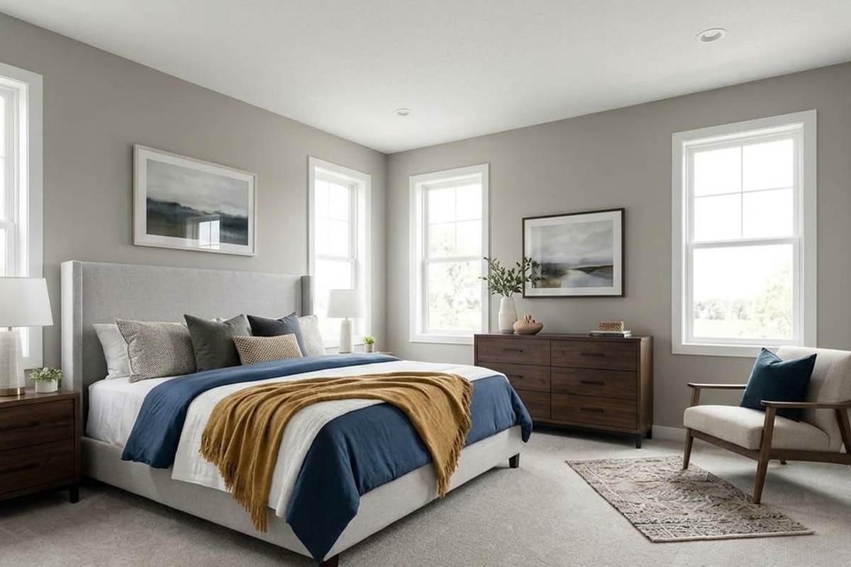
Not every gray paint can satisfy you! Yes, that’s right.
Whenever you think of considering a gray paint color for your home, the endless list of grays with either green, purple, or blue undertones will appear.
There are some true gray paint colors and some grays that highlight a specific color undertone! Meanwhile, some grays are cool and some are warm.
So yeah, there are a ton of Sherwin-Williams Grays to consider!
So, today – I will be discussing a gray paint color that’s quite timeless, sophisticated, modern, and charming all in one.
Yes, Sherwin-Williams Gray Matters it is!
This solid gray paint color is a medium to darker-toned gray with deep green undertones (not very dominant though).
It can tend to add a strong character and depth to your space – hence, equally efficient in creating a bold and subtle statement.
Hence, if you like the feel of grays and an utmost monochromatic vibe, this color is something to look forward to!
So, are you excited to know what this tone of gray has for you?
Well, in this color review, I will be discussing a couple of scientific details, color inspirations, do’s and don’ts, and applicable color palettes.
Let’s get started!
Sherwin-Williams Gray Matters SW 7066 Details and Specifications

What separates the gray with blue undertones from gray with green undertones or purple undertones?
Well, it’s the details and specifications.
If you are new here, let me tell you – there are quite some facts and scientific terms that you would want to acquaint yourself with. (Before choosing a paint color for your home)
It’s important to analyze these values and then determine where, when, and how to use these paints!
So, first and foremost, one of the most important terms that I usually observe getting ignored is Light Reflectance Values (LRV)!
Every color has an associated Light Reflectance Value!
For Gray Matters, the LRV is 39!

Which falls on the darker to the medium end of the scale – and somehow aligns on the bolder end.
Remember, the higher the value, the lighter the paint color is! (On a scale of 0-100)
And vice versa!
Oh, if you want to just try Gray Matters so you’ll know just how it’ll look, you can easily with a peel-and-stick sample from Samplize. Order some samples now!
Moving ahead, let’s discuss the RGB and HEX Values of the color.
Red = 167
Green = 168
Blue = 162
HEX Value = #a7a8a2
Now that I am concluding, I promise not to bore you with these scientific details anymore.
Let’s talk about the practical aspects of this popular gray paint color.
How Does This Color Feel in a Space
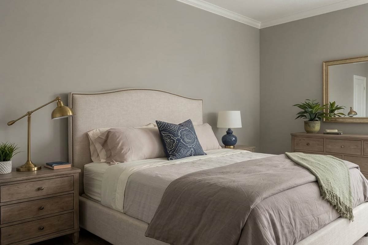
I wouldn’t call this gray paint a gray-green color. (Because the undertones are quite hidden and sneaky)
In a space, this gray paint will add boldness, drama, and a strong character that the home will absolutely adore and admire.
Well, if you want to create an illusion of a smaller space, this color will help pull the walls closer to create a balanced environment.
For very small spaces, be careful and use this paint color only as an accent.
Secondly, this gray paint will always feel cool and elegant – well, not too icy to create a chilly environment nor too warm.
Yes, it’s somewhere on the medium or neutral end.
How Does Light Affect the Color?
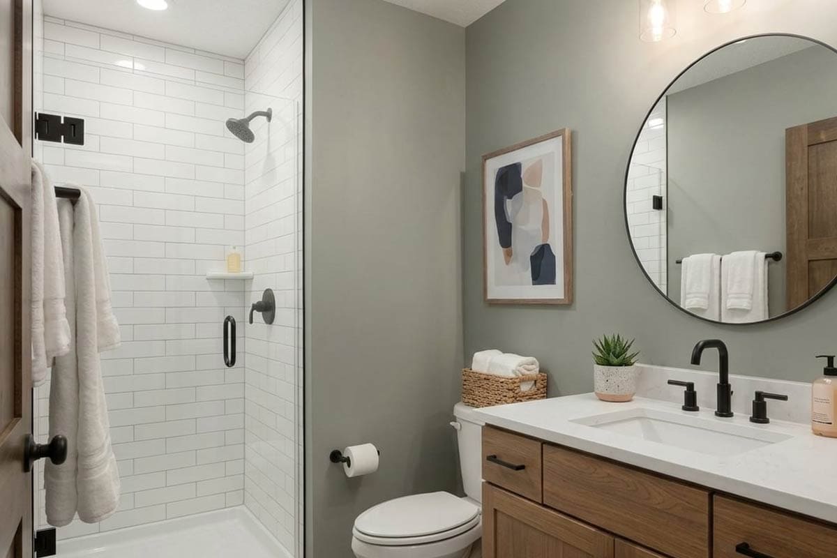
Light – whether natural or artificial has a role to play here!
The more light you give to this paint – the lighter it’s bound to feel. Hence, always use this paint in a room that receives sufficient natural light.
Otherwise, it might look dull and dingy!
Moreover, depending upon the compass directions, this gray paint might feel different.
For instance, in north-facing rooms, this color will look crisper and grayer. Whereas in the south-facing rooms, this gray will appear more neutral and greenish.
Now here’s another aspect to consider!
Always analyze the view from the windows of that specific room.
In this case, if you have a large window facing a lush, green lawn, SW Gray Matters will appear even greener! Yes, a good green!
To truly see what your home’s environment and lighting will do here, try out a real paint sample. It takes out the guesswork!
What are the Best Coordinating Colors?

Creating color palettes can be quite a fun task to do. (I absolutely love it)
So, you must choose the best complementary colors in order to define a palette that looks eye-catching and cohesive.
This gray will best pair with crisp whites, lighter grays, shades of teal, dark red, and yellows.
And other than that, you have a wide plethora of color opportunities and options to pair with! (You can be as creative as you want)
However, you have to be careful as to what vibe you need in your space for a perfect color combination.
So, I am going to enlist the two most popular color schemes here – monochromatic and contrasting.
Monochromes are generally great for modern and contemporary setbacks.
On the other hand, Eclectic, Mid-Century Modern, and Farmhouse play well with contrasts.
So, here are a few of the colors I would recommend for a monochromatic palette!
- SW 9163 Tin Lizzie
- SW 7067 Cityscape – see my review here!
- SW 7068 Grizzle Gray – see my review here!

On the other hand, here are a few of the colors I would recommend for a contrasting color palette!
- SW 6757 Tame Teal
- SW 6203 Spare White
- SW 6673 Banana Cream – see my review here!

For your ceilings, trims, and moldings – SW Pure White will help produce a true hue of SW Gray Matters.
SW Gray Matters Vs Similar Colors

Although you must know that even though the following colors look similar, they might still differ in the undertones or reflectivity!
So, two of the closely related colors are SW 7659 Gris and BM PM-7 Platinum Gray!
Let’s see how all of them differ.
Gray Matters Vs Gris

Sherwin-Williams Gris is a bold steely gray that feels neutral to its hue.
Yes, when observed closely, you wouldn’t find the blue or green undertone that may be present in the former paint color.
With an LRV of 39, the reflectivity values are exactly the same! Hence, equally dark enough.
Order a wall-stick sample of Gris here to help you compare colors in your own space.
Gray Matters Vs Platinum Gray

Benjamin Moore Platinum Gray is a medium-toned bold gray that has an undertone of brown to it!
Yes, it’s not a true gray paint – so always ensure where you plan to use it!
This gray paint has an LRV of 39.64 – which is quite similar to the above-mentioned!
Do yourself a favor and grab some stick-on sample sheets of these two colors and see what looks best in your home.
Where to Use Gray Matters?
View this post on Instagram
SW Gray Matters is a pretty gray paint that can make a beautiful statement in any corner of your home.
It is not necessarily an accent – rather can also play a great neutral or base (and can be used on all the walls of your rooms).
Especially with Mid-Century Modern, Modern, contemporary, transitional, and Victorian interior design styles – this paint absolutely plays flawless.
Let’s have a look at where and how to incorporate this paint color in your home.
Gray Matters in Living and Dining Rooms
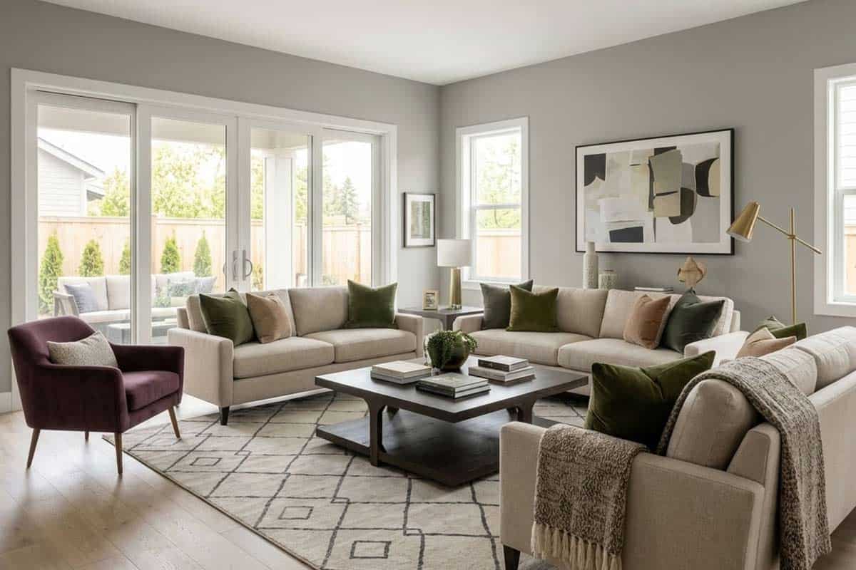
If your living and dining room has an appropriate size, consider painting this color on all the walls – with a clean white paint on the moldings.
If the size is small, just an accent wall wouldn’t be a bad idea either!

With your furniture, it’s ideal to choose some linen in white or off-white or even a tan leather couch and accent chairs.
To create a striking contrast, choose teal blue, red, or yellow to play a contrast.
Lastly, don’t hold back from adding a couple of indoor plants in the empty corners.
Using in Bedrooms