A symbol of happiness, friendliness, sunshine, and warmth – yellow paint color simply goes beyond aesthetics.
When talking about an utmost delight, energy, and charm in a space – the yellow hue is what strikes the most!
What’s more is that versions of yellow are one of the most versatile colors on the home decor spectrum.
The right shade, tint, or tone of yellow can magically transform the vibe of your space and make it feel more sophisticated, calm, or soft.
Well, not every yellow is challenging – and especially if you have Sherwin Williams Friendly Yellow on your mind.
This lighter-toned yellow paint color will feel utmost vivid and vibrant – while offering a touch of energy and enthusiasm to the space.
It is an easy color to brighten your space – and at the same time, if you have a Coastal, Caribbean, or traditional-style design – this color can easily pair with others!
Even country themes, for example a sunflower bedroom decor, dances lovingly with yellows to greet you each day under natural lighting.
So, how excited are you to incorporate a tinge of ‘Friendly Yellow’ into your space?
Well, you can be as creative and as mind-blowing as ever, when pairing and composing the color palettes!
Don’t worry – I got you covered!
So, let’s get started.
Sherwin Williams Friendly Yellow SW 6680 Details and Specifications

There is a wide array of differences between lemon yellows, mustards, golden yellows, light yellows, and marigold yellows. (And the list is endless)
Confusing, right?
Well, let me tell you, there are a ton of yellows on the swatch – and the only way to differentiate them all is the details and specifications.
Yes! A color has a lot to speak and convey.
And mainly through undertones, reflectivity, and how it is composed of.
So, making it easier for you – here’s a little guideline!
First and foremost, one of the most important terms that I usually observe getting ignored is Light Reflectance Values (LRV) or the LRVs!
Every color has an associated Light Reflectance Value!
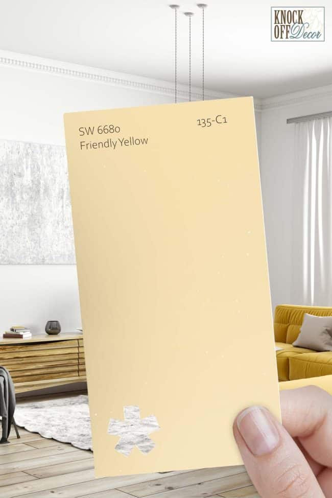
For Sherwin Williams Friendly Yellow, the LRV is 76!

And that means that the color falls on the lighter end of the scale – yes, quite light to make your room feel airy and bright!
Remember, the higher the value, the lighter the paint color is!
And vice versa!
If you want to see how Friendly Yellow will look in your unique environment, I highly suggest ordering a peel-and-stick paint sample from Samplize here!
Moving ahead, let’s discuss the RGB and HEX Values of the color.
(This determines how the paint color is composed of)
Red = 245
Green = 224
Blue = 177
HEX Value = #f5e0b1
Now that I am concluding, I promise not to bore you with these scientific details anymore.
Let’s talk about the practical aspects of this subtle and soft yellow paint color.
How Does This Color Feel in a Space?
Sherwin Williams Friendly Yellow is light and stark yellow paint color that feels quite muted, subdued, as well as vibrant when used in a space.
It’s neither too light nor too heavy or textural – it’s a perfect medium to light yellow to give a perfect glow to your space.
You can consider using this paint on all the walls (and sometimes as an accent in the kitchen or featured walls).
Lastly, this color is responsible for bringing a warm, cozy, and heated vibe to the room – thus, try to make the most use of this paint color in northern, colder regions.
On the other hand, avoiding the paint in the interiors of very warm areas is something that you must note.
How Does Light Affect the Color?
Right when you choose a yellow paint color for a room, it’s important to note the compass directions of the windows!
So, I highly recommend using SW Friendly Yellow in the north-facing rooms since the incoming gray and cool rays can perfectly neutralize the warmth of the yellow paint.
On the other hand, in the west or south-facing rooms, this paint can feel too much yellow or heated up! (Yes, it’s smart to avoid that)
Other than that, this paint will always feel lively and welcoming. And it’s even better if you have ample windows in the room.
For the artificial lighting, try avoiding yellow and rather pick warm whites or cool whites.
Like I said, the best way to see this color in action before you paint is to buy some paint samples you can easily stick on your wall. It’ll definitely give you some clarity if you’re unsure!
What are the Best Coordinating Colors?

My favorite part of the discussion!
Choosing color schemes and palettes is one of the most interesting things to do.
You get to play with multiple hues and their tints, tones, and shades.
But in general, SW Friendly Yellow pairs beautifully with creamy whites (warm), plum, browns or bronze, saturated blues, and deeper greens.
In terms of metallic accents, you can choose matte black or chrome.
So, I am going to enlist the two most popular color schemes here – monochromatic and contrasting.
Monochromes are generally great for modern and contemporary setbacks.
On the other hand, Eclectic, Mid-Century Modern, and Farmhouse play well with contrasts.
So, here are a few of the colors I would recommend for a monochromatic palette!
- SW 6681 Butter Up
- SW 9021 Naples Yellow
- SW 6682 June Day

On the other hand, here are a few of the colors I would recommend for a contrasting color palette!
- SW 9076 Ruby Violet
- SW 7004 Snowbound
- SW 6037 Temperate Taupe

For your ceilings, trims, and moldings – SW Extra White or SW Pure White will help protrude a true hue of SW Friendly Yellow.
SW Friendly Yellow Vs Similar Colors

There are various yellow alternatives to pick from!
Well, some might differ in the undertones or some in reflectivity values – but overall, they all make great considerations to take inspiration from.
To name a few, Sherwin Williams SW 6637 Banana Cream and Benjamin Moore 177 Mushroom Cap are on the top of the list!
Let’s see how all of them differ.
Friendly Yellow Vs Banana Cream

Another beautiful and mellow, yellow paint color – SW Banana Cream is bound to bring utmost joy and happiness to your room.
Check out my full review on Banana Cream paint here!
It has an LRV of 75 – which makes it equally lighter and brighter as compared to the former paint color.
However, in excessive lighting conditions, this paint color will slightly showcase an orange undertone.
So, try examining a couple of swatches before you finalize this paint!
Get stick-on sample sheets of Banana Cream to test in your home.
Friendly Yellow Vs Mushroom Cap

This is another classical yellow hue with a soft and creamy, neutral look.
With an LRV of 74.53 – this hue feels equally light and airy.
However, it can appear slightly stark and a way “too lively” – so it’s best to neutralize the appearance with the help of infusing creamy whites and subtle blues.
They might look very similar on the screen, but the biggest secret is to order samples of the color and then assess the brightness and tones in the environment you’re painting in. Pick up peel-and-stick samples now from Samplize!
Where to Use Friendly Yellow?
SW Friendly Yellow makes an enchanting statement, wherever used!
Whether it is the kitchen cabinets, kid’s bedroom, nursery, or play area, exteriors, or sunroom and living room – this color of hope will feel absolutely delightful.
So, let’s have a look at where and how to incorporate this paint color in your home.
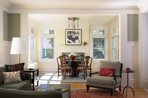
Friendly Yellow in Living and Dining Rooms
Definitely a yes – and especially if it’s a weekend home in the colder regions (where it snows tremendously) – this color of warmth will bring your space closer to the sun and coziness.
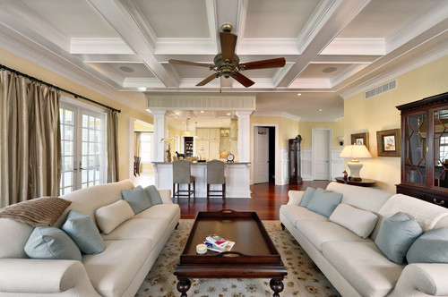
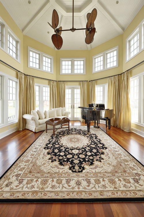
I highly recommend using this paint color in living rooms that have ample incoming natural light – with ample windows making a flawless statement.
You can pair this yellow with crisp white on the ceiling, window moldings, and door frames.
Lastly, for the furniture fabrics, you can either choose clean white or beige with a touch of charcoal blue on the throw pillows and other accessories.
Also, ensure to add warmer woods like mahogany for a ‘wow’ effect.
Using in Bedrooms
If you want to add a fun-loving touch to your bedroom, while at the same time, induce warmth, yellow is the number one color to look forward to!
It can work best with gray, black, and white – especially on the furniture frame, bedding, and accessories.
You can consider painting all the walls in yellow and further adding shades of blue or mauve on the bed cover, artwork, and rugs.
Adding textures like macrame, faux, and fur is also a great way to add depth and texture.
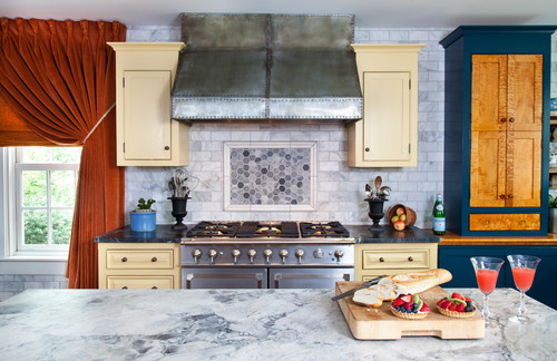
Friendly Yellow in Kitchens
Who doesn’t love the quirkiness of yellow in the kitchen?
Especially on the cabinets – this paint color is a must choice for industrial, farmhouse, and Caribbean-style spaces.
You can best complement this yellow with white on the backdrop wall, window frames, countertop, and tiles.
Lastly, it’s best to add matte black on the pull handles and knobs for a perfectly flabbergasting look.
Using on Exteriors
Do you reside in Florida or somewhere by the coast?
Well, in that case, yellow is quite a common color for the exteriors of your home.
This color pairs beautifully with SW Pure White on the trims, shutters, and moldings along with light gray on the shutters.
Furthermore, if you have porches and columns – either choose a white paint or natural stone wainscotting.
An Easy Way to Sample This Color!
Instead of picking up a small can, or worse, an entire gallon can, to “”test”” out Friendly Yellow, you can order a peel-and-stick sample of it from Samplize.
The company is genius – they provide a 12″” x 12″” stick-on square you can put up anywhere in your home to try out a paint color.
For a few bucks, it’s definitely worth the small investment so you can see what the color will do in YOUR unique space, with your own lights and shadows.
Now that you have all the secrets – are you excited about painting your home in SW Friendly Yellow?
This paint doesn’t have a lot of restrictions and rules – so, you’re pretty good to go either way!
Well, I would love to know your thoughts – comment below!

Leave a comment