
Greens are the ongoing color trend that will probably never even go out of style.
Apart from looking extremely chic, appealing, and soothing, this color has the potential to play with our minds in a very positive way.
Of course, it will release stress-free hormones but also make you feel calm and composed at the end of the day.
And also, it’s a multi-faceted color that has various shades and tones at various points of the day.
So, don’t worry and relax!
In this color review, I will define what this color truly has to offer!
Along with its whereabouts and how abouts!
So, Benjamin Moore Sea Haze is a neutral grayish-green paint color that is neither too dark nor too light.
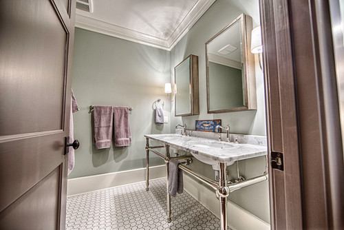
Well, just a perfect neutral tone, per se.
Secondly, it may tend to look slightly warmer or cooler at different times of the day – but that’s truly not much of a deal (after we discuss how to play with that)!
And lastly, this color will never disappoint you.
It’s calm and soothing – and will definitely make your homes feel more refreshing than ever.
So, let’s get on board the journey to Benjamin Moore Sea Haze.
Benjamin Moore Sea Haze 2137-50 Details and Specifications

There are a ton of greens on the BM swatch!
Some may be aligned to grays, some to blues, and some are true greens.
But do you know how to differentiate each one of them?
Well, it’s simply the idea of specifications, details, and underlying theories.
Color theory is a whole new world.
And trust me – you truly have to understand each aspect before you pick a paint color for your home.
So, let’s take the all-important concept of Light Reflectance Values or the LRVs that determine how light or dark the paint color is.
You can easily find that value at the end of your Benjamin Moore paint swatch or even the website!
Here, in this case, the LRV of Benjamin Moore Sea Haze is 45.83.

And that means it falls on the medium end of the scale – neither too dark nor too light.
(Remember, the lesser the value, the darker the paint – on a scale of 1-100)
If you want to see how Sea Haze will look in your unique environment, I highly suggest ordering a peel-and-stick paint sample from Samplize here!
Secondly, other important associated terms are the RGB and the HEX Values.
Red = 181
Green = 181
Blue = 172
HEX Value = #B5B5AC
Ok, so we’ve discussed the technical and scientific information. Let’s get started with the practical aspects of this grayish-green Benjamin Moore paint.
How Does This Color Feel in a Space?
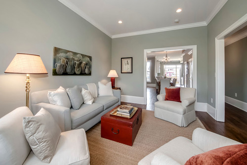
Benjamin Moore Sea Haze will refresh you, revitalize you, and make you feel extremely calm and comfortable.
Since it’s not a warm-toned color, it might sometimes feel cool and unwelcoming. But, with the fun-loving palette, you can absolutely make that happen!
So, when observing through a bigger lens, you must know that this color has the potential to exhibit chilly vibes.
Hence, making a great statement in the warmer states where you need that kinda’ vibe.
Whether you have a larger-sized bedroom or a medium-sized living room, don’t hold back from this color if you truly embrace a unique experience.
Even in small-sized rooms, this color isn’t a bad option if you plan to use it on all the walls.
How Does Light Affect the Color?
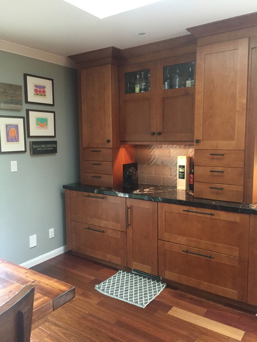
Natural or artificial light has the potential to further brighten this paint color.
So, as discussed earlier, BM Sea Haze can look totally cool, crisp, and chilly when used in the north-facing rooms. (Of course, due to the incoming cool light)
Whereas in the west or south-facing rooms, the little hidden warmth is what needs to be perceived.
Meanwhile, you always have the advantage of using this color in small, medium, or even large-sized rooms.
That’s the ultimate beauty, isn’t it?
Lastly, you can always add a sense of warmth with warm white lighting through wall sconces, chandeliers, and pendant lighting fixtures.
As I said, the best way to see this color in action before you paint is to buy some paint samples you can easily stick on your wall. It’ll definitely give you some clarity if you’re unsure!
What are the Best Coordinating Colors?

You must pair Benjamin Moore Sea Haze cohesively and creatively to know its utmost powers.
And that is why you have to be careful when choosing complementary color schemes!
You can best pair this green paint with true whites (in the case of trims etc), yellows, lighter grays, charcoal blues, and even mauves.
You can also incorporate any of the metallic tints as accents here – like matte black, gold, and brass.
Furthermore, you can either choose from a monochromatic or a contrasting color palette, depending upon the interior design style and your preference.
So, here are a few of the colors I would recommend for a monochromatic palette!
- 2137-70 White Wisp
- 2137-60 Gray Owl
- 2137-40 Desert Twilight
On the other hand, here are a few of the colors I would recommend for a contrasting color palette!
- 1615 Rock Gray
- 2122-70 Snow White
- HC-80 Bleeker Beige

For your ceilings, trims, and moldings, you can use BM Chantilly Lace as it is a true white paint and will further enhance the original adjacent hue.
BM Sea Haze Vs Similar Colors
This generic grayish-green paint tends to share tons of similarities with greenish grays and other neutral-toned grays.
Whether it’s the undertones or reflectivity, BM Sea Haze can be compared to a couple of other BM and SW hues.
So, let’s discuss the major ones – AC-26 Ozark Shadows and SW 6198 Sensible Hue.
And see how they all differ.
Sea Haze Vs Ozark Shadows

These two share a ton of similarities; however, a major difference is the undertones.
The latter is a neutral with deeper taupe undertones.
And when talking about the reflectivity values – it has an LRV of 45.83 – and that equally feels darker and deeper.
It doesn’t really feel green unless the room has window views to the back or front lawn.
Get stick-on samples of these colors to test in your home.

Another beautiful neutral from the collection, this paint tends to add a bold and stark contrast to the walls.
It doesn’t have a dominant green like the similar BM October Mist color, but when painted on the walls can detect a slight one.
However, it feels equally soothing and you can definitely incorporate it!
Also, this color has an LRV of 46, which makes it a mid-toned, calming neutral.
They might look very similar on the screen, but the biggest secret is to order samples of the color and then assess the brightness and tones in the environment you’re painting in. Pick up peel-and-stick samples now from Samplize!
Where to Use Sea Haze?
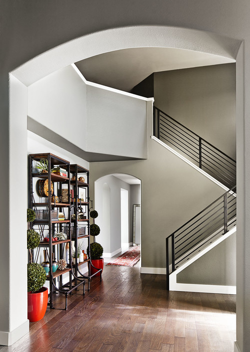
Can I say that you can use it everywhere?
Well, of course – don’t hold back from using this paint in your home!
Whether it’s the kitchen cabinets, exterior shiplap, or interior walls – this color will truly make a flabbergasting statement.
When talking about styles, this color must be used in coastal, Caribbean, and modern farmhouses!
Let’s see where and how to incorporate this green paint color in your home.
Sea Haze in Living and Dining Rooms
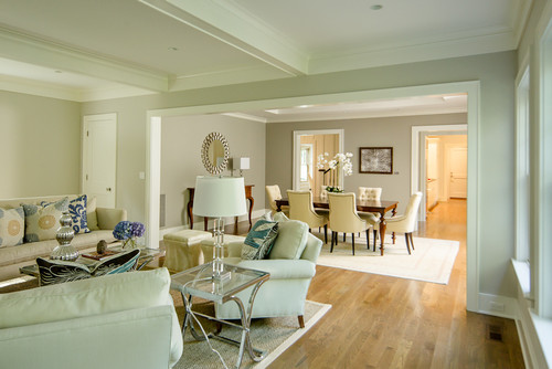
You can choose to paint all the walls in this color or even have an accent on the door and window frames.
You can even paint the brick mold in this color and leave the rest to the shades of off-white.
And since this color can exhibit a cool and crisp touch, don’t hold back from incorporating warmer shades of off-whites on the rugs, curtains, and couch fabrics.

In terms of metal accents, choose matte black or chrome!
Lastly, try splashing some fun through your throw pillows and decorative accents. Something in hot mustard and burnt orange is good to go.
Using in Bedrooms
I would love the feel of this color in the bedroom!
Especially if you have a sea-facing one – why not try this color?
You can have some rich walnut shades on the wooden furniture and textures. Furthermore, in amalgamation with ample glass and metallic tints.
You can even choose to paint this color on the headboard wall and further introduce using rattan, wicker, and cane through wall accents and mirror pieces.
Yes, don’t forget mirrors for a positive flow of feng shui.
Sea Haze in Kitchens
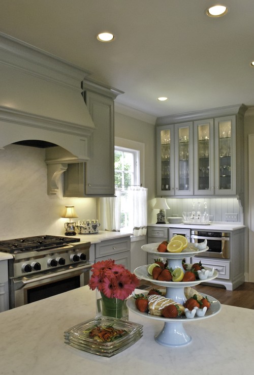
This is one of the best places to have this pretty gray-green paint color.
Yes – on the cabinets!
If you want to add an artistic touch to your kitchen, do consider painting this color on the cabinets.
Trust me, you can never be disappointed.
You can pair this color with something warmer, like SW Wool Skein on the backdrop wall.
Moreover, you can add brass or golden pull handles, a white marble countertop, and gray backsplash tiles.
For pendant lights or wall sconces, do consider brass or gold itself.
Using on Exteriors
This color can be used on the exterior walls with darker gray or green on the shutters, door, and window frames.
Generally, it’s better to pick creamy or crisp whites as accents on trims, moldings, and special architectural features.
Your roof tiles could be gray, black, or even red!
Lastly, don’t hold back from using natural stone wainscotting (in a warmer base)!
An Easy Way to Sample This Color!
Instead of picking up a small can, or worse, an entire gallon can, to “test” out Sea Haze, you can order a peel-and-stick sample of it from Samplize.
The company is genius – they provide a 12″ x 12″ stick-on square you can put up anywhere in your home to try out a paint color.
For a few bucks, it’s definitely worth the small investment to see how the color will look in YOUR unique space, with your own lights and shadows.
My 7 Key Tips for BM Sea Haze
1. Understand Sea Haze’s Green-Blue Balance Before You Commit
Sea Haze sits in a delicate space between green and blue, and the balance between those two qualities shifts depending on your room’s light.
In rooms with warm natural light, the green pulls forward and gives it an earthy, sage-like quality.
In cooler or north-facing rooms, the blue takes over and the color reads much more like a muted coastal tone.
Knowing this ahead of time saves you from being surprised once the paint is on the wall.
2. Pair Sea Haze with Cool or Neutral White Trim Only
Warm white trims with yellow or cream undertones will create a noticeable clash against Sea Haze’s cool green-blue base.
I always recommend crisp, cool whites like Benjamin Moore Chantilly Lace or Simply White to keep the trim feeling clean and intentional next to this color.
Getting the trim right is one of the most impactful decisions you’ll make when using this color!
3. Choose the Right Flooring Tones to Complement Sea Haze
Sea Haze works beautifully with cool to neutral wood floors, like light maple, whitewashed oak, or gray-toned luxury vinyl.
Floors with heavy orange, red, or warm honey tones will pull against Sea Haze’s cool character and create a disconnect that’s hard to ignore.
Light, cool-toned flooring lets this color breathe and keeps the space feeling cohesive and intentional.
4. Use Sea Haze in Bathrooms and Bedrooms for Maximum Impact
This color’s calm, watery quality makes it particularly well-suited for bathrooms and bedrooms where a sense of quiet and ease is the goal.
I’ve seen Sea Haze absolutely shine in primary bathrooms paired with cool stone tile and brushed nickel fixtures.
It creates a spa-like atmosphere that feels genuinely restful without relying on bold color choices!
5. Match Cabinet Tones Carefully in Kitchens and Baths
Sea Haze pairs best with white, off-white, or light gray cabinetry that leans cool rather than warm.
Warm wood cabinets in honey, pecan, or golden tones will compete with this color’s cool base and leave the space feeling visually unsettled.
Cool-toned or painted cabinets are consistently the strongest pairing I recommend with this color in kitchen and bath spaces.
6. Apply a Satin or Eggshell Finish for Best Results
Sea Haze’s soft, muted character comes through most beautifully in a satin or eggshell finish that adds a subtle sheen without overpowering the color’s quiet nature.
A flat finish can make this color look dull and lifeless, while anything shinier than satin risks making the green undertones look harder than they should.
Satin is my consistent recommendation for living areas, and eggshell works perfectly in bedrooms with this color.
7. Test Sea Haze on Exterior Walls with Northern or Eastern Exposure
On exteriors, Sea Haze performs exceptionally well on homes surrounded by natural greenery, as the color blends harmoniously with landscape tones.
North and east-facing exterior walls bring out the color’s cooler, more refined blue-green quality that looks clean and current against white or charcoal trim.
On south or west-facing walls in full sun, the green can intensify significantly, so always test your sample in direct afternoon light before committing to the full exterior.

Leave a comment