
The cool and calm, tranquil and peaceful, and serene and restful – Benjamin Moore Healing Aloe is all you need in the coming years.
This cool and crisp color is bound to make you feel chilly – and that is when you have to be very careful while using it in your home.
Many homeowners have loved the feeling of this paint and other similar BM greens in their kitchens, bathrooms, bedrooms, as well as the living room – and trust me, it is definitely worth it.
Mimicking the tones of deeper aloe vera grass, this color very profoundly adds a touch of nature into your home.
And with the latest color trends for the years 2020 and 2021, this tone of soothing green is a must to look forward to!
So, are you too excited to incorporate a touch of this color in your home?
But before we get into that, I want to help you understand the true specifications behind the paint color, its appearances, aesthetics, and majorly – if you should use this paint in your home or not!
So, sit back and relax!
I am going to throw off some very interesting insights about this paint that you would absolutely love to know!
Benjamin Moore Healing Aloe 1562 Details and Specifications

Before you plan to pick this paint for your home, you must remember to study and analyze the color specifications and details.
Every color has a story to tell – and that is what makes it so unique!
So, next time – remember there are no two colors that are the same, even though they appear ‘similar’!
Even though they tend to look alike, they can be very different based on the undertones and reflectivity.
So, let’s cook up some of the details here!
First and foremost, look towards the end of your paint swatches to determine the Light Reflectance Values or the LRV’s of the paint color.
This value helps in determining how light or dark the paint is – and you must know this to make informed decisions.
So, the LRV of Benjamin Moore Healing Aloe is 69.66.

Remember, the greater the value, the lighter the paint and vice versa!
On a scale of 1-100, 100 being the lightest!
And that means it is a comparatively lighter-toned chilly green paint color.
Another tip: If you want to easily try out Healing Aloe to see how it will show, you can with a peel-and-stick sample from Samplize. Pick up your samples here!
Secondly, other important associated terminologies are the RGB and HEX Values that further tell us what the color is made of.
Red = 213
Green = 219
Blue = 210
HEX Value = #d5dbd2
Since we have discussed the technical and scientific information, let’s get started with the practical aspects of this green Benjamin Moore paint.
How Does this Color Feel in a Space?
Undoubtedly, Benjamin Moore Healing Aloe makes you feel crisp, chilly, and cool when used on the wall.
It has deep, cool green and gray undertones that exhibit a vibe to make you feel uncomfortable in certain circumstances.
But don’t worry – I am going to help you there!
Furthermore, this color helps in releasing stress while calming down your space.
So, after a long day of work and sweating, you are quite likely to feel cooler and at peace when you come back home.
And that’s why I highly recommend the warmer and tropical states to incorporate this paint either in the common spaces or even the private rooms.
Moreover, there is another magic this color plays!
It will help in pushing away your walls – hence, making your space look and feel larger than it already is.
How Does Light Affect the Color?
Natural light always has a great role to play here!
It is bound to make your space feel airier and lighter – without compromising on the appearance and the feel!
I recommend you use this paint in the west and south-facing rooms!
Using this paint in the north-facing rooms is an absolute no-no as it will make your room feel even colder and more unwelcoming!
Else, you can always play with artificial lighting in the form of warm white or yellow lighting to create a dramatic experience.
I’ll have to say again, the absolutely coolest way to check a color like this out in your home is with a wall sample from Samplize. Buy yours here.
What are the Best Coordinating Colors?

Choosing complementary colors is one of my favorite tasks to do!
Whether it is for the bases, neutrals, or the accents – you must read this section very carefully!
First and foremost, you could either choose from a contrasting or a monochromatic color palette – depending upon your interior design style and preference.
In the case of contrasts, you can pick from grays, beiges, creamy whites, olive and bottle greens, blacks, charcoal blues, and deep browns.
So, check out these few colors I would recommend for a monochromatic palette!
- 1564 Beach Glass
- 1566 Stonybrook
- 1568 Quarry Rock
On the other hand, here are a few of the colors I would recommend for a contrasting color palette!
- HC-109 Sussex Green
- 1514 French Canvas
- 2132-40 Eclipse

Remember to pair these with BM Simply White on the trims, moldings, and other decorative architectural features.
BM Healing Aloe Vs Similar Colors
Benjamin Moore provides a wide array of similar-looking options for this chilly green paint!
But remember – they may either differ in appearances, undertones, or the reflectivity values – as discussed before.
So, to name a few, the two most similar-looking color options are 1576 Ice Cap and HC-171 Wickham Gray.
Healing Aloe Vs Ice Cap

Another beautiful paint from the minty green collection, Benjamin Moore Ice Cap feels absolutely cool with deep gray undertones.
It has an LRV of 67.41 – thus, falling on the lighter end of the scale.
Moreover, you can pair it with creamy whites, darker and lighter grays, and ample patterns and textures to feel delightful.
Order peel and stick samples of these colors here to help you compare these colors in your own living spaces.
Healing Aloe Vs Wickham Gray

Blending the greens, whites, and grays, Benjamin Moore Wickham Gray is a soothing and tranquilizing tone that makes a great option to be used in the home.
With an LRV of 68.94, this color makes a great lighter tone – hence, can be used as neutrals as well as bases.
Furthermore, try avoiding in the north-facing rooms.
Try out the looks of these colors in your own home with a some temporary wall samples. You can find them here!
Where to Use Healing Aloe?
BM Healing Aloe is so quiet and welcoming that you can practically use it anywhere in your home – whether living rooms, nurseries, kids’ rooms, bedrooms, kitchens, meditation rooms, or bathrooms.
Talking about the interior design style – Benjamin Moore Healing Aloe is a great recommendation for Coastal, Modern, Floridian, Contemporary, Caribbean, and Cape Cod-style.
Try avoiding it in design styles like Country, Farmhouse, and Bohemian styles as they crave a warmer appeal!
Let’s see where and how to incorporate this beautiful cool green color into your home.
Healing Aloe in Living and Dining Rooms
Absolutely – why not?
If you genuinely want a cool and crisp touch, this color would be a great recommendation!
You can pair it with creamy whites, darker greens, matte black metal, pinks, golden-tints, blacks, and even grays to create a subtle contrast.

You can also add some textures and patterns through accessories like curtains and rugs!
Your space is quite likely to feel airy, bright, and enhanced with this paint!
Remember to incorporate warmer wooden textures here for a sense of contradiction in the palette!
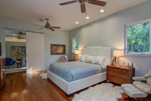
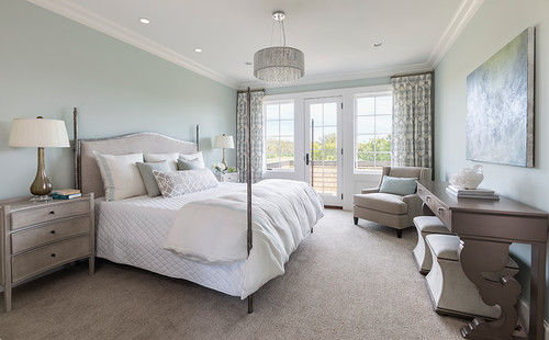
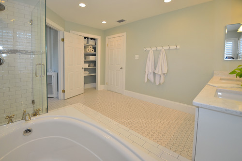
Using in Bedrooms and Bathrooms
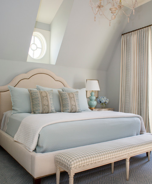
I would personally love a bathroom with this paint in it!
Since these two spaces are quite personal, you should incorporate a paint so calm and soothing.
Furthermore, you can pair it with whites and lighter grays for a perfect contrast.
Not as an accent but you can use this paint as a base or a neutral.
Moreover, using matte black chandeliers would further help in refining the look of your bedroom.
Healing Aloe in Kitchens
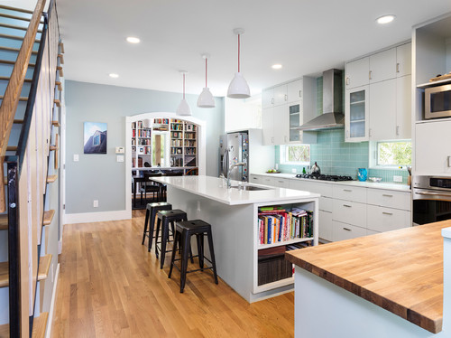
Especially for the open concept plans, if you like a nice tint of cool hue in your kitchen, you can absolutely incorporate this on the cabinetry or the backdrop wall.
Try pairing it with a white or black marble countertop, white hexagonal glossy backsplash, and nickel-tinted fixtures and pull handles. (Avoid Brass)
You can also choose the other way around by painting the backdrop wall in this color and letting the cabinets in Crisp white.
Using on Exteriors
Healing Aloe on exteriors will further make the color look lighter than it already is.
I recommend using this paint on Cape Cod, Craftsman, and Caribbean-style homes.
Pair it with white, gray, or off-white shaded trims and moldings!
Yes – that way you make a great contrast in your home exteriors!
Also, you can do the other way round, by using whites on the decorative moldings!
What’s the Best Way to Sample This Color?
So now my favorite tip when it comes to testing out a versatile color like Healing Aloe – go and order a peel-and-stick sample from Samplize.
They’ve created an awesome way to sample colors with real paint, but no mess. Simply stick on your paint sample instead of having to get a test can of actual wet paint.
For only a few dollars you get a good sized square to throw up temporarily anywhere you want to “try” on your color, other similar colors, and any possible coordinating hues you like. It’s great!
My Top 7 Tips for Healing Aloe
1. Use Healing Aloe’s Soft Green to Make Light Floors Truly Shine
Light oak, blonde hardwood, and whitewashed floors pair beautifully with Healing Aloe because the color’s soft, muted green warmth complements those natural tones without competing.
I’ve seen this combination create a grounded, organic feel that looks intentional and effortless at the same time.
If you have light flooring, consider yourself ahead of the game with this color!
2. Pair Healing Aloe with White Shaker Cabinets for a Fresh, Calming Kitchen
White shaker cabinetry is one of the best companions for Healing Aloe in a kitchen because the clean lines and bright white let this color’s gentle sage quality take center stage.
I’ve seen darker or busier cabinet styles compete with Healing Aloe in ways that muddy the whole look, so keeping cabinets light and simple really pays off here.
3. Prime Carefully If You’re Covering a Darker Color
Healing Aloe is a mid-toned, muted color that can struggle to fully cover deep grays, bold blues, or dark greens without a quality tinted primer underneath.
Skipping that primer step is the kind of shortcut that adds extra coats and frustration to your project.
4. Choose the Right Sheen for Each Space
Healing Aloe works beautifully in an eggshell finish for living areas and bedrooms, where you want that soft, calming presence without any distracting shine.
In kitchens or bathrooms, stepping up to a satin finish protects the color while keeping it looking clean and intentional.
5. Take Advantage of How Well This Color Works in Bedrooms and Bathrooms
Healing Aloe genuinely thrives in spaces meant for rest and restoration, and I’ve seen it transform bedrooms and bathrooms into genuinely calming retreats!
The color’s muted, spa-like quality makes it a natural fit anywhere you want to feel a sense of quiet and ease.
6. Be Thoughtful About Exterior Use in Harsh Sun Exposure
On exteriors, Healing Aloe can wash out significantly under intense direct sunlight, losing some of its gentle green depth and reading flatter than expected.
North or east-facing elevations tend to show this color at its very best outdoors, where softer light lets its true character come through.
7. Test Healing Aloe Next to Your Existing Metals and Hardware First
This color has a cool, green-leaning base that works best alongside brushed nickel, matte black, and unlacquered brass hardware.
Warm polished brass or heavily warm-toned bronze fixtures can clash with Healing Aloe’s cooler undertones in ways that feel slightly off, so always test your hardware against a large sample before committing!
So, how do you want to use this color in your homes? Interiors or Exteriors?
Now that you have all the secrets, are you excited about painting your home in Healing Aloe?
Should there be any questions or thoughts, let me know in the comments below!

Leave a comment