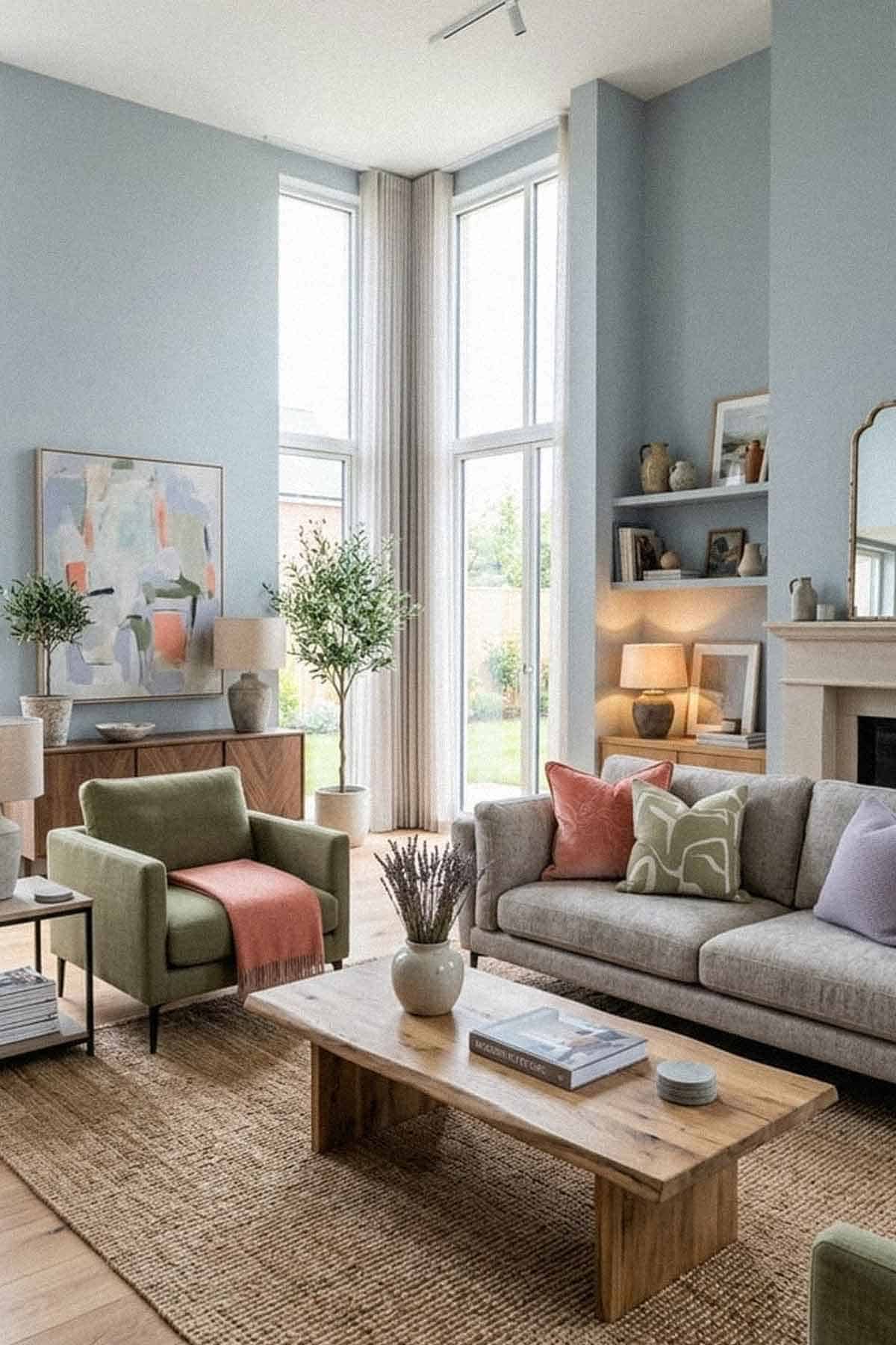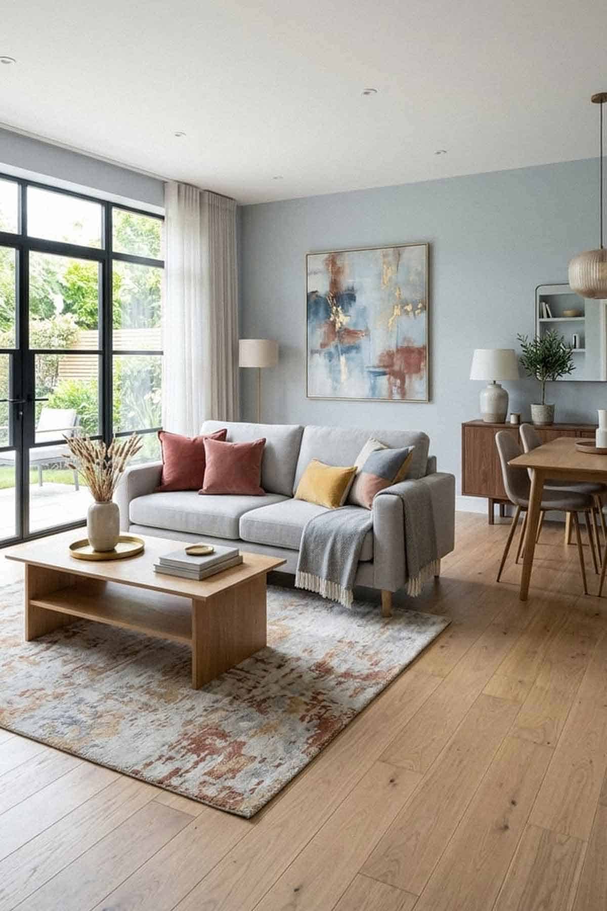
A pious, clean, and calming blue – Sherwin-Williams Upward is all set to take your home into a different note.
It is a pure light-toned blue paint color that mimics the feel of a tranquilized haven.
This paint color is bound to add a ‘chill’ effect in your homes – whether you use a tint or paint all the walls in this specific color.
So, if you are looking for a blue that is somewhat more bold and characteristic and yet extremely light to make your space feel bright and lively, choosing SW Upward is one of the best ways.
The reason this timeless color differs from the rest of the lighter blues is solely its texture and appearance on the walls.
It is a pure blue paint color with almost little to no deflections of other paint colors.
However, in some cases, the paint color tends to look lighter or darker depending on the natural conditions.
Another point to note is the colors you want to pair it with.
Let me tell you, this specific blue is not easy, and you have to be careful when using and pairing this paint color.
Let’s discuss if this is the right paint color for your home or not!
Sherwin-Williams Upward SW 6239 Details and Specifications

I always recommend that my clients study the color before using it in their homes.
Trust me, it’s not as easy as it sounds!
You are expected to know the underlying theories and facts related to the paint color.
Whether it is the undertones, brightness or darkness, and the associated values, you must get the hang of it before choosing a paint color.
Don’t worry! I am going to simplify it for you.
So, first and foremost, turn around your paint swatches and have a look at the Light Reflectance Values or LRVs to understand if the paint color is light or dark.
The LRV of Upward is 57 – thus, neither too dark, nor too light.

Rather, when you paint your walls with this paint color, it may appear much lighter than expected!
Because paint colors can change in different environments, I recommend you also just try Upward out at home with a peel-and-stick sample from Samplize. Order some samples now!
Secondly, other terms that you must know are the RGB and HEX Values.
Red = 191
Green = 201
Blue = 208
HEX Values = #bfc9d0
Now that we have discussed the scientific data, let’s jump on to the practical aspects and applications of the paint color.
How Does this Color Feel in a Space?

Above, you can see how this color is used on the ceiling of the beach-style living room in New York.
SW Upward feels extremely motivating, light, airy, and spacious when used in your home.
You are quite likely to feel colder with this color around (since it is a cool-toned paint color)!
So, just in case if you are looking to have a cozy feeling in your space, you must not use this unless you balance the appearance with some warmer-toned paint colors.
For warmer regions – I recommend painting this color in the entrance of your house and especially in the common areas to create a calming and tranquilizing effect.
This paint color also solves the issues of space-saving hacks.
So, if you are residing in a congested space, using this paint color as an accent would be a great way to create an illusion in your home.
You can always blend this paint color with lighter-toned paint colors that have an LRV of more than 70.
How Does Light Affect the Color?
Light and paint colors go hand in hand! If there is light, there is color.
However, the type of light may affect how the paint color might look.
In this case, the color appears to be lighter in excessive natural light. Sometimes, due to a lack of sun rays, this color may also appear grayish.
Meanwhile, in the absence of lighting conditions, this paint color appears darker – well, something like SW Bracing Blue.
You are quite likely to find out tinges of purple in this paint color – but only under specific lighting conditions.
Secondly, don’t forget the power of artificial lighting!
The saturation and color of your light bulbs have a lot to do with creating a specific aura in your home.
I’ll say this again – get some wall samples to try on this color in your own home and confirm if it’ll work or if you need to try something else.
What are the Best Coordinating Colors?

Now that we know how the color appears in your rooms, it is important to understand the color schemes.
Color theory is far more than what meets the eye!
So, in order to feel the real beauty of this paint color, you must learn what best complements the paint color.
So, if you are planning to use this paint color in your living space, you must color coordinate the accents, bases, and neutrals to create a perfect, cohesive look.
You could either choose an engaging and contrasting theme or a minimalistic monochromatic theme, based on your personal preference or interior design style.
So, have a look at the paint colors that you could consider for a monochromatic palette:
- SW 6240 Windy Blue
- SW 6241 Aleutian
- SW 9151 Daphne

In this photo of the fan deck, you can see how indoors, in the shadows, how much darker Upward can appear.
On the other hand, for a contrasting palette, you could consider the following paint colors:
- SW 9085 Touch of Sand
- SW 6224 Mountain Air – See my full guide here!
- SW 9087 Smoky Beige

In the case of ceilings, trims, and moldings, choose SW High Reflectance White for a crisper touch.
Sherwin-Williams Upward Vs Similar Colors
There are plenty of blues on the swatch that can play an absolute alternative to Upward.
Depending on how light or dark the color you prefer, or the specific undertones, the following paint colors are the closest related.
So, the two colors you can choose are SW 6534 Icy and SW 6533 Mild Blue.
SW Upward Vs SW Icy

Icy is a light-toned blue paint color that has deep purple undertones.
With an LRV of 56, this paint color shares quite a few similarities with our spotlight color.
The two paint colors seem to have a major difference when observed in daylight.
The latter is considered to have more purples as compared to the former.
I always suggest placing a white sheet of paper against the color strips to better see the true hue and undertones.
Order a wall-stick sample of Upward here to help you better compare these colors in your own house.
SW Upward Vs SW Mild Blue

Another great blue-purple on the swatch – SW Mild Blue has an LRV of 65, making it the lightest paint color of all.
This light-toned paint color is a great alternative with slightly purple undertones that can be observed under specific lighting conditions.
For even more accurate results, I would recommend buying real-time swatches and samples to determine the true hue.
Also, don’t forget about buying real-time samples to determine the tonality of the paint in your home’s lighting. Pick samples up from here.
Where to Use Upward in Your Home?
Check out how this DIY’er reveals her kitchen nook and gets a most refreshing look (above).
SW Upward can absolutely be used in homes if you are looking to have a cool and tranquilizing effect at the same time.
Especially for Coastal, Mediterranean, Modern, Minimalistic, and Contemporary interior design styles – this paint color is pretty good to go!
Let’s discuss how and where to incorporate this paint color in homes.
Upward in Living Rooms and Hallways
If you want a cool and crisp effect in the living room, it is highly recommended to use this paint color.
Otherwise, if you are looking to create a cozy environment, I would recommend using this paint as an accent and pair it with beige upholstery, some warm-toned throw pillows, and blankets.
You can paint the trims in lighter and creamier colors and let the floor be pure hardwood.
Secondly, for the fireplace, you could choose a natural stone cladding with grey shades or, for a modern look, you could choose black marble.
Using in Kitchens

If you want a cool-toned kitchen or if you want to make it look larger and more spacious, use this paint color either on the cabinets or the backdrop walls.
Make sure to pair it with stark white paints and some chrome-finish fixtures.
Moreover, if you are planning to use chandeliers, make sure to align the accents with those of the pull handles.
Upward in Bedrooms
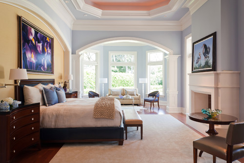
Pure and bliss, have a look at SW Upward painted on the walls of this traditional bedroom
SW Upward in the bedrooms is an absolute bliss.
So, I would highly recommend this paint color in bedrooms as long as you pair it with whites, off-whites, greys, mauves, and some greiges.
Use sheer curtains in your bedroom to let in ample natural light.
Moreover, on the focal headboard wall, you can use this paint color or in some cases, paint all the walls in this color.
To add a touch of character, you can add some darker tones to create a perfect backdrop.
Using in Bathrooms and Laundry Rooms
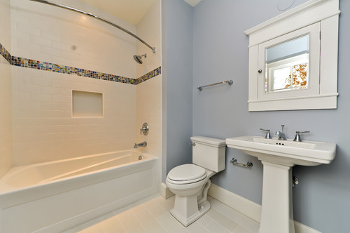
SW Upward, when used in bathrooms and laundry rooms can create a perfect tranquilizing effect. So, if you are looking to create a peaceful haven in the bathroom, paint the walls in this color.
Furthermore, try pairing the paint color with white cabinets and golden or chrome pull handles. Also, don’t forget to add plants!
Upward on Exteriors

This is a great fit for exteriors – you could either paint the walls in this paint color or choose to paint the doors in this color and leave the rest for whites and greys.
I Recommend Sampling Upward!
If you’re on the fence and need a bit of convincing, try this color on for size by ordering a peel-and-stick sample from Samplize.
These are my favorite ways to test colors in a space and to see how they work with other coordinating colors.
It doesn’t cost all that much, and you can temporarily place these handy 12″ x 12″ squares that are true to color around your house. I love them!
Upward Undertones
The Primary Undertone That Sets Upward Apart
Sherwin-Williams Upward leads with a soft, airy blue undertone that gives it that calm, open quality most people are drawn to immediately.
What’s worth knowing is that this blue base can shift from a clear, sky-like tone to something noticeably cooler and more gray depending on how much natural light your room receives throughout the day.
The Gray Undertone That Quietly Takes Over
Upward carries a gray undertone that becomes far more visible in rooms with limited natural light or north-facing exposures.
I’ve seen this color look almost entirely gray in shadowed spaces, which can feel like a completely different color from what was chosen on the chip!
This is exactly why observing your sample across different lighting conditions is so important with this particular color.
The Subtle Green Undertone Worth Watching For
There’s a soft green undertone hiding inside Upward that doesn’t always announce itself right away.
I’ve seen it surface most noticeably when Upward is placed near warm whites or cream-toned trim, where the contrast pulls that green quality forward in a way that genuinely surprises people.
It’s a subtle shift, but once you notice it, it’s hard to unsee in certain rooms.
Why Artificial Lighting Changes Everything with Upward
Under warm artificial lighting in the evening, Upward’s blue tone softens and its gray undertone tends to take center stage.
This shift can make Upward feel significantly more muted and less vibrant than it appears in daytime conditions, so checking it under your actual bulbs is absolutely essential!

My 7 Key Tips for SW Upward
1. Test Upward in different lighting before committing
Upward can look soft and airy in natural daylight but warmer and slightly greyer under incandescent or LED lighting.
I always test a large swatch on multiple walls and observe it at different times of the day to avoid surprises!
2. Pair Upward with warm wood floors
This color looks amazing against oak, hickory, or maple flooring with natural golden tones.
I like how the light, slightly grey undertones of Upward allow the wood’s warmth to shine without clashing.
3. Coordinate Upward with white or cream cabinetry
In kitchens or bathrooms, I use Upward on the walls to make white, cream, or soft taupe cabinets pop beautifully.
The contrast is soft yet sophisticated, and it brightens spaces without feeling stark!
4. Use Upward in bedrooms for a serene feel
I love painting bedrooms in Upward because it has a calming presence that works perfectly with soft linens and muted accent colors.
It helps create a restful retreat while still keeping the space feeling light and airy.
5. Consider Upward for exterior trim or siding
On exteriors, Upward pairs wonderfully with natural stone, brick, or neutral siding colors like beige, taupe, or soft greys.
I always recommend testing a large section first because sunlight can dramatically change its appearance outdoors!
6. Mind the undertones when mixing with other colors
Upward has subtle grey and warm undertones, so pairing it with overly cool blues or bright whites can feel off.
I find it blends best with muted tones, soft pastels, or earthy neutrals to maintain a cohesive, inviting look.
7. Use a quality primer to prevent patchiness
This soft, light color can show roller marks or uneven coverage if the walls aren’t primed properly.
I always use a high-quality primer first, especially over darker walls, to save myself time and frustration during the topcoat stage!


Leave a comment