Are you a fan of earthy tones? Maybe you like more taupes, beiges, and browns?
If so, don’t hold back from considering Sherwin-Williams Universal Khaki for your next dream home project.
It is a perfect mid-toned warm paint color that is neither too dark nor too light.
With a slightly creamier texture, this warm paint color defines the true beige amalgamated in the form of a taupe.
This color has a subtle look to it and doesn’t really prove to be very energetic or bright!
So, if you have a similar taste, why not try this?
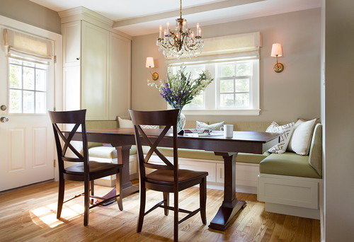
The traditional dining space above reflects the utmost beauty of SW Universal Khaki.
Symbolic of khaki fabric, this paint color reflects a similar hue, which is quite sophisticated and yet calm.
Even though it has deep brown undertones, if you observe it in natural daylight, you are quite likely to detect shades of warm reds underneath.
Yes, this color is a chameleon – it reflects its different sides in different rooms and different natural conditions.
But don’t worry, I’ll help you unveil them all!
Just sit back and relax! I promise, in no time you’ll be able to use this color like an expert interior decorator.
Sherwin-Williams Universal Khaki SW 6150 Details and Specifications

If you are planning to choose this paint color, you first need to understand the how, where, and when about it!
And all of this can be easily determined if you are aware of the underlying basics and color theories.
Yes, color psychology is important as well, which helps you know the mood the color will create in your room.
Let’s begin with one of the most important terminologies that you must acquaint yourself with – light reflectance values or LRVs!
This value helps in determining how light or dark the paint color is – and depending on that information, we can analyze the rooms in which the color needs to be used.
So, the LRV of Universal Khaki is 40 – and that means it is a mid-toned paint color that can be used in a small as well as a large room.

(The lower the value – the darker the paint color)!
Oh, if you want to just try Universal Khaki so you’ll know just how it’ll look, you can easily with a peel-and-stick sample from Samplize. Order some samples now!
Similarly, other associated terms are RGB and HEX Values.
Red = 184
Green = 169
Blue = 146
HEX Value = #b8a992
Now that we have discussed the scientific facts – let’s jump on to some of the practical aspects and applications of this beautiful and timeless paint color.
How Does this Color Feel in a Space?
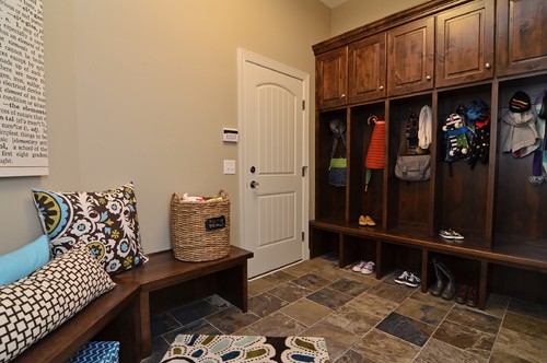
SW Universal Khaki acts as a perfect base paint in this home entryway
Sherwin-Williams Universal Khaki feels subtle and settled in a space.
It is not very bright and energetic – instead, it is bound to exhibit a warm look through a bold character.
You are bound to feel homey and cozy if you plan to use this paint color in your home.
So, I would highly recommend using this paint color in homes that are situated in colder and northern regions since it is warm and would always impart a feeling of warmth.
If you plan to use it in warmer areas, you are bound to feel uncomfortable unless you balance out the look with cooler paint colors.
Since this paint color is soft and subtle, you should expect to feel calm and tranquilized as soon as you come back home.
How Does Light Affect the Color?
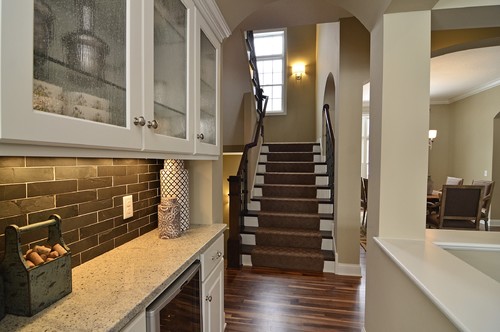
Have a look at how artificial and natural light plays with this paint color
Light has a major effect on Universal Khaki. In the case of excessive light, this color tends to look lighter like SW Wool Skein.
In the absence of natural light, this paint color appears to be darker, like deep brown and taupe.
I would highly recommend using this paint color in north-facing bedrooms to give a slight warm texture to the space.
Moreover, you can also consider using warm whites and cool whites with artificial lighting to balance the saturation of the room.
To truly see what your home’s environment and lighting will do here, try out a real paint sample. It takes out the guesswork!
What are the Best Coordinating Colors?

Creating an eye-catching and balanced color palette is primary. You can best make use of this paint color if you choose the best opposites to pair it with.
There are two main color schemes that you could use – contrasting or monochromatic.
Depending on the interior design style and the overall running theme of your space, you could choose from either.
Nevertheless, the best opposites for this paint color are browns, warm grays, and off-whites.
Here I am going to enlist a few paints that you can pair it with (in the case of a contrasting scheme)!
- SW 7036 Accessible Beige (See my guide here!)
- SW 6144 Dapper Tan
- SW 7051 Analytical Gray

For a monochromatic theme, you could consider the following paint colors:
- SW 6148 Wool Skein
- SW 6149 Relaxed Khaki
- SW 9117 Urban Jungle
In the case of trims, moldings, and door and window frames – consider SW Pure White as it will truly highlight the paint color.
Sherwin-Williams Universal Khaki Vs Similar Colors
It is very easy to find alternatives for SW Universal Khaki unless you are looking for a specific similar beige tone with similar undertones.
However, the two most similar paint colors are SW 7548 Portico and SW 7533 Khaki Shade.
You could also place these on a white sheet of paper to determine the true hue of all the paint colors.
Universal Khaki Vs Portico

With an LRV of 42, this paint color is comparatively lighter than Universal Khaki. It is quite likely for you to detect deep red undertones in this paint color in the afternoon sunlight.
SW Portico is a bolder paint color that makes your space feel settled and warm.
Order a wall-stick sample of Portico here to help you compare colors in your own space.
Universal Khaki Vs Khaki Shade

With an LRV of 44, this paint color is the lightest of them all. Similar to the above two, you are quite likely to find pink/red undertones beneath this paint color.
Khaki Shade makes a great alternative to Universal Khaki since it is a timeless and sophisticated shade that will never fade away, even years later.
Do yourself a favor and grab some stick-on sample sheets of these two colors and see what looks best in your home.
Where to Use Universal Khaki?
Sherwin-Williams Universal Khaki can be used absolutely anywhere in your home and especially in the common areas. It pairs especially well with wooden elements and textures.
For interior design styles like traditional, transitional, French country, bohemian, and contemporary – it is definitely a good-to-go solution.
The timelessness of this color is a great reason behind its flexibility. Whether it is your living or family room, or, for the matter of fact, a bedroom, kitchen, or hallways, Universal Khaki makes a great solution in these homes!
Let’s discuss the individualistic uses of the paint color in your home.
Universal Khaki in Living Rooms
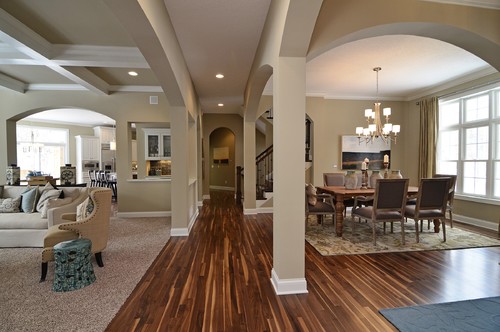
This traditional home in Minneapolis perfectly reflects the seamless use of this beige paint color.
Many traditional and transitional styled homes incorporate this paint color. So, if you are one of them – make sure to pair it against walnut browns and deep wooden textures.
Moreover, you can incorporate hardwood floors and wrought iron railings on the staircases as well.
For the furniture, make sure to keep it light in a beige fabric!
Using in Kitchens
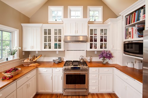
This beautiful, traditional Cape Cod kitchen reflects SW Universal Khaki on the walls
You can incorporate this paint color in the kitchen, whether on the backdrop wall or the cabinets.
Along with this, I would recommend using round wooden pull handles to further add a detail to your kitchen space.
Make sure to use a white granite countertop along with chrome fixtures to make your kitchen look spotless.
Universal Khaki in Bedrooms

Bedrooms deserve a calm and soothing backdrop. Well, universal khaki is a great way to incorporate piousness in the bedrooms.
On top of that, you can incorporate stark whites through bed frames, nightstands and decorative accents.
Using on Exteriors
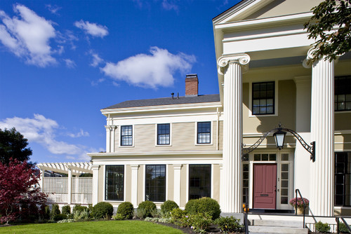
“UK” makes home exteriors look refined and timeless as you can see in the above photo.
Using this color on exterior walls will further make the paint color look light and bright. Whether you are using the shiplaps or the mud or concrete – this paint color is absolutely delightful on the exteriors.
For a more tropical appearance – many southern states tend to incorporate this paint color on the exteriors of their homes.
Great Paint Sample Tip!
Here’s my favorite tip when it comes to testing out a color like Universal Khaki – go and order a peel-and-stick sample from Samplize.
These guys figured out a great way to sample colors much more easily. Simply stick it up instead of having to get a small can of actual wet paint.
For a few bucks you get a large-sized square to throw up temporarily anywhere you want to “try” on a paint color and any possible coordinating hues you like. Too cool!
So, do you feel confident about using Universal Khaki in your home? Well, do let me know your experiences in the comments below!

My 7 Key Tips for SW Universal Khaki
1. Test Universal Khaki in multiple light conditions
Universal Khaki can look dramatically different depending on natural light versus artificial lighting.
I always test a sample on a wall in the morning, afternoon, and evening to see its true tones.
This helps avoid the unpleasant surprise of it appearing too green or yellow in certain rooms.
2. Pair Universal Khaki with warm wood floors
This color looks incredible with medium-toned oak or walnut flooring.
I like using it with classic shaker-style cabinetry in cream or off-white to make the space feel cozy and cohesive.
It creates a timeless look that balances warmth without feeling too dark or heavy.
3. Choose the right sheen for high-traffic areas
For kitchens and hallways, I recommend a satin or semi-gloss finish with Universal Khaki.
It cleans easily and resists marks, while still keeping the soft matte appeal that makes this color so versatile.
4. Consider contrast with cool-toned flooring
If your floors are gray-toned or whitewashed, Universal Khaki can prevent the space from feeling cold.
I use it to add subtle warmth while keeping a modern and airy vibe.
It’s especially nice in open-concept living areas where natural light is abundant.
5. Use it to highlight architectural details
Universal Khaki makes moldings, trim, and built-ins pop without the starkness of bright white.
I love using it on exteriors as well, particularly on porch trim paired with muted olive or beige siding.
It softens the overall look while still maintaining visual interest.
6. Perfect for calm, versatile bedrooms
This color has a gentle warmth that creates a relaxing atmosphere in bedrooms and guest rooms.
I often pair it with linen bedding and natural textures to keep the space feeling inviting but understated.
It works beautifully with both traditional and modern décor styles.
7. Mind undertones when choosing accents
Universal Khaki leans slightly green depending on lighting, so I always compare it against textiles and furniture first.
I have avoided clashing by testing rugs, curtains, and pillows nearby before committing to a full wall.
This step saves headaches and ensures a harmonious look throughout the space.
What NOT to Pair with This Color
Color Pairings That Work Against Universal Khaki’s Warm Balance
Cool, saturated colors like cobalt blue or bright teal fight directly against Universal Khaki’s warm, dusty character.
These cooler tones expose the yellow undertone in Universal Khaki and make it read muddy rather than refined.
Cool grays are equally problematic, pulling this color in two conflicting directions simultaneously.
Decor Styles That Conflict with Universal Khaki’s Personality
Ultra-modern and industrial decor styles are a difficult pairing with Universal Khaki.
The raw concrete, black metal, and cool minimalism found in these styles visually clash with this color’s soft, grounded warmth.
I’ve seen Universal Khaki look tired and out of place when surrounded by stark, contemporary furnishings.
Trim Colors That Undermine This Color’s Natural Appeal
Bright white trim is one of the most common pairings I’d steer you away from with Universal Khaki!
The stark contrast exposes any yellow shift in this color and makes the overall look feel unintentional.
Cool-toned whites like Sherwin-Williams High Reflective White create a similar problem by pulling this warm neutral off-balance.
Furniture Tones That Create Visual Tension
Gray upholstered furniture introduces a cool conflict that strips Universal Khaki of its warmth entirely.
Heavily distressed or painted white furniture creates a similar issue, making this color feel flat and colorless.
Finishes That Dull Universal Khaki’s Best Qualities
Cool-toned stone finishes like blue-gray granite or slate tile work against this color’s warmth in kitchens and bathrooms!
Gray-toned exterior brick or cool concrete siding creates the same tension outdoors, making Universal Khaki look unexpectedly dull.