
Cabinets and countertops take up a lot of visual space in your kitchen, so the way they work together can set the tone for the entire room.
A good pairing has enough contrast to stay interesting, but enough in common to feel connected.
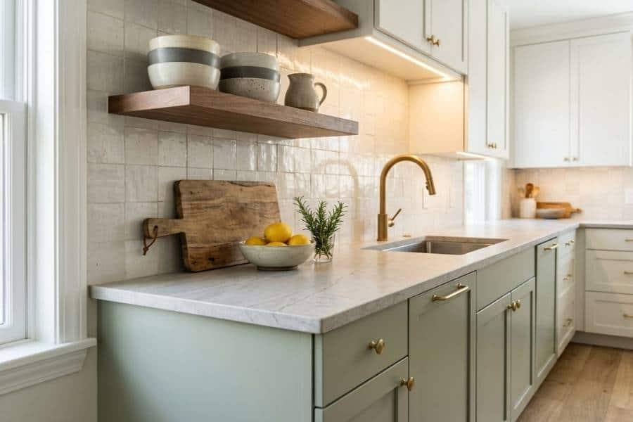
Color plays a part, of course, but there’s more to consider.
Undertones, wood grain, veining, sheen, texture, and lighting can all change how two finishes look side by side.
I’ve found the best combinations feel considered without making every surface look like part of a matching set.
Start with the Overall Kitchen Palette
Before choosing cabinets or countertops, take stock of what’s already in your room.
Flooring, wall color, appliances, lighting, and other fixed finishes all influence which combinations will sit comfortably in the space.
A warm wood floor, for instance, can work well with finishes that share some of that warmth.
Cooler flooring or wall colors may suit a more neutral or cool-toned combination.
Everything doesn’t need to fall into the same color family, but your different surfaces should make sense together.
Starting with the room as a whole also helps you avoid choosing two materials that look great on their own but feel disconnected once they’re installed.
That sense of a room agreeing with itself is a big part of why some kitchens feel calm to walk into and others feel slightly restless.
Use Undertones to Narrow the Choices
Two finishes can seem compatible at first and still look slightly off when they’re placed together.
Often, undertones are the reason.
A creamy white cabinet can feel out of place next to a countertop with distinctly blue-gray veining.
Warm oak or walnut may also clash with a surface that leans strongly cool.
These differences can be subtle on small samples and much more obvious across your full kitchen.
Choosing cabinet colors that work with brown granite often comes down to balancing the stone’s warmth and variation with the surrounding palette.
The same principle applies to other countertop materials and cabinet finishes.
Once the undertones sit comfortably together, narrowing down the rest of your palette becomes much easier.
Warm undertones tend to make a kitchen feel softer and more welcoming, which matters in the one room where people always seem to gather.
Build Contrast Instead of Matching Everything
Cabinets and countertops don’t have to belong to the same color family.
In fact, I think some contrast often adds depth to a kitchen.
Light cabinetry can provide a clean backdrop for a darker countertop.
Richly grained wood may look better next to a quieter surface that allows the natural pattern to stand out.
The reverse can work just as well.
A countertop with dramatic veining can become the focal point when your cabinetry is simpler.
Think about which material you want the eye to notice first.
Giving one surface a little more visual weight keeps the combination interesting without making the two finishes compete.
A room with a clear focal point is easier to relax in, since your eye knows where to land instead of bouncing between surfaces.
Balance Pattern, Grain, and Movement
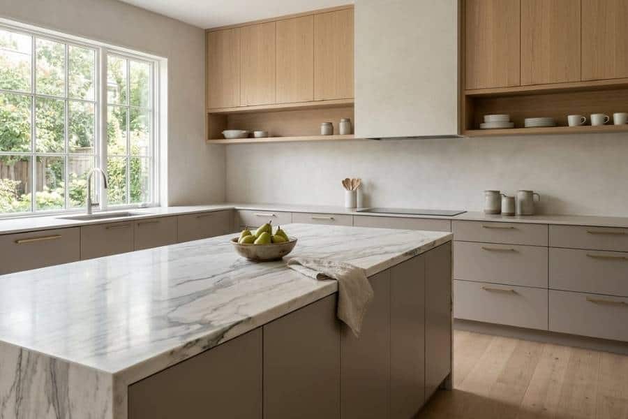
Color usually gets the most attention, but pattern matters just as much.
A countertop with sweeping veins, speckles, or noticeable variation already brings plenty of movement into your room.
Pairing it with heavily grained cabinetry can make the space feel busier than you intended.
A smoother painted finish or quieter wood grain may give the countertop more breathing room.
The opposite approach works when your cabinetry has a distinctive grain or finish.
In that case, a less dramatic countertop can keep the focus where you want it.
Neither surface has to be plain.
They just need enough visual separation that you can appreciate each one.
Noticing the grain of your own cabinets years later is one of those quiet pleasures that makes a house feel like it was put together with care.
Compare Cabinet and Countertop Samples Together
Inspiration photos help narrow down your ideas, but real samples tell you much more.
Sheen, grain, veining, texture, and subtle color shifts are easier to judge when you can compare materials side by side.
When choosing cabinets and countertops at the same time, comparing options from Graber Supply makes differences in warmth, texture, and contrast easier to spot.
Subtle variations that barely show up on a screen can become much more noticeable in person.
This matters even more with neutral palettes.
Two shades of white, beige, or gray can look nearly identical on their own, then reveal noticeably different undertones when placed side by side.
Handling the actual materials also tells you how they’ll feel under your hands every morning, which is something no photo can show you.
Think about Appearance and Everyday Use
Looks matter, but your countertops also have to handle everyday kitchen life.
Materials differ in durability, care requirements, texture, and natural variation, so appearance shouldn’t be your only deciding factor.
When choosing a surface that works with the kitchen’s overall design, consider how the material performs alongside its color and pattern.
Countertop materials vary in durability, maintenance needs, heat resistance, and staining susceptibility, all of which can matter in an everyday kitchen.
A beautiful surface can still be a frustrating choice if its upkeep doesn’t suit your household.
The strongest pairing works visually for your room while making sense for how the kitchen is actually used.
A kitchen you aren’t worried about protecting is a kitchen you’ll happily cook and host in, and that ease is worth as much as any finish.
Use the Backsplash and Hardware as Connecting Details
Once your cabinets and countertops are settled, smaller finishes can help bring the room together.
A backsplash might pick up a subtle tone from the countertop or bridge the counters and cabinetry.
Hardware can connect with your faucet, appliances, or lighting without matching every metal finish exactly.
Pay attention to how much visual activity is already in your room.
Bold countertop veining often looks best with a quieter backsplash.
If your cabinets and counters are fairly restrained, there’s more room for patterned tile or distinctive hardware.
These finishing touches work best when they support your main materials rather than compete with them.
Hardware is also the part of the kitchen you touch most, so a shape and weight you enjoy in your hand quietly improves the room every single day.
Check the Combination in the Room’s Actual Light
Materials can look surprisingly different once they leave the showroom and enter your kitchen.
Natural light changes throughout the day, while overhead and under-cabinet lighting can bring out undertones that weren’t obvious before.
Nearby paint colors and flooring can also affect how a finish reads.
If possible, move larger samples around your room and look at them in morning, afternoon, and evening light.
Place them near your flooring, backsplash area, and appliances rather than judging them on an empty table.
Seeing the materials where they’ll actually be installed gives you a far better sense of whether the pairing works.
It also shows you how the kitchen will feel at the hours you use it most, from early coffee to the soft lamplight after dinner.
Aim for Coordination, Not Uniformity
A well-designed kitchen doesn’t need cabinets and countertops that look as though they came from the same set.
Shared undertones, thoughtful contrast, and a good balance of pattern and texture are usually enough to make your room feel connected.
Once those larger surfaces work together, choices like backsplash tile, hardware, paint, and lighting become easier.
The goal is simple: let your cabinets and countertops complement each other while giving each material enough character to stand on its own.
Get that balance right and the kitchen stops looking decorated and starts feeling like the warm center of your home.

Leave a comment