
You chose white cabinetry, neutral tile, maybe a pale stone countertop.
Nothing in the bathroom should feel particularly cold.
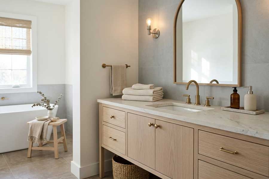
Yet somehow it does.
The usual reaction is to add something obviously warm.
Brass hardware goes in. A beige bath mat appears.
Maybe a wood stool gets tucked beside the tub.
Sometimes that helps.
Other times, your room still feels cold, only now it has a few warmer objects sitting inside it.
The issue usually isn’t how much white or gray you used.
It’s how the undertones, materials, lighting, and surface finishes behave next to one another.
Once you start looking at those relationships, your room becomes much easier to diagnose.
The Problem Usually Isn’t the Amount of White
A mostly white bathroom can feel warm. It can also feel stark.
White itself rarely explains the difference.
Put a creamy white wall beside crisp, blue-leaning tile and your paint may suddenly look more yellow than it did on the sample.
Reverse that with a bright white wall and warmer stone, and the stone can start reading beige or slightly muddy.
Neither finish changed. Your eye is comparing them.
That same principle applies to cabinetry.
If your room already has cooler tile but warmer metal or stone, looking at white bathroom vanity options in warm finishes can make more sense than assuming the cabinet itself needs to become beige or strongly wood-toned.
The goal isn’t to make every surface warm.
It’s to keep your whites and near-whites from fighting each other.
There’s a similar point here where we talk about Sherwin-Williams Greek Villa, a creamy off-white that becomes more obviously warm when it sits beside stark, cool whites.
That’s why two white finishes can clash even though both seemed perfectly neutral on their own.
I think the useful question isn’t, “Do I have too much white?”
Ask what kind of white you have and what it’s being asked to sit beside.
A warm off-white may be exactly what your bathroom needs when the floor, wood, and metals lean warm.
Put that same color against an icy marble-look tile, and the relationship changes.
Beige isn’t automatically safer.
A beige with a pink undertone can fight with yellow-based stone just as easily as two whites can disagree.
This is also the room where you get ready every morning, so those small disagreements register long before you can name them.
Read the Fixed Surfaces before You Add Anything
Paint gets blamed for a lot of bathroom problems because it’s easy to notice and relatively easy to change.
I’d start somewhere else.
Look at the finishes that would be expensive, messy, or frustrating to replace.
Floor tile usually qualifies.
So does shower tile, a large stone countertop, or an existing tub surround.
Those surfaces should get the first vote.
Stand in your room during daylight and look beneath the obvious color.
Does the tile pull blue? Does the stone lean creamy?
Is your floor closer to taupe than gray?
Does a beige surface carry a faint pink cast?
You don’t need to become a color theorist.
You just need to stop treating every pale surface as if it were truly neutral.
That distinction matters because neutrals still have temperature.
Benjamin Moore’s Dove Wing offers a useful example. It is a warm off-white, but cooler surrounding finishes can make its peachy-beige side much more obvious.
A paint chip held by itself can’t show you that relationship.
Put your samples beside the tile. Then beside the countertop.
Move them into your actual bathroom.
A color that looks quiet and refined on a sample card may suddenly look yellow once it meets your shower wall.
That’s useful information.
Much better to find it before painting the room.
Warmth Comes from Material, Not Just Color
The usual advice to “add warmer colors” misses half the room.
Your bathroom can stay almost entirely white, cream, or pale gray and still feel comfortable if its materials create enough variation in light, grain, and surface texture.
Wood is a good example.
Grain breaks a broad neutral surface into small shifts of tone rather than giving your eye one uninterrupted block of color.
Honed stone behaves differently from glossy ceramic tile.
Brushed metal softens reflected light compared with a mirror-like polished finish.
Put a satin-painted cabinet below a honed stone counter and your room can feel quieter before you change a single color.
Texture does some of the work that color usually gets credit for.
The National Kitchen & Bath Association’s 2026 Bath Trends Report found that 96% of surveyed professionals identified neutrals as the most popular bathroom colors.
Neutral bathrooms clearly aren’t disappearing.
What matters is how those neutrals are layered.
A pale oak cabinet can introduce movement without adding a strong new color.
Natural stone can bring subtle variation into a restrained palette.
Linen and woven storage can soften the transition between hard tile, glass, and metal.
That softness is worth chasing, because a bathroom is one of the few rooms you experience barefoot and half-awake.
The reverse is true, too.
You can choose warm beige tile, cream walls, and gold-toned hardware and still end up with a bathroom that feels clinical if every surface is slick, polished, and visually similar.
Warmth is partly color.
Material character matters just as much.
Use One Element to Bridge the Temperature Gap
Most rooms don’t need every finish pushed in the same direction.
They need a bridge.
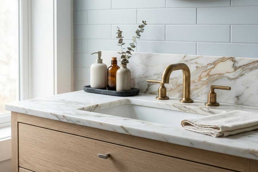
Imagine cool white shower tile, pale stone with mixed veining, and warmer brass hardware.
Your instinct may be to repaint the walls beige or decide the tile was a mistake.
That could be a much bigger project than your room actually needs.
Instead, look for one element capable of connecting the cooler and warmer sides of your palette.
Cabinetry can do it.
So can stone, wood, wall color, or a quieter metal finish.
Your bridging element doesn’t need to match everything.
It needs enough visual connection to each side that the contrast starts to look intentional.
Stone with a cool white background and warmer veining can do the same job.
A softened off-white wall can sit between cool tile and natural wood.
A brushed metal can connect a pale palette without becoming the loudest finish in the room.
This is where people often make the project harder than it needs to be.
They try to correct every surface at once when one well-placed go-between could do most of the work.
There’s a limit.
If one dominant surface has a pronounced pink undertone and another is strongly yellow, a single bridging choice may not solve the conflict.
At that point, changing one major finish may work better than continuing to layer new ones over the problem.
A bridge connects. It can’t hide everything.
Lighting Can Undo a Good Palette after Sunset
A bathroom that looks balanced at 10 a.m. can feel entirely different at 8 p.m.
Artificial light has its own color temperature, measured in Kelvin.
ENERGY STAR describes light around 2700K to 3000K as warmer-looking white, while 4000K and above appears cooler and bluer.
That difference becomes obvious when you’re working with whites and near-whites.
A creamy wall can appear richer under warmer light.
Cool marble may become more pronounced beneath cooler light.
Brass can look mellow in one setup and aggressively yellow in another.
Don’t assume the answer is installing the warmest bulb you can find.
Bathrooms still have jobs to do.
Mirror lighting used for shaving, makeup, or grooming needs clarity as well as atmosphere.
Very warm light may create the mood you want around the tub while making your vanity area less useful.
Test your room both ways.
I’d argue the evening version matters most, since that’s usually when you’re winding down and want the room to feel calm rather than exposed.
If your palette only works in daylight, the design isn’t finished yet.
The Mistakes That Make Warmth Look Forced
Brass gets too much responsibility in neutral bathrooms.
When your room feels cold, changing chrome or nickel hardware to brass can help, but brass can’t repair an undertone conflict.
In a room that already leans heavily creamy or yellow, another warm finish may push the whole palette too far.
Sometimes the cooler metal was helping.
The more expensive mistake happens when every finish is approved alone.
Tile gets picked one weekend. Paint comes later.
Hardware is ordered from an online photo.
Each choice makes sense by itself, then all three meet in your bathroom for the first time.
Compare them together before committing whenever you can.
There’s also a temptation to match every undertone once you decide your room should feel warm.
I’d resist that.
Cream walls, honey-colored wood, yellow-beige tile, warm stone, and yellow brass may sound coordinated.
In the actual room, the result can feel heavy.
A cool white sink, a gray vein in the stone, or a quieter nickel accent may be exactly what keeps your palette fresh.
Sheen matters, too.
A room full of glossy surfaces creates sharper reflections and more visual activity.
Matte tile, honed stone, brushed metal, or satin-painted cabinetry can quiet your room without changing its basic colors.
That’s why changing color alone doesn’t always fix the problem.
A Five-Minute Temperature Check before You Change the Room
Before repainting, replacing hardware, or deciding your tile has to go, give the bathroom five minutes.
Turn off the artificial lights during the day and find the surface you’re least willing to replace.
In most bathrooms, that’s the floor, shower tile, or countertop.
Now compare your other major neutrals directly against it.
Don’t judge them from across the room.
Which ones suddenly look yellower, bluer, pinker, or grayer?
Turn the lights back on and repeat the comparison.
Something may shift.
Now ask which single finish could connect the two sides of your room.
It might be wall color. It might be cabinetry.
It could be a countertop with enough variation to speak to both temperatures.
If you find that bridge, you may not need to replace the expensive tile at all.
This method also helps with mixed metals.
They don’t need to match simply because they share a room.
What matters is whether each finish has a visual relationship with something else nearby.
A warmer sconce with cooler plumbing hardware can work when your room gives both finishes a reason to be there.
Random contrast looks accidental. Repeated contrast looks deliberate.
Warm Does Not Have to Mean Beige
There’s a point where warming up a neutral bathroom starts making it less interesting.
The fix isn’t to remove every cool note.
A white basin can sharpen creamy cabinetry.
Gray veining can give warm stone some definition.
Nickel can stop a room full of oak and beige from drifting too yellow.
Those cooler moments create edges, and rooms need edges.
In my experience, the strongest neutral rooms usually leave one temperature contrast intact rather than correcting every difference.
That contrast gives your eye something to measure the warmth against.
Without it, your whole room can slide into one beige note and lose the very depth you were trying to create.
Sometimes the finish that looks slightly out of place is the reason everything else looks right.
I’ve come to see that as the difference between a bathroom that’s merely finished and one that actually feels welcoming when you walk in.

Leave a comment