
Let me tell you, greige and the coast are a match made in paint heaven.
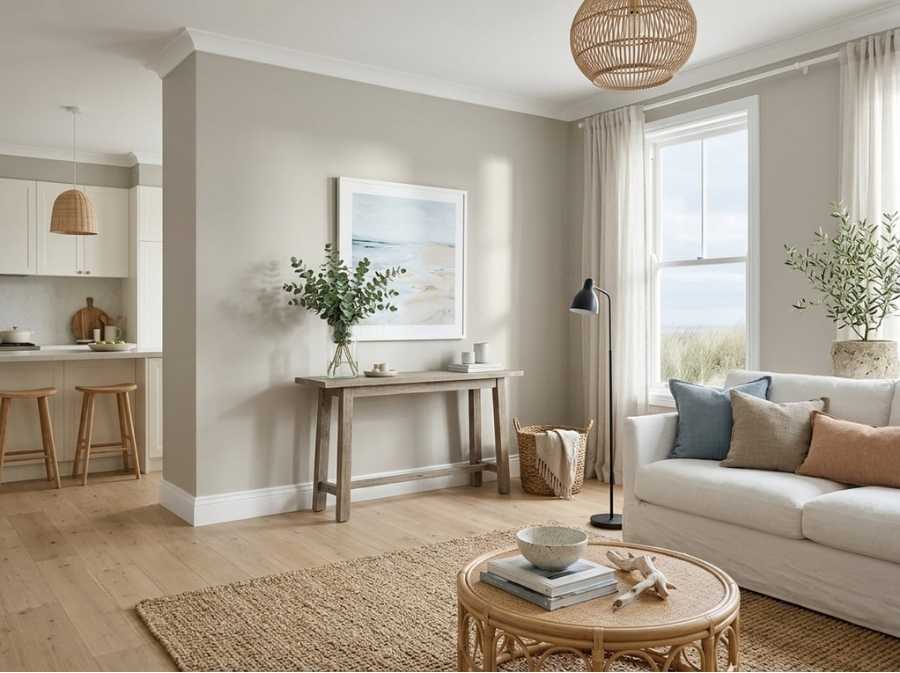
Picture it.
Pale sand, sea mist rolling in off the water, salt-bleached timber and that soft gray-blue sky right before a storm.
Now imagine bringing that calm, sun-washed feeling into your brand-new duplex on the NSW South Coast.
That’s exactly what a good coastal greige can do.
It’s not quite gray and not quite beige, and I love how beautifully it sits in that in-between space.
But choosing the right one for a duplex is a little trickier than picking a color for a single home.
You’re thinking about two units, two households who each want to feel at home and a whole lot of strong coastal light.
So, let’s get started!
What Makes a Greige Feel “Coastal”?
A coastal greige is usually light to mid-toned, with a soft, slightly warm base.
It should feel airy, never heavy or muddy.
The best ones echo nature. Think driftwood, dune grass, weathered fences and wet sand.
They work hand in hand with white trim, natural timber and linen textures, which is why I find they make a room feel relaxed the moment you walk in.
Here’s the part people forget. Light on the South Coast is intense.
Cancer Council Australia notes that Australia has some of the highest levels of UV radiation in the world, with the UV Index reaching the extreme category of 11 and above.
That strong sunshine will wash colors out, especially on exteriors and in north-facing rooms.
A greige that looks perfectly balanced in a dim paint store can suddenly read almost white once it’s up on your walls.
So, I always say sample on site, right next to your floors and furniture. Truly, every time.
Choosing Greige for Duplex Home Designs on the South Coast
Duplexes are having a real moment along the coast.
They let you live in one side and rent out the other, or share a block with family while each of you keeps a home of your own.
Before you pick colors, it helps to understand the build itself.
In the Shoalhaven, for example, the local council’s dual occupancy rules say a complying development needs a parent lot of at least 400 m², a lot width greater than 15 m and a maximum building height of 8.5 m.
Those numbers shape the footprint, the window placement and how much natural light each unit gets, which in turn shapes how cozy each home feels day to day.
Builders such as Mojo Homes offer duplex home designs across the NSW South Coast, with a Housing World Shoalhaven display home in the region.
Browsing their duplex designs is a great way to see how the layouts flow.
Several of their facades are designed for lots around 15 m wide, which is exactly where light and color choices start to really matter.
Why does layout matter for paint?
Because in a duplex, one unit often gets beautiful morning light while the other is shaded by the shared wall.
The same greige can look completely different on either side.
My advice?
Choose one main greige for the whole duplex, then adjust the trim or accent colors per unit if one side feels darker, so each home still has its own personality.
How Does South Coast Light Affect Greige?
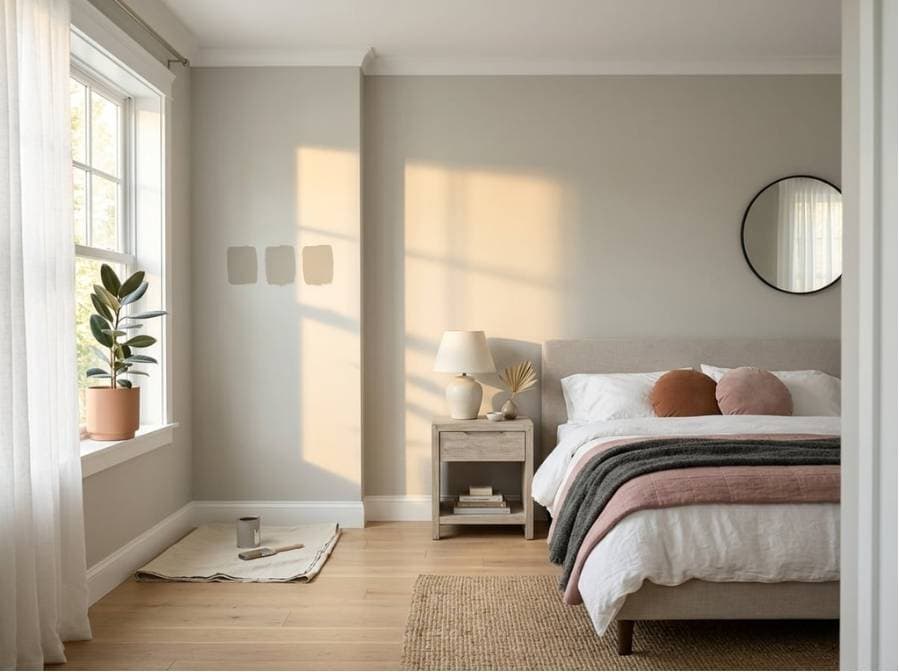
Coastal homes deal with two big things. Bright sunshine and moist sea air.
Historic records from the Bureau of Meteorology for Nowra show an annual mean of 6.8 hours of sunshine a day and an average 9am relative humidity of 70%.
That combination means lots of glare in summer, and a soft, slightly hazy light on misty mornings, the kind that makes slow weekend breakfasts feel extra peaceful.
Here’s how that plays out on greige:
North-facing rooms get warm, bright light most of the day.
Greiges look lighter and warmer here, so you can go a touch deeper than you think.
South-facing rooms get cooler, indirect light. Greiges can drift gray or even a little green.
Lean toward a warmer greige to keep things cozy, especially in bedrooms where you want to unwind.
East-facing rooms glow in the morning and cool down by afternoon.
A balanced greige works best.
West-facing rooms blaze with golden afternoon sun.
A slightly cooler greige stops your space from feeling too yellow.
My Top Coastal Greige Picks
These are the greiges I keep coming back to for coastal homes.
They’re US shades, but most Australian paint stores can color-match them.
Results can vary between brands, so I’d always test a sample pot first.
Sherwin-Williams Agreeable Gray SW 7029
It’s soft, warm and light enough to keep a room airy, and it lets your art and textiles take the lead.
In shaded spots, it can show a hint of green, so test it on a south wall before you commit.
See our full review here.
Sherwin-Williams Accessible Beige SW 7036
A little warmer and more beige-leaning.
It’s gorgeous with timber floors and sandy tones, and I find it feels especially welcoming in living rooms where everyone gathers.
Benjamin Moore Edgecomb Gray HC-173
Light, creamy and very coastal.
In bright sun, it can read almost like a warm off-white.
It’s lovely for open-plan spaces in a smaller unit, where you want the whole space to breathe.
Benjamin Moore Revere Pewter HC-172
The deepest of the bunch.
It brings more depth and works well on feature walls, cabinetry or exteriors with strong white trim, and it gives a dining room a cozy, wrapped-in feel.
In some light it can lean slightly green, so I’d pair it with warm whites. Get more tips here.
Exterior vs. Interior: Splitting the Duplex
Exteriors are where duplexes really need a plan.
Both units usually share one facade style, so the colors should look cohesive from the street.
A soft greige body with crisp white trim and a darker accent on the front doors keeps things polished and balanced, and it gives your guests a warm welcome before they even knock.
Think about heat too.
For roofs, the NSW BASIX solar absorptance guidance groups colors as light below 0.475, medium from 0.475 to 0.7 and dark above 0.7.
A lower absorptance reflects more heat and helps keep your home cooler on hot days.
I think pairing a light roof with a soft greige exterior is a smart, coastal-friendly combo.
Inside, you have more freedom.
One unit might go warm and sandy, while the other leans slightly cooler and calmer.
Just keep the trim and ceiling white the same in both units.
It makes touch-ups and future maintenance so much easier, trust me.
What Are the Best Coordinating Colors?
Greige loves company. Here’s what pairs beautifully on the coast:
Whites: Soft warm whites for trim and ceilings keep the look fresh without feeling stark.
Blues: Dusty blues and muted navy for front doors, cabinetry or a powder room bring in that ocean feel.
Greens: Soft sage and eucalyptus tones echo the coastal bushland, and a few eucalyptus stems in a vase do the same job indoors.
Naturals: Rattan, linen, light oak and stone tie everything together and add the kind of texture that makes your home feel layered and lived-in.
One more tip from me? Keep your accent colors slightly muted.
Bright, saturated shades can feel harsh in strong coastal light.
Bringing Soft Coastal Calm to Both Sides of the Wall
Coastal greige is calm, flexible and timeless.
It suits a duplex perfectly because it looks great on both sides of the wall and still lets each unit feel like home.
Sample in your actual light, plan your exterior as one cohesive look and choose finishes that can handle sun and sea air.
Have you used greige in a coastal home? Which shade won you over?
Let me know in the comments below!

Leave a comment