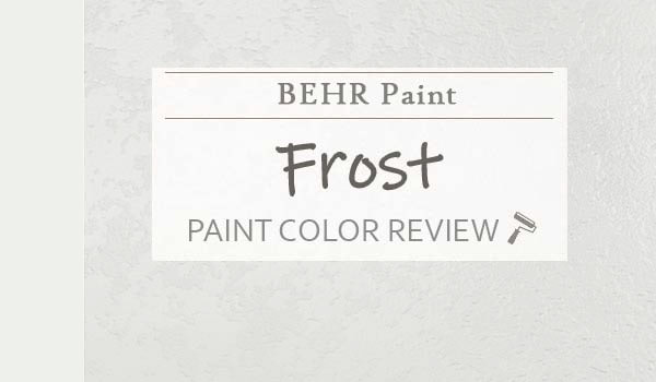
This is one of the most popular and admired white paint colors in the industry.
Of course, there are many amazing and attractive whites offered by top paint brands, but they differ in various ways.
As the name suggests, Behr “Frost” is a clean off-white paint color that closely relates to a cool and crisp feel with deep, hidden blue or gray undertones.
Yes, it can make your space feel quite cool, rigid, and calm – while at the same time, exhibiting that sense of purity and blissfulness.
Just like the actual frost in the late fall and winter months, this cool white color can create a similar vibe in your space.
And since it’s almost a true white, you can absolutely use it on your trims, moldings, ceilings, and any special architectural details.
So, are you looking to add a tinge of Behr Frost to your home? Do you want it as a base or neutral?
Don’t worry – I have got you covered on how to do this best!
This color review will totally help you figure out if this is the paint color for your home or not. And if yes, how to best make use of it!
So, let’s get started!
Behr Frost 57 Details and Specifications

Before you choose any white paint color for your ceilings and trims, I must tell you to dive deeper into what the color is truly composed of.
Not every white paint color is alike! Well, some have various dominant undertones and some are chameleons.
Generally, some whites have warm undertones and some have cool. Some reflect blue or gray and some reflect red or yellow.
And you truly need to figure that out!
So, do you know what’s going to help you?
Well, it’s the details and specifications associated with a paint color.
Before you choose a paint color for your home, you must analyze the underlying theories and facts.
And that is what will help you make informed decisions.
So, first and foremost, let me introduce you to the concept of Light Reflectance Values or the LRVs that determine how light or dark the paint color is.
You can easily find that value on the Behr website.
Here, in this case, the LRV of the Behr Frost is 87.
And that means it falls on the lighter end of the scale. Yes, very light that it’s almost a true white!
(Remember, the greater the value, the lighter the paint – on a scale of 1-100)
Also, just in case you wonder where to find the Behr decks – well, simply visit your nearest Home Depot store!
Secondly, other important associated terms are the RGB and the HEX Values.
Red = 239
Green = 240
Blue = 236
HEX Value = #eef0ec
Since we have discussed the technical and scientific information, let’s get started with the practical aspects of this cool white Behr paint.
How Does This Color Feel in a Space?
View this post on Instagram
Behr Frost is a cool white paint color that can make your space feel crisp, cool, chilly, formal, and refreshing.
And believe me, you must truly have an eye for a cool white paint color to use in your home. Otherwise, it might be a major regret!
Furthermore, this color is bound to push the walls away and create a large and enhanced space.
So, if you’re currently dealing with small square footage in your loft or apartment, this color can truly help create an illusion.
Furthermore, I highly recommend using this color in warmer regions where you tend to crave a sense of freshness and enthusiasm indoors at all times.
How Does Light Affect the Color?
Natural light has a major role to play here.
First and foremost, it can enhance the room and make it feel brighter.
Due to the high light reflectivity value, this color can reflect ample light to create an illusion of an airier space.
Secondly, natural light hitting the walls can almost wash off the gray or blue undertones and make it look like a true white.
And since this white paint color is dominantly cool white, you have to be careful around where and which compass direction to use it in.
In the north and east-facing rooms, it can look predominantly cool and crisp – thus, merging with the incoming cool and gray rays to create a daring atmosphere.
Hence, not recommended unless you’re craving a similar vibe.
Secondly, in the south and west-facing rooms, this color can work out since the incoming warm rays can neutralize the cool atmosphere.
What are the Best Coordinating Colors?

This is not a very easy color to work with! And that’s all because of the cool undertones.
Not every color can easily pair with this cool white color. Hence, you must only consider blending the cooler tones with this white.
So, this color will pair beautifully with blues, greens, and darker grays. You can also add wooden touches as an accent on the shelves and furniture.
Also, if you are planning to introduce material and metallic accents through floating shelves, chandelier, artwork frames, and furniture frames – remember to add tinges of rustic wood, matte black, and brushed brass.
Discussing further, you have the option to choose from either a monochromatic or contrasting color palette!
Here are a few of the colors I would recommend for a monochromatic color palette!
- PPU26-14 Drizzle
- PPU18-05 French Silver
- PPU26-05 Flint Gray

Here are a few of the colors I would recommend for a contrasting color palette!
- N500-5 Magnetic Gray
- PPU15-16 Simply Blue
- 250F-4 Stone Brown

For your ceilings, trims, and moldings, this cool white paint color in itself plays a great role.
Behr Frost Vs Similar Colors

Picking similar colors isn’t challenging as far as you know exactly what you want!
They won’t be exactly the same; however, will differ in the undertones or reflectivity.
So, the two closely related colors are BM OC-65 Chantilly Lace and SW 7006 Extra White.
Let’s see how all of them differ.
Frost Vs Chantilly Lace

BM Chantilly Lace is a clean and crisp white that makes a great statement on the ceiling, trims, and moldings.
It’s a true white paint with an LRV of 90.4, which is comparatively airier and lighter than the former paint color.
Mimicking the finishes of fresh cotton and pure silk, this pure white paint definitely makes a great alternative.
Frost Vs Extra White

Behr Frost is whiter than SW Extra White!
However, the undertones are similar – blue and gray that make the color appear quite cool and fresh.
With an LRV of 86, these two colors are equally light and airy.
Where to Use Frost?
Behr Frost is a versatile paint color that can be used anywhere in your home.
Whether it plays a base on the ceiling, trims, and moldings or a neutral on your walls, this color makes a great statement.
Especially for interior design styles like Scandinavian, Transitional, Modern, French Country, and Contemporary – this color is quite good to go.
So, let’s see where and how to incorporate this color into your home.
Frost in Living and Dining Rooms
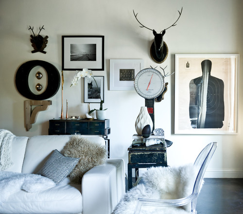
In the living and dining room, you can use this color on all the walls in combination with a dark color like gray or blue on the feature wall.
For this color scheme, I highly recommend choosing metal tints over wooden textures.

Something along the lines of matte black and brushed brass or gold is something to look forward to.
In the case of a fireplace, you must choose natural stone like granite around the perimeter.
For the upholstery, choose either dark gray, black, or clean white linen, faux fur, or velvet to create a cozy atmosphere.
Using in Bedrooms
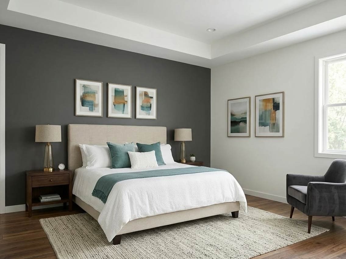
This white paint color for the bedroom isn’t a bad choice!
However, if your bedroom has a north-facing window, you might have to be slightly careful.
So, you can best use this color in combination with a stark hue on the headboard wall to add a sense of visual interest.
Remember to use ample metals on the furniture frame, nightstand frame, and other artworks and mirrors.
For the bedding, you can choose cool gray, white, or even warmer tones to feel cozy and welcoming.
Frost in Kitchens
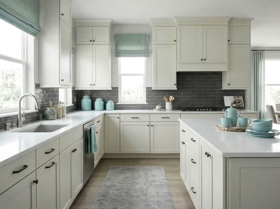
Behr Frost kitchens are quite in trend! (Of course, since they’re all white)
So, if you want to make a kitchen look larger, you can paint the cabinets and the backdrop wall in this specific color.
For the knobs and pull handles, don’t hold back from gold or brushed brass for a touch of luxe and sophistication.
Lastly, you can add a sense of color with the help of colored hexagonal backsplash tiles and flaunted exposed crockery.
Using on Exteriors

This versatile cool white color can be used extensively without worrying much about the style.
You can choose a blend of blues, greens, grays, and blacks on the roof and special architectural features.
Generally, this color works best on the facade walls.
For the exterior doors, windows, and shutters, you can pick any color you feel like.
Otherwise, for a pop of contrast, don’t hold back from bold blue, sage green, burnt umber, or mauve.
In the case of columns on the patio and porch, you can use natural stone wainscotting to add an authentic, detailed character to this facade!
What NOT to Pair with This Color
Color Pairings That Work Against Behr Frost
Frost’s cool, crisp white base makes it very unforgiving when paired with warm or yellowed whites.
Creamy whites, ivory tones, and warm off-whites will clash visibly against it and make both colors look dirty.
Deeply saturated cool colors like cobalt or navy can also overpower Frost and strip away its soft, airy character.
3 Decor Styles That Clash with Frost’s Clean Character
Rustic farmhouse, heavily distressed, and warm boho decor styles tend to fight against everything Frost is trying to do.
I’ve seen Frost look completely out of place surrounded by aged wood tones, terracotta, and warm woven textures.
Its cool clarity needs a cleaner, more contemporary backdrop to truly shine!
Trim and Accent Colors to Keep Away From Frost
Warm beige or greige trim is one of the worst pairings I see with Frost.
That yellow-beige quality in warm trims pulls hard against Frost’s cool base and creates an unsettling contrast.
Stick to crisp cool whites or soft grays for trim and you’ll be in much safer territory.
Furniture Tones That Undermine This Color
Heavy, dark espresso furniture and warm honey-toned wood pieces both create a jarring disconnect with Frost.
I’ve seen warm brass and gold hardware pull this color in a direction that feels completely unintended.
Cooler metal finishes and lighter wood tones are a far better fit for this color’s personality!
7 Interior and Exterior Finishes to Skip with Frost
Flat finishes tend to make Frost look chalky and dull, especially in well-lit spaces.
Warm-toned stains on exterior wood trim, warm brick, and sandy concrete all fight against its cool profile.
Bronze fixtures, oil-rubbed hardware, and warm terracotta pavers are finishes that consistently work against Frost both inside and out.
Should there be any questions or thoughts, let me know your thoughts in the comments below!