

There are some wonderful ways to infuse shades of blues in your home!
Some are light and pastel and some are deep and bold – and there’s yet another category that’s a true soft blue to enliven your space.
And one such example is Sherwin-Williams Atmospheric. As the name suggests, this color relates to the colors of the sky and the atmosphere.
Are you feeling dreamy yet?
This soft baby blue paint color is light, airy, and has a true tinge of blue in it. Yes, there aren’t any undertones like gray or green.
And that’s why this color has a sense of starkness to it, which means that too much of this paint on the walls can prick the eye and make the aura uncomfortable.
Don’t worry – I will acquaint you with some very interesting and creative details later!
Apart from bringing your space closer to nature, this color is also responsible for calming you and releasing anxiety from you!
No wonder – why the kids love to have this color in their rooms, especially the baby boys. It’s neither masculine nor too soft!
So, if you’re looking to add this color to your home, this color review will help you make informed decisions.
So, let’s get started!
Sherwin-Williams Atmospheric SW 6505 Details and Specifications

There’s a reason that differentiates this specific blue from the other neutral blues like SW Tidewater or SW Naval!
Well, it’s the details and specifications.
If you are new here, let me tell you – there are quite a few facts and scientific terms that you would want to acquaint yourself with. (Before choosing a paint color for your home)
It’s important to analyze these values and then determine where, when, and how to use these paints!
So, first and foremost, one of the most important terms that I usually observe getting ignored is Light Reflectance Values (LRV)!
Every color has an associated Light Reflectance Value!
For Sherwin-Williams Atmospheric, the LRV is 67!

Which falls on the medium to the lighter end of the scale – and somehow aligns on the lighter end!
Remember, the higher the value, the lighter the paint color is!
And vice versa!
If you want to see how Atmospheric will look in your unique environment, I highly suggest ordering a peel-and-stick paint sample from Samplize here!
Moving ahead, let’s discuss the RGB and HEX Values of the color.
Red = 194
Green = 218
Blue = 224
HEX Value = #c2dae0
Now that I am concluding, I promise not to bore you with these scientific details anymore.
Let’s talk about the practical aspects of this popular baby blue paint color.
How Does This Color Feel in a Space?
Sherwin-Williams Atmospheric is responsible for imbibing a stress-free, laid-back, and relaxed vibe in the space.
It’s cool and calm – thus, making you feel poised after a long day at work.
If used on all the walls of your room – this color can exhibit chilly vibes (especially in the north-facing rooms).
So, remember to always limit the use and make it a unique and stunning factor in the room.
Moreover, this color will always make your space feel airy, spacious, lively, and enlarged – hence, if you’re struggling with square footage – this color can truly solve the issues.
A Pro Tip: Try avoiding too much of this color everywhere since that can feel too chilly, stark, and can prick the eye!
How Does Light Affect the Color?
Light has some role to play here!
Yes, it doesn’t alter the undertones when hitting the walls of SW Atmospheric – but always makes the room feel bright and lively.
On the other hand, the compass directions have a lot to say here!
In the north and east-facing rooms, this color will slightly feel cool and crisp – but not majorly grayish.
In the south and west-facing rooms, this color will feel a little warmer (but not too much)!
Lastly, you can always play with artificial light in the form of pendant lights and wall sconces to create a desired ambiance in the room.
Like I said, the best way to see this color in action before you paint is to buy some paint samples you can easily stick on your wall. It’ll definitely give you some clarity if you’re unsure!
What are the Best Coordinating Colors?
Creating color palettes can be quite a fun task to do. (I absolutely love it)
So, it’s crucial for you to choose the best complementary colors in order to define a palette that looks seamless and cohesive.
This soft baby blue can be best paired with lemon yellows, darker grays, crisp whites, and lighter beiges.
And it all boils down to the kind of vibe you need in your space for a perfect color combination.
So, I am going to enlist the two most popular color schemes here – monochromatic and contrasting.
Monochromes are generally great for modern and contemporary setbacks.
On the other hand, Eclectic, Mid-Century Modern, and Farmhouse play well with contrasts.
So, here are a few of the colors I would recommend for a monochromatic palette!
- SW 6506 Vast Sky
- SW 6507 Resolute Blue
- SW 6508 Secure Blue

On the other hand, here are a few of the colors I would recommend for a contrasting color palette!
- SW 6680 Friendly Yellow – see my full guide here
- SW 6254 Lazy Gray – see my full guide here
- SW 7004 Snowbound

For your ceilings, trims, and moldings – SW Extra White or SW Pure White will help protrude a true hue of SW Atmospheric.
SW Atmospheric Vs Similar Colors

Although you must know that even though these following colors look similar, they might still differ in the undertones or reflectivity!
So, one of the closely related colors are SW 9054 Little Boy Blu and BM 806 Breath of Fresh Air!
Let’s see how all of them differ.
Atmospheric Vs Little Boy Blu

SW Little Boy Blu is a notable baby blue paint that has a hidden tinge of gray in it.
Hence, it’s not too stark and sharp like the former blue paint color.
With an LRV of 67 – these two paint colors hold an equal depth and density! However, the latter paint will feel more subdued and muted!
They might look very similar on the screen, but the biggest secret is to order samples of the color and then assess the brightness and tones in the environment you’re painting in. Pick up peel-and-stick samples now from Samplize!
Atmospheric Vs Breath of Fresh Air

These two colors have notable differences in the undertones. The former is fresh and bright whereas the latter has a tinge of navy to it!
It’s more cool and crisp – and with an LRV of 70.55 – this color is the lightest of them all!
Generally, this tone is more subdued and masculine.
In certain lighting conditions – it can also feel slightly gray and daring.
Buy some wall samples of each of these colors to easily compare them right in your home.
Where to Use Atmospheric?
SW Atmospheric can make a cute and serene statement in any way possible – however, the creative you are, the better!
So, you can best optimize the use of this paint on the door and window frames, furniture frames, accent walls, bathrooms, kids’ rooms, nursery, kitchen cabinets, and exterior trims, moldings, or soffits.
You see – they’re all unique ways to use this color.
Especially for the Coastal and beachy-style homes, this color is a number one option.
So, let’s have a look at where and how to incorporate this paint color in your home.
Atmospheric in Living and Dining Rooms
This soft baby blue paint can be used on either the walls of your living room or the built-in cabinetry.
It’s best to pair it with creamy white on the adjacent walls with a touch of natural wooden textures as an accent on the furniture, artwork frames, and other accessories.
Adding a hint of white, lemon yellow, and light gray through throw pillows is what I highly recommend.

At the same time, to maintain a refreshing vibe, it’s ideal to add fresh indoor plants, jute rugs, macrame wall hangings, and rattan furniture, if possible.
Generally, patterned curtains would go with the theme, but you can also pick sheer white curtains or gray linen ones.
Using in Bedrooms and Bathrooms
There’s only one condition to use this paint color on all the walls of your bedroom – well, if it’s large enough to accommodate the stark behavior of the color.
Otherwise, you can consider adding this color only to the ceiling to see how magical it plays.
Furthermore, incorporate creamy whites on the adjacent wall and ample faux fur on the rug and blanket to feel cozy.
For the bedding, you can play fun-loving by incorporating geometrical patterns and hues like lemon yellow, light gray, and white.
Atmospheric in Kitchens
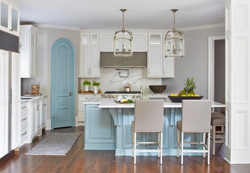
SW Atmospheric can best play on the kitchen cabinets!
Throw a splash of clean white on the backdrop wall and either chrome or brushed brass finish on the pull handles and knobs.
On the backsplash, you can choose a fancy hexagonal tile or stone that flaunts gray veins and patterns.
Using on Exteriors
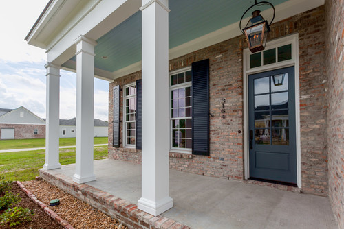
Are you decorating a beachy or Coastal home? Well, if yes, this color will play flawlessly outdoors.
You can choose to use this color on the main facade or even only on the trims, moldings, and soffit!
Otherwise, choose vice versa!
Furthermore, in the case of entryway doors and windows, pick from bold blues or lemon yellows to add character to your home.
You Should Order Samples of Atmospheric
Let’s face it, good paint isn’t cheap. While painting is a relatively inexpensive, good bang-for-your-buck project, picking colors can be hard. You don’t want to buy a whole can of something until you know for sure.
So together with the info here, you can literally “see” what this color will look like in your home before you commit.
Getting a peel-and-stick sample from Samplize is the best thing since paint rollers!
If you don’t know yet, you can order a 12″ x 12″ square sample with the real paint color on it. Stick it on your wall multiple times and in multiple places to find out exactly if the color is for you.
My 7 Key Tips for Atmospheric
1. Lean Into Atmospheric’s Cool Side with the Right White Trim
Atmospheric has a cool, blue-leaning gray base that really comes alive when paired with a crisp, cool white trim.
Warm whites with yellow or cream undertones will create an uncomfortable tension against this color’s cool character.
Stick to whites like Sherwin-Williams High Reflective White or similar cool-based whites to keep everything feeling intentional and cohesive.
2. Choose Light Wood Flooring to Balance Atmospheric’s Cool Depth
I’ve seen Atmospheric look absolutely stunning over light to medium wood floors with cool or neutral undertones.
Floors with heavy orange or red tones, like traditional cherry or warm oak, will fight against this color’s cool, collected nature.
Lighter, cooler-toned woods like maple, ash, or whitewashed oak let Atmospheric breathe and keep the space feeling fresh and balanced.
3. Pair Atmospheric with the Right Cabinet Colors in Kitchens and Baths
Atmospheric works beautifully as a wall color alongside white or off-white cabinetry with cool undertones in kitchens and bathrooms.
Warm honey-toned or heavily grained wood cabinets will clash with its cool base, so keep cabinet tones neutral or cool-leaning.
Navy or charcoal lower cabinets paired with Atmospheric walls create a layered, pulled-together look that feels intentional and current!
4. Use Atmospheric in North-Facing Rooms with Intention
North-facing rooms can push Atmospheric toward a noticeably cooler, moodier appearance due to the lack of warm natural light.
In those spaces, I recommend warming things up through lighting by choosing bulbs in the 2700K to 3000K range.
Layering in warm textiles and natural materials helps balance the coolness without fighting the color’s true character.
5. Apply Two Full Coats for the Truest Color Result
Atmospheric is a mid-tone color that can look uneven or washed out if only one coat is applied.
Two full coats give you the depth and consistency this color needs to look its absolute best on the wall.
Always allow full drying time between coats to avoid any streaking or uneven tone issues.
6. Use Atmospheric on Exteriors where Cool Tones Complement the Surroundings
This color performs beautifully on exteriors surrounded by natural greenery, as the cool gray-blue reads as calm and grounded against landscaping!
Pair it with a deep charcoal or near-black trim on the exterior for a clean, modern contrast that holds up well in natural light.
Avoid pairing it with warm brick or terracotta accents on the exterior, as those tones will clash directly with its cool base.
7. Test Atmospheric in Every Lighting Condition Before Committing
I’ve seen this color shift noticeably between morning light, afternoon sun, and evening artificial lighting.
Under warm incandescent bulbs, it can read softer and slightly warmer, while cool LEDs will push it toward a crisper, more pronounced blue-gray.
Taking the time to observe your sample across all of these conditions is the single best thing you can do before buying a full gallon!
So, how do you want to use this color in your home? Interiors or Exteriors?
Now you see, SW Atmospheric has much more to offer among the many in the SW Blue category!
Should there be any questions or thoughts, let me know in the comments below!

Leave a comment