
The appeal comes from restraint.
I love how mid-century bathrooms borrow clean furniture silhouettes and warm materials, then pair them with fixtures that feel at home in a modern space.
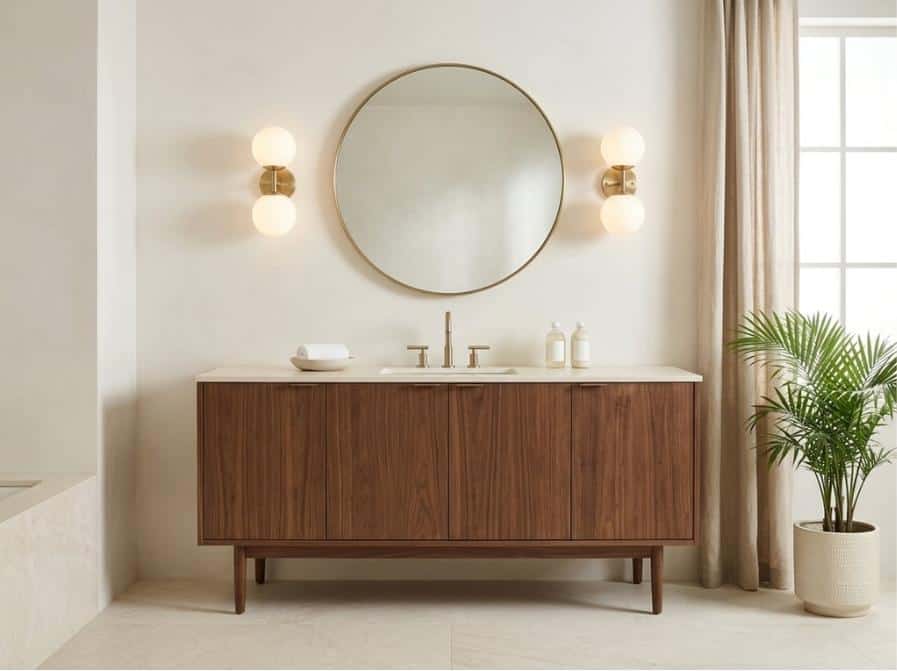
The result is welcoming rather than stark, with enough character to make your everyday bathroom feel special.
There’s something about a West Elm-inspired bathroom that makes even a small space feel thoughtfully put together.
Maybe it’s the warmth of walnut against a soft white wall, or the way a round mirror balances the straight lines of a wooden cabinet.
Nothing seems overdone, yet every detail has a purpose, and I think that’s why the room feels so calm to walk into.
A mid century modern vanity from AURA Modern Home can establish that furniture-inspired foundation.
Getting the look right comes down to choosing your proportions first, then letting paint, lighting, and hardware support the cabinet instead of competing with it.
What Gives a Bathroom That West Elm Mid-Century Look?
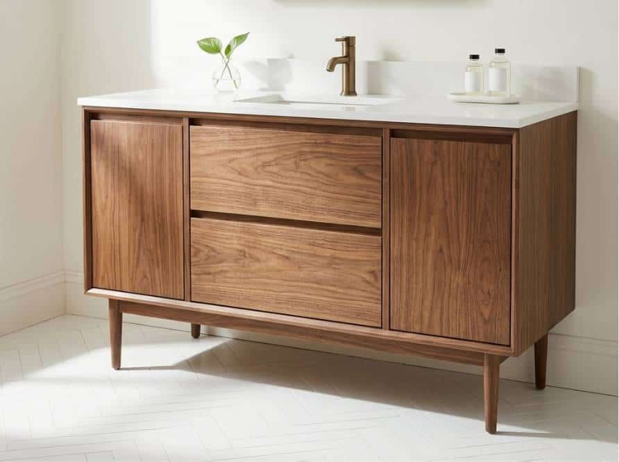
I always start with the furniture silhouette.
The familiar mid-century formula combines warm wood, simple rectangular forms, and legs that lift the piece away from the floor.
In your bathroom, these details make a vanity feel more like a carefully chosen piece of furniture than standard built-in cabinetry, the kind of thing you’d be just as happy to see in your living room.
Warm Walnut and Teak-Inspired Finishes
I think walnut makes a great starting point because brown tones and visible grain give the room natural warmth.
Against creamy walls and pale countertops, your cabinet can become the focal point without needing fancy detailing.
Teak-inspired finishes shift the mood slightly, with golden or honey-colored undertones that can look especially pretty in a bright room, a bit like morning sun on a wood floor.
Don’t rely on a finish name alone.
One cabinet might use genuine wood veneer, another stained wood, and a third a printed wood-look surface.
Those materials can differ in grain variation, water-care instructions, and how their edges look up close.
I’d check the actual construction and finish samples rather than assuming every “walnut” option behaves alike.
Compare the cabinet with your floor tile before you choose wall paint.
A strongly orange-toned cabinet beside equally warm flooring can push your whole room toward yellow.
A quieter stone-look tile or less creamy wall color helps give the wood some breathing room.
Tapered Legs and Unfussy Fronts
Slender, tapered legs create that unmistakable furniture profile.
The exposed floor beneath the cabinet makes its outline feel lighter, which helps when your room already has a visually heavy bathtub or shower enclosure.
I find that a little open floor also makes a bathroom feel less crowded first thing in the morning, when you want the space to feel easy.
Flat-panel doors let the grain provide texture.
Slatted or fluted fronts can work, too, but they add another pattern.
Pair a deeply grooved cabinet with busy floor tile and a heavily framed mirror, and your room can quickly lose the calm that made you love the inspiration in the first place.
Keep the Sink Area Quiet
A simple white or softly veined countertop draws a clean line above the wood.
An integrated sink makes that line feel extra continuous, although an undermount basin can create a similar look.
You don’t need either one to pull off the style.
A tall sculptural vessel sink isn’t automatically wrong, either.
It just needs restraint elsewhere.
If your cabinet already has decorative legs and a textured face, I’d skip another dramatic shape, since the room probably doesn’t need it.
Floating or Legged: Which Vanity Shape Works Better?
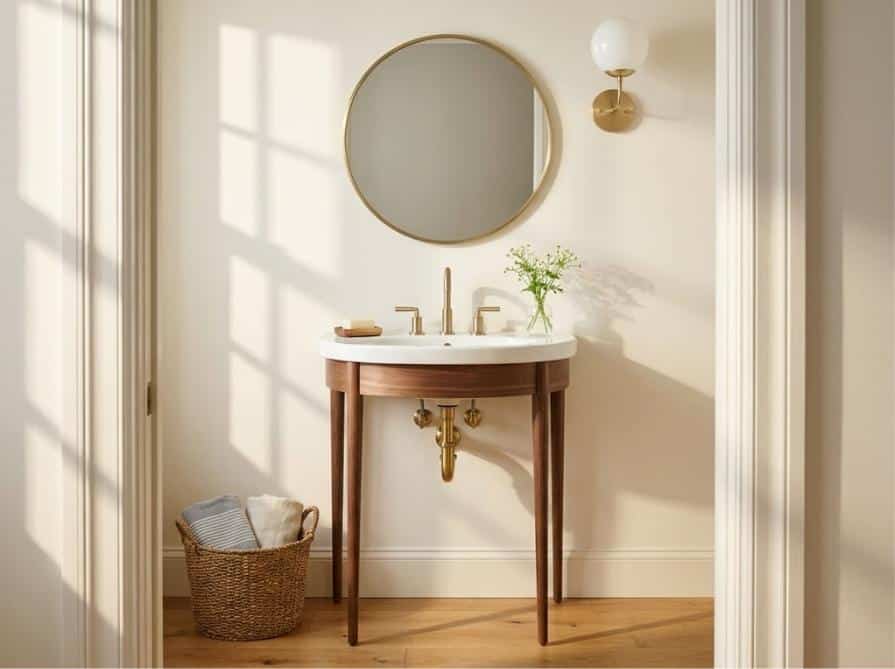
A legged vanity looks like furniture.
A floating vanity feels more architectural.
Both can suit the West Elm-inspired mood, but they change how much visual weight sits near your floor.
There’s a common belief that floating always means better for a small bathroom.
I’d say not quite.
A narrow cabinet with fine legs can look lighter than an oversized floating box, especially if the floating one sticks too far into your walkway.
When Tapered Legs Make Sense
In a powder room, a compact walnut cabinet with visible legs can give the space all the character it needs.
Pair it with a round mirror and one simple light fixture, and the room starts to feel like you planned it for your guests, without a complicated tile scheme.
Look at the leg height as well as the shape.
Very short legs under a deep cabinet may barely change its bulky outline.
More visible clearance can help, as long as the design stays stable and your installation follows the maker’s instructions.
Cleaning is the less photogenic question.
Can you actually reach underneath with a mop?
I’ve seen an awkwardly shallow gap trap dust and splashes, even when the vanity looks beautiful in photos.
When Floating Makes More Sense
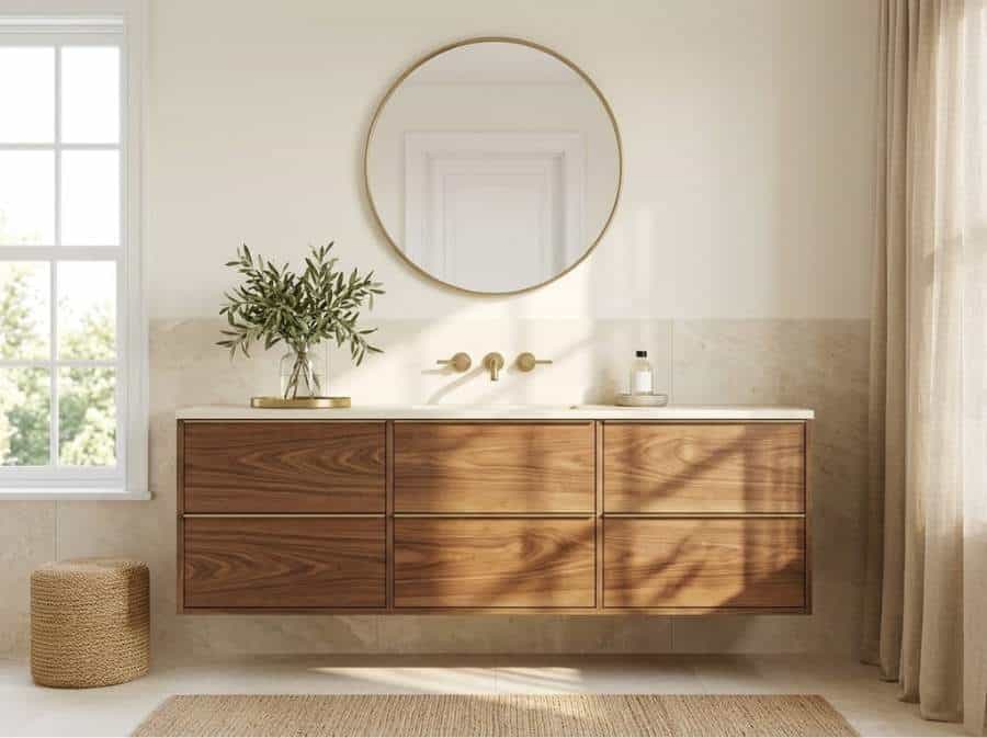
A wall-mounted vanity keeps the floor visible from one side to the other.
That continuity can look striking with pale, large-format tile, especially in a narrow room.
It also gives the mid-century palette a slightly more modern edge.
Installation is the trade-off.
Your wall needs proper support, the manufacturer’s mounting method matters, and existing plumbing can affect both position and storage.
Don’t assume a floating unit can simply replace a floor-standing cabinet without checking those details.
For a shared primary bath, I’d sketch the drawer layout on paper before choosing the silhouette.
A beautiful cabinet isn’t very useful if the sink plumbing takes up the space you planned for your toiletries.
A vanity that keeps both of your routines tidy does more for a peaceful morning than any finish ever will.
The Paint Colors That Make Walnut Look Its Best
Paint changes the way wood looks.
The same walnut finish can look rich against a muted off-white and surprisingly orange against a colder white.
That’s why I pay more attention to undertones than to a paint chip’s popularity.
Benjamin Moore White Dove OC-17
White Dove offers a soft off-white backdrop for a medium walnut cabinet.
Benjamin Moore lists its light reflectance value at 83.16, a measure of how much visible light a painted surface reflects.
That’s a helpful reference for brightness, not a promise that the color will look the same in your room.
Try it beside pale stone-look flooring and understated brass hardware.
The wood stays distinct, but the wall doesn’t create the harsh contrast of a bright white, so the room feels gentle and lived-in rather than clinical.
Sherwin-Williams Alabaster SW 7008
Alabaster is another warm white, one Sherwin-Williams describes as soft and balanced.
I think it looks lovely with deeper wood tones and beige or greige tile, especially when you want the vanity to bring most of the room’s color.
Consider painting your walls and trim the same color in finishes suited to each surface.
That removes a distracting line of contrast.
But check the result under your actual vanity lights, since warm bulbs can make creamy whites look more yellow than you’d expect.
Sherwin-Williams Evergreen Fog SW 9130
For a bolder choice, Evergreen Fog is a muted gray-green.
Sherwin-Williams named it its 2022 Color of the Year, describing its subdued, nature-inspired character.
Against brown wood, that gray-green contrast can give your powder room depth without needing a bold tile pattern.
I like how it brings a little of the garden indoors, which can make a windowless powder room feel more restful.
A lighter option is Sherwin-Williams Sea Salt SW 6204, which can look greener or bluer depending on what’s around it.
Neither green is a guaranteed match.
Tape painted sample boards beside your actual cabinet and floor, then look at them in daylight and under the bathroom’s electric light.
A photo on a screen tells you what a palette could be.
Your room tells you whether it works.
Get the Mirror, Lighting and Hardware in Balance
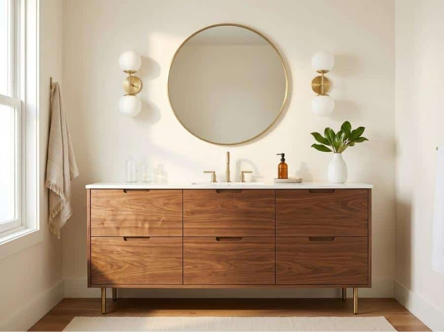
Once you’ve chosen the vanity and wall color, it’s tempting to make every remaining piece a statement.
An elaborate mirror, sculptural sconces, and striking pulls might each look great on their own.
Together, I’ve found they can turn a calm space into a collection of competing details.
Round or Arched Mirror?
A round mirror softens the straight edges of a wooden cabinet.
An arch does something similar but draws your eye upward, which can help above a narrower vanity or beneath a higher ceiling.
Size matters more than the curve.
As a starting point, I find a mirror slightly narrower than the cabinet often feels balanced.
A 24-inch mirror above a 30-inch single vanity might work, but the sink position, faucet height, and nearby sconces can change that.
Mark the outline with painter’s tape on your wall before committing.
An undersized mirror above a broad vanity looks stranded.
Squeezing an oversized mirror between two sconces creates the opposite problem.
Give the Face Useful Light
Milk-glass globe lights suit this design because their soft shapes echo the mirror without adding visual clutter.
A simple brass or matte black sconce is another good option.
Don’t pick lighting by its silhouette alone.
Fixtures beside a mirror may light your face more evenly than a single overhead light, depending on their placement and output.
If you only have room above the mirror, I’d focus on soft, diffused light over a narrow decorative beam.
Soft light is also what makes a bathroom feel welcoming when a guest steps in at night, not just practical when you’re getting ready.
Make sure fixtures are approved for their actual bathroom location and follow your local electrical requirements.
Color matters, but so do brightness and being able to see clearly while you shave or put on makeup.
Choose a Leading Metal Finish
Brushed brass brings out the warmth of walnut.
Matte black gives it a sharper, more modern outline.
A mix can look intentional, as long as one finish clearly leads.
For example, brass at the faucet and cabinet pulls can work with a slim black mirror frame.
What tends to look scattered is adding another standout metal finish with each new decision.
The idea is simple, and it’s one I use in every room of a home.
Repeat a finish enough to create a connection, but not so often that your room looks like a matching fixture set.
A Quick Checklist Before You Choose Your Vanity
A cabinet can suit your mood board and still be wrong for the room.
Before you choose the final size or setup, I’d check the layout where the vanity will actually sit.
- Measure usable width. Account for trim, nearby fixtures, and the clearance you need to open doors or drawers. A cabinet can technically fit against a wall while blocking another fixture.
- Mark the depth. Tape the countertop footprint onto your floor. Walk past it and test access to the shower or toilet. I’ve found the depth you overlook online is often the one you notice most in person.
- Find the plumbing. Supply lines and drains can get in the way of deep drawers or a cabinet on exposed legs. A qualified installer should look at any changes to pipe locations or wall support.
- Check usable storage. A three-drawer vanity doesn’t always hold more than one with two well-arranged drawers. Ask how much inside space the basin and plumbing take up.
- Confirm the sink setup. Check the exact countertop, basin style, faucet-hole arrangement, and required clearances. Product photos don’t always show every available option.
- Think about your real routines. A guest powder room may need a spot for spare hand towels, which is a small touch your guests will notice. A primary bath shared by two people may need separate spaces for everyday supplies.
Finish by reading the manufacturer’s installation and care instructions.
Bathroom-friendly surfaces still need good ventilation and quick cleanup of standing water.
These details rarely show up in inspiration photos, but they shape how well your room works years later.
Let Your Bathroom Feel Like a Natural Part of Your Home
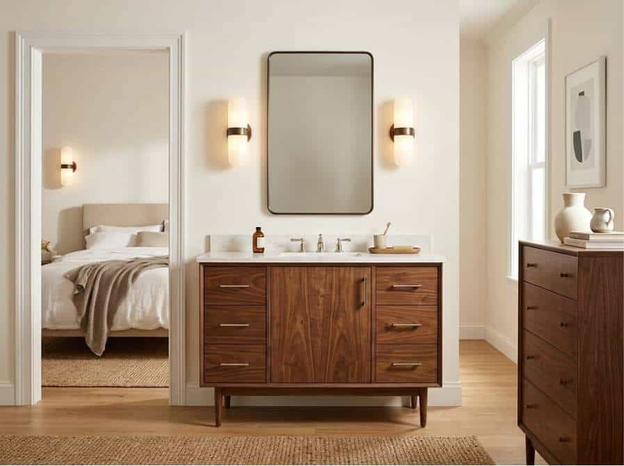
A convincing West Elm-inspired bathroom doesn’t need every fixture to come from the same design decade.
A modern shower and simple tile can sit happily beside a walnut cabinet with tapered legs.
I’d look beyond the bathroom doorway before settling on your last finishes.
If the bedroom next door has warm wood or the hallway has soft neutral walls, echoing one of those will make the transition feel natural.
The best result isn’t a perfect copy of a showroom photo.
It’s a bathroom that looks like it’s always belonged in your house, and feels just as warm as the rest of it.

Leave a comment