
Every year the design world tells you what colors are coming, and every year the most reliable preview isn’t a forecast at all.
It’s the finish schedule inside the priciest new apartments actually being built and sold.
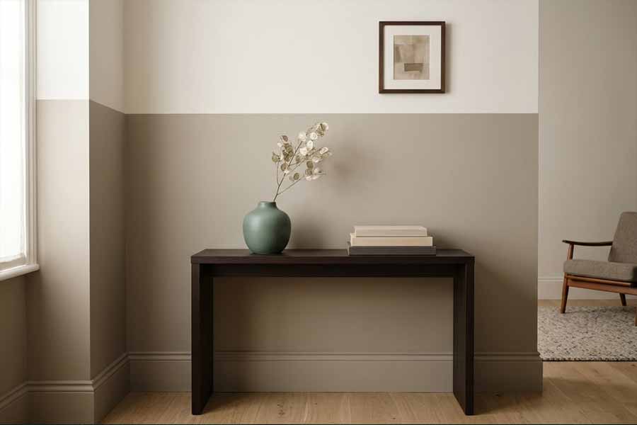
Developers competing for buyers who could spend their money anywhere don’t guess at palettes.
They hire the world’s most expensive designers, and those designers show their hand in the paint.
Right now some of the clearest signals are coming out of Dubai, where new stock is trading at genuinely staggering numbers.
The typical Dubai apartment now sells for around AED 1.3 million according to Land Department transaction data compiled by DXB Analytics, and that’s the median, not the ceiling.
In design-forward districts, the ceiling is far higher: low-rise, boutique communities like City Walk are averaging north of AED 3,000 per square foot.
When a developer is charging that, the interiors get styled to within an inch of their life, and the color choices are deliberate.
Here’s the good news for the rest of us.
Those choices map almost perfectly onto the 2026 colors the big American paint brands just released, which means you can get the exact look for the price of a gallon and a weekend.
Below are the five palettes showing up in the most expensive new apartments right now, and the affordable dupes that nail each one.
Where These Looks Are Coming From
Before the dupes, a quick note on the source material, because you can actually look at it yourself.
The finishes below are pulled from the marketing photography and show units of new premium developments, the kind you’ll find scrolling through apartments for sale in Dubai in districts like City Walk, Downtown, and the newer waterfront towers.
Open a few listings and study the walls, the millwork, and the way the light falls on them.
That styled photography is a free trend board, and it’s remarkably consistent from one high-end project to the next.
Once you know what to look for, you’ll start seeing the same five moves everywhere.
It’s worth saying why Dubai specifically is such a useful bellwether.
It pulls designers and buyers from every major market, so its interiors tend to blend European restraint, American warmth, and Gulf luxury into something that reads as globally current rather than regionally specific.
The looks translate cleanly to a house in Ohio, and I’ve seen these same moves work beautifully in everyday homes.
Look 1: The Warm Greige Envelope
The single most dominant move in expensive new apartments right now is the disappearance of cold gray.
For roughly a decade, luxury meant a chilly, blue-based greige.
That’s gone.
The new premium neutral is warm, earthy, and slightly khaki, wrapped across walls and trim in the same shade for a seamless, enveloping effect.
If you’ve been wanting to make a room feel more pulled-together and expensive, this is one of the easiest ways to do it.
This is almost exactly what Sherwin-Williams named its 2026 Color of the Year.
Universal Khaki (SW 6150) is a warm neutral the brand’s color team describes as an ultra-usable, classic sophistication shade, and it’s the closest hardware-store match to what these developers are using in their model units.
The dupe: If you want the look without committing to the full color-drenched treatment, Sherwin-Williams Accessible Beige (SW 7036) is the softer, more forgiving cousin and one of the most popular warm greiges ever made.
For a near-identical Benjamin Moore alternative, reach for Pashmina (AF-100).
Paint the walls and trim the same color in different sheens (eggshell on walls, satin on trim) to get that expensive seamless envelope without spending a fortune.
Look 2: Espresso Drenching
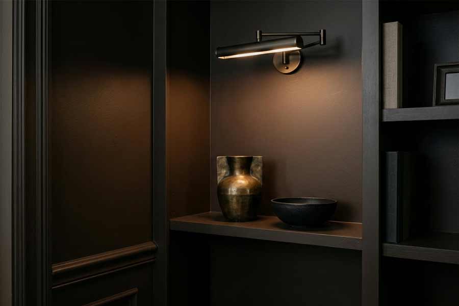
The boldest trend in high-end 2026 interiors is the return of brown, and not a timid brown.
Designers are drenching powder rooms, studies, and feature walls in deep, luxurious espresso, a color with charcoal in its bones that reads as moody and tailored rather than dated.
In the Dubai model units it shows up on joinery, media walls, and the occasional fully wrapped small room.
I’ll be honest, when I first saw this trend I wasn’t sure it would translate to everyday homes, but it really does.
Benjamin Moore saw this coming and built its whole year around it.
Silhouette (AF-655), the brand’s 2026 Color of the Year, is described as a blend of burnt umber with delicate charcoal undertones, inspired by the resurgence of classic tailoring and the brown color family.
It’s the trend in a can.
The dupe: Silhouette itself is the aspirational pick, but if you want the look for less, Behr’s Chocolate Sparkle (PPU5-19) and Sherwin-Williams Van Dyke Brown (SW 7041) both land in the same rich espresso territory.
Use it in a small room.
Browns of this depth are most striking in a powder room or a home office, where the enclosure makes the color feel like a jewel box instead of a cave.
Look 3: Smoky Jade as the New Blue
Where the last cycle reached for navy as its safe pop of color, the expensive apartments of 2026 are reaching for a muted, grayed-down jade.
It’s a blue-green that feels grounded and slightly moody, used on cabinetry, built-ins, and bedroom feature walls.
It photographs as sophisticated and, crucially, it flatters the warm neutrals in Look 1 instead of fighting them.
This is one of my favorite trends right now because it works so well across so many different rooms in a home.
Behr made this its headline shade.
Hidden Gem (N430-6A), the brand’s 2026 Color of the Year, is a smoky jade the company calls a dynamic blend of blue and green designed to feel both grounded and energizing.
Because it’s already a Behr stock color, this is the rare case where the trend color and the budget color are the same thing.
The dupe: If you’re matching in another brand, Sherwin-Williams Rosemary (SW 6187) and Benjamin Moore Knoxville Gray (HC-160) both read as that same dusky, upscale green.
On kitchen cabinets or a bank of built-ins, a smoky jade instantly signals custom, high-end joinery even on flat-pack furniture.
Look 4: The Soft-White Ceiling and Gallery Wall
Expensive apartments have quietly stopped using builder-grade bright white everywhere.
The new move is a soft, warm white with the barest hint of body, used on ceilings and in gallery-style rooms so the white itself feels intentional rather than default.
It’s the difference between a wall that looks unpainted and a wall that looks genuinely chosen.
This one small shift can completely change how a room feels, and it’s something I think every home deserves.
This tracks with Pantone naming the soft white Cloud Dancer as its 2026 Color of the Year, a luminous, calming white meant to read as serene rather than sterile.
Paint brands don’t sell Pantone colors directly, so this is where a good dupe matters most.
The dupe: Benjamin Moore White Dove (OC-17) is the designer default for exactly this reason: a soft, warm white that never goes stark.
Sherwin-Williams Alabaster (SW 7008) is its equally beloved counterpart.
Either one on the ceiling and trim, paired with the warm greige from Look 1 on the walls, is the single most cost-effective way to make your room read expensive.
Look 5: The Tonal Accent, Not the Accent Wall
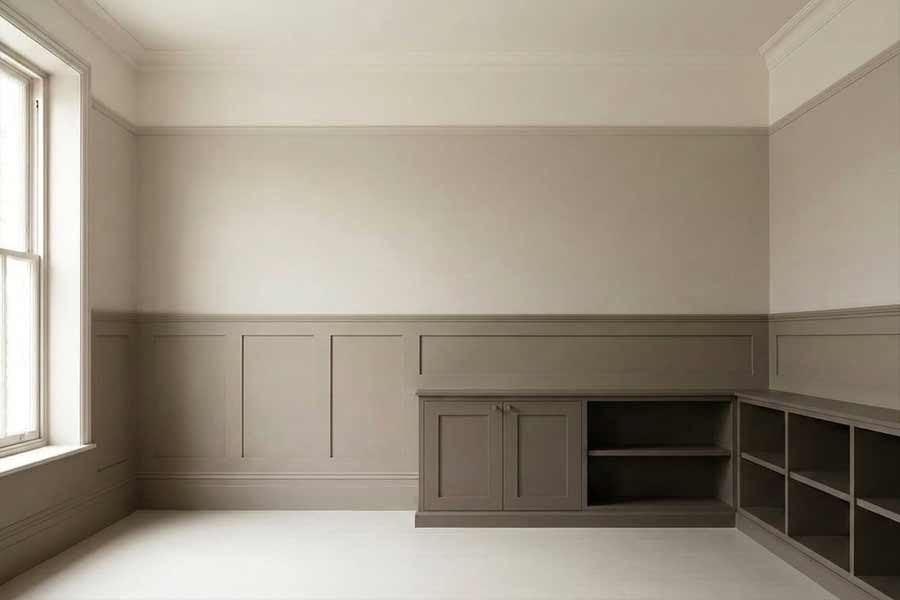
The last trend is less a color than a technique, and it’s the one that most separates the million-dollar apartments from ordinary ones.
Instead of a single contrasting accent wall, high-end interiors are using tonal layering: three or four shades from the same color family, moving from a pale version on the ceiling to a mid-tone on the walls to a deeper version on the lower third or the built-ins.
The result reads as depth and intention rather than a single bold gesture, and it’s one of those moves that makes a home feel genuinely designed.
You don’t need a designer to copy this.
Every brand’s 2026 palette is built as a coordinated family for exactly this purpose.
Pick your favorite of the looks above, then pull two or three neighbors from that brand’s fan deck: a lighter tint for the ceiling, the main shade for the walls, and a deeper relative for the cabinetry or a paneled lower wall.
The dupe strategy: Sample pots are your best friend here.
Buy the small sizes of three related shades, paint big swatches, and live with them for a few days in your actual light before committing.
Tonal layering is cheap in materials and rich in effect, which is exactly the trade every budget decorator is looking for.
The Palettes Worth Stealing This Year
The palettes coming out of the world’s most expensive new apartments aren’t exotic or out of reach.
They’re warm greige, espresso brown, smoky jade, soft warm white, and tonal layering, and every one of them has a named, affordable match at Sherwin-Williams, Benjamin Moore, or Behr.
The developers charging thousands per square foot aren’t using secret colors.
They’re using the same 2026 shades sitting in your local paint aisle, applied with a little more discipline.
Copy the discipline, buy the dupe, and your walls won’t know the difference.

Leave a comment