
Benjamin Moore Dark Harbor is a dark, enticing bluish-green paint color that exhibits a rich and stark feel in a room.
Mimicking the deep waters of streams and lakes, this paint color is quite amusing and has the potential to bring the most contrast, luxe, and sophistication to any space.
Well, this is also one of my favorites due to obvious reasons.
First and foremost, if you follow the #banthebeige trend, you would love to have an intriguing paint color like this in your home.
It opposes the idea of subtleness and calmness while bringing an absolute charm, energy, and visual interest to the room.
And since the paint color is quite dark, it further adds depth and drama!
BM Dark Harbor makes a great accent at all times!
So, if you particularly have an Eclectic, Maximalist, and Hollywood Glam style, this is the number one color option to opt for.
And believe it or not, you would truly admire the walls when painted in BM Dark Harbor.
Don’t worry, this color review will help you make the best use of this paint color.
(Where, when, how, and with what)
So, let’s get started!
Benjamin Moore Dark Harbor CSP-720 Details and Specifications

Every color is unique – even if they fall in the same shade category.
And do you know what differs them all?
Well, it’s the color specifications and details.
For Benjamin Moore Dark Harbor, you must really have an eye to truly like this color.
It may or may not go out of trend – but at the same time, it will always excite, energize, and amuse you.
So, let’s have a look at what makes this paint color so out-of-the-box and stunning.
First and foremost, let me introduce you to the concept of Light Reflectance Values or the LRVs that determine how light or dark the paint color is.
Here, in this case, the LRV of Benjamin Moore Dark Harbor is 5.88.

And that means it falls on the darker end of the scale – and yes, extremely dark.
(Remember, the lesser the value, the darker the paint – on a scale of 1-100)
Most often, it’s best to sample a paint color in your home to confirm it’s going to work how you expect. You can do this easily using Samplize. Grab one now for Dark Habor!
Secondly, other important associated terms are the RGB and the HEX Values.
Red = 30
Green = 72
Blue = 80
HEX Value = #1e4850
Since we have discussed the technical and scientific information, let’s get started with the practical aspects of this rich and dark bluish-green Benjamin Moore paint.
How Does This Color Feel in a Space?
Benjamin Moore Dark Harbor is bound to make your space feel characteristic, dark, bold, rich, English-like, and elegant.
It’s neither too warm nor too cool to define a particular saturation in the room. Rather, it’s a perfect blend that makes your room feel a bit formal and energetic.
Well, if you have an abnormally large room, you can use this color on the walls to add depth and create an illusion to bring the walls closer.
Don’t worry – you can even use this paint in smaller spaces (but only as accents on the walls, furniture pieces, or accessories).
Other than that, you’re bound to feel slightly formal and cozier with this paint on board.
How Does Light Affect the Color?

Natural as well as artificial light has a major role to play in this paint color.
Due to the low reflectivity of the paint, the incoming light is mostly absorbed – and that’s when the room feels dark and moody.
And in the case of no light, the paint color will almost look like a shade of dark gray or black, thus creating a dingy atmosphere.
Hence, you must only use this paint color if you have sufficient incoming natural light in the room. (Also, the size of the room shouldn’t be too small)
Otherwise, you always have the opportunity to play with artificial light to add liveliness and brightness to the room.
Generally, warm white lighting plays fabulously. (Make use of wall sconces, chandeliers, and pendant lights)
Again, I really recommend you try out some wall samples because colors will look different in every location.
What are the Best Coordinating Colors?

Benjamin Moore Dark Harbor is comparatively a tricky paint color to deal with.
Since it’s quite style-specific, the color palette choices are further restricted.
The dark tone of the color makes it a given that you have to choose a subtle white to neutralize the boldness, a bright hue accent, and a soothing base to foster cohesiveness.
You can best pair this blue-green paint color with shades of pink/coral, mustard, light gray, and crisp whites.
You can also incorporate any of the metallic tints as accents here – like brass and gold. Glossy, brushed, and matte!
Don’t forget to infuse patterns (in black and white) to add exclusiveness to the room.
About material specifications – try walnut woods, faux fur, glass, and brass!
Furthermore, you can choose from a monochromatic or a contrasting color palette, depending upon the interior design style and your preference.
So, here are a few of the colors I would recommend for a monochromatic palette!
- CSP-715 Fair Isle Blue
- 2135-40 Province Blue
- CSP-670 Silken Blue
On the other hand, here are a few of the colors I would recommend for a contrasting color palette!
- CSP-365 Grandma’s China
- HC-12 Concord Ivory
- OC-23 Classic Gray

For your ceilings, trims, and moldings, you can use BM Chantilly Lace as it is a true white paint and will further enhance the original adjacent hue.
BM Dark Harbor Vs Similar Colors
This gorgeous bluish-green paint tends to share tons of similarities with other dark-toned paints.
Whether it’s the undertones or reflectivity, BM Dark Harbor can be compared to a couple of other BM and SW hues.
So, if BM Dark Harbor is a little too dark or blue and green for you, these subsequent colors can be considered as an option.
So, let’s discuss the major ones – BM 2057-10 River Blue and SW 9142 Moscow Midnight.
And see how they all differ.
Dark Harbor Vs River Blue

Benjamin Moore River Blue is equally a bluish-green paint color with slightly lesser brightness and starkness.
Yes, even though the undertones are similar, the latter paint feels more balanced, calm, and composed.
With an LRV of 5.27 – this is equally dark, bold, and moody.
Lastly, note that this blue paint color has deep green and black undertones as well!
Find out what works best in your home’s environment and lighting by putting up some temporary samples and observing – Get samples from Samplize.
Dark Harbor Vs Moscow Midnight

Sherwin-Williams Moscow Midnight is a blue-toned paint color with very little emerald green undertones – find out more about this one here!
More inclined towards blues, this paint color is something to consider in the Eclectic and Hollywood Glam style designs.
With an LRV of 5, this paint color is equally dark and deeper.
You can also check out BM Gentleman’s Gray, which is even more blue but just as deep.
Order a wall-stick sample of Dark Harbor here to help you compare these colors in your own space.
Where to Use Dark Harbor?
Benjamin Moore Dark Harbor is a beautiful bluish-green paint color that can be used anywhere in your home.
The bold paint makes a flabbergasting and stunning statement as an accent in your kitchen, bedroom, living room, home office, and exterior doors and window frames.
Excited to know how to creatively use this paint in your home? So, let’s have a look!
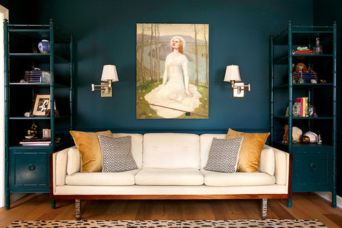
Dark Harbor in Living and Dining Rooms
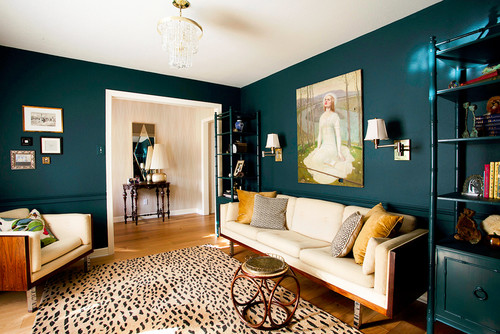
This paint color will definitely look formal, eye-catching, and crisp in the living and dining rooms.
Generally, you can consider painting all the walls in this paint color (if the size allows), for a Victorian or Edwardian look.
Otherwise, use the paint on the accent wall to add contrast, depth, and quirkiness.

For the throw pillows and accessories, use mustard, light gray, and various geometric patterns (in black and white) to complete the palette.
In the case of a fireplace, use marble or exposed brick to achieve a stark look.
Using in Bedrooms
I would highly recommend this paint color for the bedroom accent wall.
Furthermore, try pairing this paint color with clean whites on the adjacent wall, mustard on the accessories, and gray as a base on the ottomans and accent chair.
Regarding materials, choose rattan, wicker, or bamboo to imbibe a natural and refreshing look.
On the other hand, if you like a luxe and rich look, try adding golden tints to the chandelier and other lighting fixtures.
Dark Harbor in Kitchens
BM Dark Harbor would play stunning on the kitchen cabinets. Especially if you have a maximalist and glam style, this paint color would play fundamental.
And, you can also add floral blue and green wallpaper on the backsplash with a tinge of brass or gold on the knobs, lighting fixtures, and pull handles.
Otherwise, you can also play with walnut wooden textures on the floating shelves and door and window frames.
Using on Exteriors

I highly recommend painting the exterior door, shutters, and window frames in this paint color.
Along with this, you can choose clean whites on the exterior shiplap walls and light gray on the soffit, downspouts, trims, and moldings.
Lastly, don’t hold back from using natural stone wainscotting (in a warmer base)!
My Favorite Way to Sample Colors
I can’t say enough about how easy it is to use a peel-and-stick paint sample to give a color like Dark Harbor a try. The absolute best way is to order a sample from Samplize.
You can check it out right on your wall and move it around. Also, try it along with another couple of colors to test pairing possibilities.
This is WAY easier than having to open up little cans of paint and rolling/brushing on. Forget the mess and use these helpful temporary sample squares to test location, lighting options, etc.
My 7 Key Tips for Dark Harbor
1. Embrace Dark Harbor’s Depth in North-Facing Rooms
Dark Harbor actually thrives in north-facing rooms where cooler, indirect light keeps its blue-green character looking intentional and rich.
In south-facing rooms with strong sunlight, this color can shift toward a brighter teal, so test it carefully before committing to those spaces.
2. Pair It with the Right Flooring to Keep It Grounded
Dark Harbor looks stunning alongside medium-toned warm wood floors like white oak or walnut, which balance its cool depth beautifully.
I’ve seen this color feel disconnected and cold when placed over very light, cool-toned floors like pale gray tile or whitewashed wood, so keep that in mind!
3. Choose Cabinet Colors That Complement, Not Compete
If you’re using Dark Harbor in a kitchen or bathroom, white or soft cream cabinetry is one of the most successful pairings I consistently recommend.
Avoid gray-toned or blue-tinted cabinet finishes alongside this color, as they tend to blur together and remove the intentional contrast that makes Dark Harbor so striking.
4. Use the Right Sheen for Each Application
For interior walls, an eggshell finish helps Dark Harbor’s color depth come through without picking up too much glare from light sources.
On exterior trim or shutters, a semi-gloss finish allows this color’s rich blue-green tones to really stand out against siding and natural surroundings!
5. Apply Two Full Coats Without Rushing
Dark Harbor is a deep, saturated color that genuinely needs two full coats to achieve the even, consistent finish it’s known for.
Rushing to a single coat will leave you with an uneven, streaky result that doesn’t do this color justice at all, so be patient with the process.
6. Consider Dark Harbor for Exterior Shutters and Front Doors
This color is one of my favorites for exterior shutters and front doors because its blue-green depth reads beautifully against both white and gray siding.
It also pairs exceptionally well with natural stone or brick exteriors, where its cool tones complement earthy textures in a really compelling way.
7. Use Warm Metals to Balance Its Cool Intensity
Dark Harbor’s cool, moody character responds beautifully to warm metal accents like unlacquered brass, brushed gold, or aged bronze in hardware and fixtures.
I’ve seen cool chrome or nickel finishes make this color feel overly stark and cold, so leaning into warmer metals is always the smarter choice here!

Very helpful and detailed. Thanks. I liked learning about the light reflective value.