
You finally landed on the perfect creamy white or soft greige for your walls.
The room feels calm, bright, and warm.
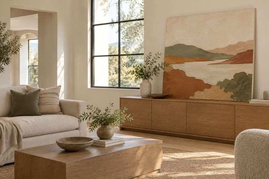
Then you stand there with a blank wall and a half-empty feeling, because art that looks great online suddenly looks wrong in your room.
A handmade piece solves a lot of that, and a paint-by-numbers kit from Davincified is an easy way in, since it can turn a photo of a place you love into a kit and shows you a color preview before you order.
Either way, the real question is the same: which colors will sit comfortably against the wall you already have?
Start with Your Wall’s Undertone
Warm neutrals aren’t all the same.
Some lean yellow, some lean pink, and some drift toward green once the afternoon light hits them.
Hold a plain sheet of white printer paper against your wall at different times of day.
Next to true white, I’ve found the wall’s undertone suddenly becomes obvious.
A wall that looks creamy in the morning can look almost beige by evening.
Why does this matter for art?
Because the colors in your painting will pick up that undertone.
A cool, icy blue can look harsh on a yellow-leaning wall.
A dusty blue with a little gray in it usually looks like it belongs there, and that sense of belonging is what makes a room feel settled and welcoming.
If you are still deciding on the wall color itself, a named warm white like Shoji White from Sherwin-Williams is a good example of a soft, welcoming neutral that plays well with natural materials and earthy art.
Pull Your Palette from What Is Already in the Room
The easiest way I know to make art feel intentional is to borrow from your own space.
Look around and pick three colors you already own:
- The wood tone of your coffee table or console
- The main color of your rug or curtains
- One accent, like a throw pillow or a vase
Now look for artwork that repeats two of those three. The third can be a surprise.
I like to think of it as a quiet echo.
You don’t want the painting to match your sofa exactly.
You want it to feel like it grew out of the same room, the way a home collected over time feels more inviting than one bought all at once.
Use Earthy Colors on Warm Walls
Warm neutral walls are forgiving, and I find earthy colors are the safest bet: terracotta, sage, ochre, clay pink, olive, and soft charcoal.
They share the same warm base as your wall, so they blend rather than fight.
Skip the pure primary colors unless you want the art to be the loudest thing in your room.
A piece with a neon blue sky will pull attention away from everything else.
If you love color, I’d go for depth rather than brightness.
A deep forest green or burnt orange has plenty of personality without feeling jarring against cream, and those richer shades make a room feel cozier as the evening light fades.
Think about Contrast and Scale
A pale painting on a pale wall can disappear.
If your walls are a very light cream, look for art with at least one darker anchor color, like a deep green hillside or a rust-colored shape, so the piece has an edge.
Scale matters just as much. A small canvas on a big wall looks lost.
As a rule of thumb, art hung above your sofa or console should be about two thirds the width of the furniture beneath it.
Not sure what size to go for?
Cut a piece of kraft paper to the size you’re considering and tape it up for a few days.
You’ll know quickly if it feels too small.
Consider Making the Art Yourself
Store-bought art is great, but I love how making your own piece lets you control the palette from the start.
If you can choose the colors, you can match them to your walls instead of hoping a print happens to work.
A painted canvas also adds something a mass-produced print can’t: visible brushwork and a bit of texture.
Those small irregularities catch the light and make a plain wall feel lived in, and there’s a quiet warmth in telling guests you painted it yourself.
If you’ve never painted before, a guided kit takes the pressure off.
The design is already mapped out, so you can spend your time simply enjoying the process, and if you would rather start from a landscape or a floral than from your own photo, there are plenty of ready-made designs to browse.
Davincified’s kits use high-opacity paint that covers in one coat, which matters when you’re filling small numbered sections with a warm, earthy palette and don’t want to layer the same shade three times.
Pick a photo that already fits your room, like a landscape in golden-hour tones or a coastline in soft neutrals, and your finished canvas will blend in almost automatically.
Hang It Like You Mean It
A great piece can look careless if it’s hung badly.
Here are a few simple rules I rely on:
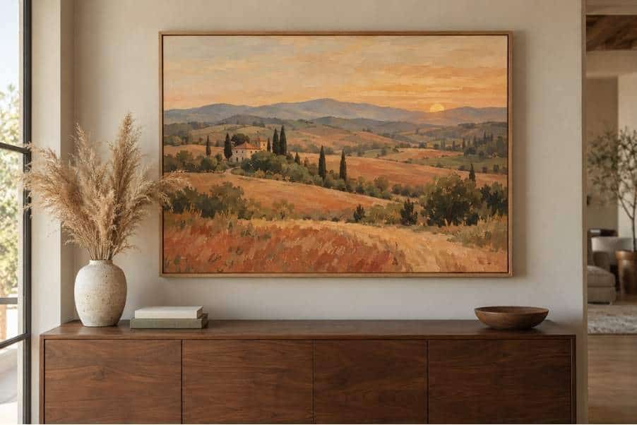
- Center the art about 57 inches from the floor, which is the standard gallery eye level
- Leave about 6 to 8 inches between the art and the top of your sofa or console
- Use a level, and measure twice before you drill
If you prefer a relaxed look, lean a larger canvas on a console or shelf, as in the photo above.
It feels casual, and it’s easy to swap when you want a change, like trading in a cozier piece for the cooler months.
Let the Room Settle Before You Judge It
Give a new piece a week before you decide it’s wrong.
Colors read differently once the light shifts through the day and your eye adjusts to having something new on the wall.
If it still feels off after that, I’ve found the fix is usually small.
Try moving a pillow, swapping a vase, or adding a throw in one of the painting’s colors.
That small repetition is often what ties everything together.
Warm Walls, Personal Art
Warm neutral walls are the perfect backdrop for art that feels personal.
Start with your wall’s undertone, borrow colors from the room, choose earthy shades with a darker anchor, and size the piece generously.
Whether you buy it or paint it yourself, I think the right piece is the one you enjoy looking at every day, because that’s what makes a house feel like home.

Leave a comment