
Kitchen color choices age faster than almost anything else in your house.
What feels fresh and on-trend the day it goes up on the wall can start to feel dated by the time the next design cycle rolls around.
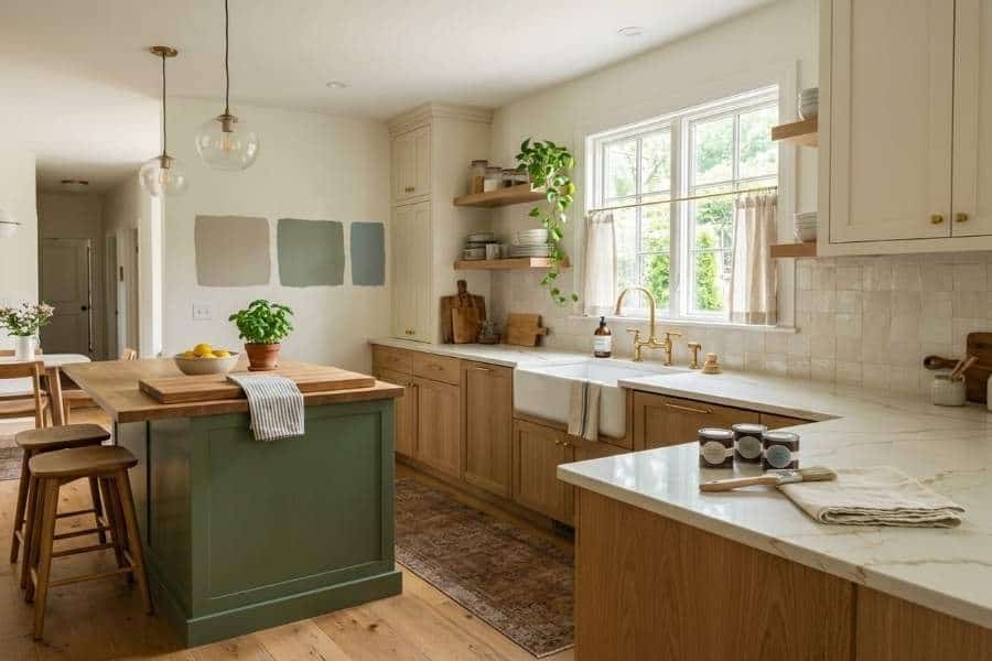
That’s especially true in a room that gets this much daily use and this much natural light throughout the day.
I think of the kitchen as the room where everyone ends up gathering, so its color sets the mood for more of your life than almost any other wall in the house.
If choosing paint is part of a larger home kitchen improvement project, it helps to settle the room’s fixed finishes before narrowing down wall colors.
Color is one of the easier decisions to get wrong simply because there are so many options and so much conflicting advice out there.
I’ve found a few practical principles can save you from repainting again in eighteen months.
Test Colors in the Actual Room, Not Just on a Swatch
This one sounds obvious, but I see it skipped constantly.
A paint chip under fluorescent store lighting looks nothing like that same color under your kitchen’s mix of natural light, pendant fixtures, and under-cabinet lighting.
Colors shift a lot depending on what’s around them too, including your countertops, cabinet finish, flooring, and even the linen café curtains or woven runner you love.
Buy sample pots of your top two or three choices and paint large swatches directly on the wall.
Ideally, try more than one spot, since light hits different walls differently throughout the day.
Live with them for at least a few days before committing, and notice how each one feels with your morning coffee and at dinnertime.
I know it feels slow, but it’s a lot faster than repainting an entire kitchen twice.
Consider How the Color Interacts with Your Cabinets
If your cabinets are staying put, whatever wall color you choose needs to work with them, not against them.
Warm wood tones can make some cool, blue-based grays feel disconnected.
So it helps to compare the two in the room before committing rather than assuming they’ll clash or work automatically.
Undertones matter more than you might expect here.
Two paints that look similar on the swatch can look completely different once they’re next to warm oak cabinetry versus cool white ones.
White and other neutral-painted cabinets can give you more flexibility.
Their undertones still need to work with the wall color, though, since cream, greige, and cool white all pull a room in different directions.
Bringing an actual cabinet door sample or a photo to the paint counter helps more than trying to describe the color from memory.
I like to think of it as making your walls and cabinets feel like old friends rather than strangers sharing a room, and that harmony is a big part of what makes a kitchen feel calm and welcoming.
Let the Fixed Finishes Lead the Color Choice
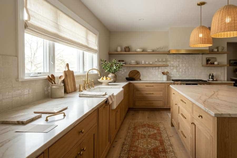
Paint is one of the cheapest and easiest things in a kitchen to change, which is exactly why it should usually be chosen last, not first.
Countertops, backsplash tile, flooring, and hardware finishes are far more expensive and disruptive to swap out.
I’d build your wall color around those elements rather than picking a favorite color and hoping everything else falls into place around it.
Countertop veining is a good place to start.
Warm-toned quartz or granite with gold or brown flecks tends to pair better with warmer wall colors.
Cooler stone with gray or blue undertones often looks better alongside a more neutral or cool-toned wall.
The same logic applies to backsplash tile and flooring, especially wood or wood-look floors.
Those carry their own warm or cool undertone whether or not that’s obvious at first glance.
Your brass or matte black hardware deserves a say too, since it’s the jewelry of the room and the walls should let it shine.
Don’t Underestimate Sheen Level
Color gets most of the attention, but sheen level matters just as much in a kitchen.
Matte finishes can look beautiful, but kitchens usually benefit from a washable paint made to handle splashes and frequent wiping.
Eggshell and satin are still popular choices because they offer some durability without looking overly shiny.
I’m a fan of a soft eggshell because it catches candlelight and pendant glow gently instead of glaring back at your dinner guests.
For trim, cabinets, and any area that gets touched constantly, a cabinet-specific enamel or coating tends to matter more than simply choosing a higher sheen.
These products are built to resist scuffing and hold up to repeated cleaning in a way standard wall paint isn’t.
That means fewer worries when your kitchen is full of friends, kids, and sauce-splattered spoons.
Think About Longevity, Not Just Trends
Trend colors come and go quickly, and a kitchen isn’t something most people repaint every year or two.
If you’re worried about getting tired of a color quickly, warm neutrals, muted greens, and softened blues are often easier to live with than the most extreme version of whatever is trending that year.
I’ve noticed these softer shades also make a great backdrop for the things that change with the seasons, like a bowl of lemons, fresh herbs on the windowsill, or a vintage tea towel.
That doesn’t rule out personality.
A bold color on your kitchen island or a single accent wall can add character without committing the entire room to a trend that might not age well.
Small Kitchens Need a Different Approach
Color behaves differently in smaller kitchens than it does in larger, open-concept ones.
A lighter palette can make a compact kitchen feel more open, but it isn’t your only option.
Deeper colors can work surprisingly well when they’re balanced with good lighting, lighter counters, or reflective surfaces like glass tile or polished hardware.
I love how a deep green or navy can make a tiny kitchen feel intentional and snug, like a little jewel box you’re happy to cook in.
If natural light is limited, warmer undertones tend to feel more inviting than stark, cool-toned whites and grays.
Those can sometimes look clinical rather than cozy under artificial lighting alone.
Choosing a Kitchen Color You’ll Love for Years
Choosing a kitchen color doesn’t have to mean picking whatever’s trending this year and hoping it works out.
Testing real samples in your actual lighting, letting your countertops and flooring guide the palette, choosing the right sheen, and thinking about longevity over trends will get you a lot closer to a kitchen you’ll still like years down the road.
Once those basics are settled, I’ve found the rest of the design decisions tend to fall into place much more easily.
And you’ll end up with a kitchen that feels like the warm, welcoming heart of your home.

Leave a comment