
How often do you crave peace, tranquility, and serenity?
You’re fortunate if you live by the woods, rolling fields, or a lake with green cover – but if not, you have to create your own natural-calm environments.
Our minds are triggered by soothing greens of plants and humble blues of the sky and water.
Since these hues are bound to release calm and positive vibrations, oftentimes, homeowners look for a similar vibe in their home – that works 24×7.
So, today, let’s have a look at a paint color that truly shares synonyms with subtleness and serenity.
Behr In the Moment is a beautiful blue-green paint color that is also dark enough to take a toll on your walls.
It is not a very pure form of green, but rather a tint or pastel that has hidden gray undertones too.
Well, regardless of that, this paint color is also quite pretty and something you must look forward to!
Don’t forget – it’s not as easy as it seems. Yes! This color comes with a baggage of do’s and don’ts – and I am going to spill all the green beans here.
So, are you excited to know how this color can make your home look super stunning?
Well, let’s get started!
Behr In The Moment T18-15 Details and Specifications

There’s something so magical about this paint color that you simply can’t ignore!
Before you choose a paint color for your home, you must analyze the underlying theories and facts.
And truly, this is one of the most important aspects that you need to consider!
After all, there is a list of tremendous tones of greens on the swatch – and this is the only way to differentiate them all.
Undertones and reflectivity!
So, let’s first check out the Light Reflectance Values or the LRV’s that determine how light or dark the paint color is.
You can easily find that value on the Behr website.
Here, in this case, the LRV of Behr In the Moment is 30.
And that means it falls on the medium to the darker end of the scale.
Don’t worry! This color plays various tricks that we will discuss later.
(Remember, the lesser the value, the darker the paint – on a scale of 1-100)
Also, just in case if you wonder where to find the Behr decks – well, simply visit your nearest Home Depot store!
Secondly, other important associated terms are the RGB and the HEX Values.
Red = 133
Green = 152
Blue = 147
HEX Value = #859893
Since we have discussed the technical and scientific information, let’s get started with the practical aspects of this soothing Behr paint.
How Does This Color Feel in a Space?
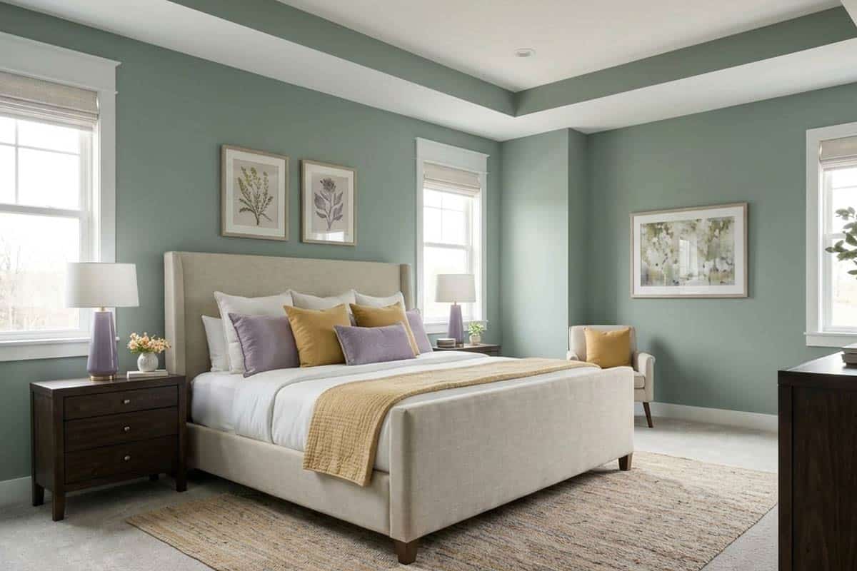
Of course, it’s important to analyze how paint color would truly feel when used in a space.
After all, that’s directly proportional to how you would be feeling.
So, this color will undeniably make your home feel calm, peaceful, serene, and extremely stunning.
Taking cues from nature, this paint color will make you feel stress-free and relaxed after a long and hard-working day at work.
It will tend to automatically release positive and motivational vibrations – and at the same time, make you want to come back home again and again.
Yes! That’s the true charm.
Furthermore, you can use this color as an accent in spaces that are either medium or large in size.
How Does Light Affect the Color?
I always say that paint color and natural light go hand in hand.
Whether it’s dark or light, green or blue, bright or pastel – light will always have a major role to play in what paint color looks like.
Even compass directions tend to alter the appearance of a paint color.
So, in such a case, Behr In the Moment will predominantly feel alike in all the directions – whether north, south, east, or west.
However, it will feel slightly cooler, darker, and crisp in the north-facing rooms. (Hint: Check out Behr Watery if you like this hue but want for something lighter in a space that gets less light).
Rest, you always have the opportunity to use artificial lighting as warm whites and warm yellows to feel the magic.
What are the Best Coordinating Colors?
Choosing a well-balanced and well complementary color scheme is necessary.
You simply can’t pair any random hue with the other. And moreover, if you have a great command of the color wheel, it’s like a cherry on the top.
Hence, from crisp and creamy whites, coral pinks, lighter beiges, to lighter grays – this particular blue-green paint will play flawlessly with all of the above-mentioned shades.
However, you must remember to be very careful when pairing them – so as to avoid making a mess!
Also, if you are planning to introduce material and metallic accents through floating shelves, chandelier, artwork frames, and furniture frames – remember to add tinges of matte black, chrome, or brushed brass.
Discussing further, you have the option to choose from either a monochromatic or contrasting color palette!
Here are a few of the colors I would recommend for a monochromatic color palette!
- MQ3-18 Ginger Sugar
- N380-3 Weathered Moss
- N410-4 Nature’s Gift

Here are a few of the colors I would recommend for a contrasting color palette!
- PPU18-07 Falling Snow
- PPU26-10 Chic Gray
- N500-6 Graphic Charcoal

For your ceilings, trims, and moldings – you can use Behr Ultra Pure White as it is a true white paint and will further protrude the original adjacent hue.
Behr In The Moment Vs Similar Colors
You can find a wide array of similar-looking options here!
Although some have a deep blue in it and some with deep green – but the similarity of a tranquility and serenity feel will remain the same.
So, the two closely related colors are BM 2136-40 Aegean Teal and SW 6221 Moody Blue.
Let’s see how all of them differ.
In The Moment Vs Aegean Teal
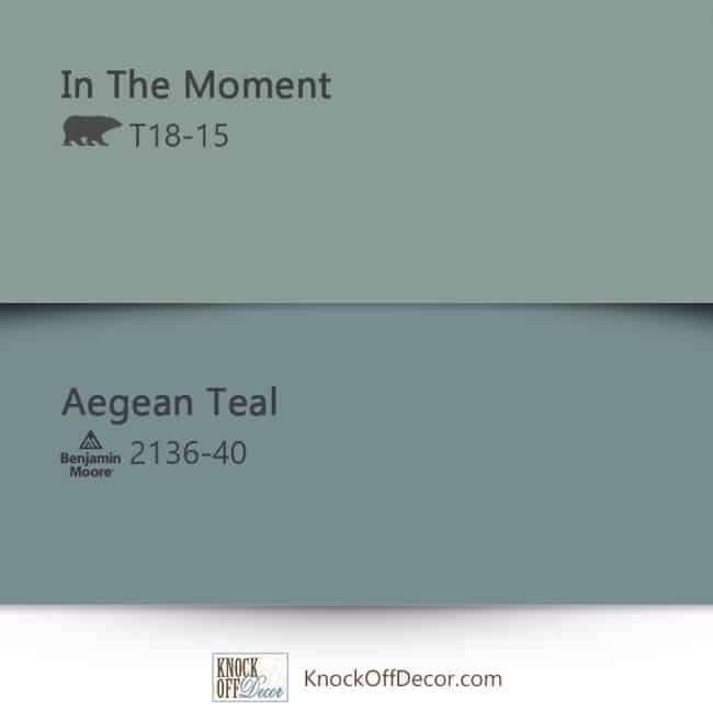
These two colors share tremendous similarities. However, a major difference is the undertones!
With an LRV of 23.96 – this color feels quite bold, intriguing, and yet very cool and calm.
Also, the latter color is comparatively darker than the former. By the way, you can learn all about BM Aegean Teal paint here!
You can best pair this color with wooden textures and brushed brass metallic accents.
In The Moment Vs Moody Blue

Another blue-green paint from the Sherwin Williams collection, this color is bound to enliven your home and make those walls feel bright and charming.
With an LRV of 27, this paint color feels comparatively lighter than the others.
There is a major difference in the undertones here as SW Moody Blue inclined more towards the blues than greens. Learn all about this color here!
Where to Use In The Moment?
Behr In the Moment is such a soothing paint color that it can be used almost everywhere in your home.
Whether it’s the focal accent wall, kitchen cabinets, exterior shiplap, or the bedroom walls – this color will play flawlessly.
You can use this color in the coastal, Caribbean, and even modern-styled homes.
So, are you excited to coat a brush on the walls? Let’s see how to incorporate this in your home.
In The Moment in Living and Dining Rooms
Why not? Well, it’s a given that this color is absolutely beautiful and majestic.
You can pair it with creamy whites, wooden textures on the beams and shelves, and ample beiges on the decorative accents and upholstery.

Even tinges of yellow on the pillows, curtains, and rug wouldn’t be a bad option.
Moreover, you must try and incorporate rich hardwood floors, brass lighting fixtures, and details like tasseled edges on the pillows and throws.
Using in Bedrooms
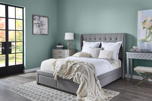
If you crave a bold, calm, and creative bedroom – this cool-toned hue has the ultimate solution.
Not only does it add a natural vibe but also makes you feel refreshed and relaxed all day long.
Else, you can also choose to paint this color on the accent walls and pair it with crisp whites on the adjacent.
Furthermore, add a tinge of natural hue with textural elements like rattan, wicker, and cane.
Lastly, don’t forget to pair the palette with a couple of textures and three-dimensional materials for a flabbergasting experience.
In The Moment in Kitchens
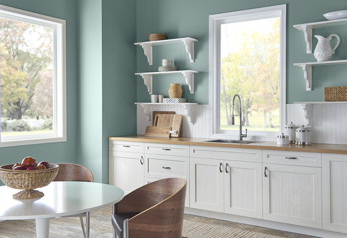
One of the best ways to make use of this color is on the kitchen cabinets.
However, you must only use it if your kitchen is large enough to accommodate the depth.
You can choose to use creamy or crisp whites on the backdrop wall to further help the color protrude out.
Lastly, pick golden accents for pull drawers, handles, and pendant lighting.
Using on Exteriors
This color is restricted to Coastal and Caribbean homes.
You can either add bold grays, blacks, or even a tinge of white to complete the exterior palette.
In the case of columns on the patio and porch – you can use natural stone wainscotting to add an authentic detailed character to this facade!
What NOT to Pair with This Color
Color Pairings That Work Against Behr In the Moment
In the Moment’s cool, blue-green base makes it very sensitive to warm-toned colors placed near it.
Warm beiges, golden yellows, and terracotta shades create a jarring clash that pulls this color in two different directions at once.
Burnt orange and rust tones are particularly damaging because they sit opposite this color on the spectrum and create instant visual tension.
Decor Styles That Fight This Color’s Character
Rustic farmhouse and heavily warm bohemian styles don’t align with what In the Moment brings to a space.
The warm, aged textures and earthy tones common in those styles conflict directly with this color’s cool, calm nature.
Traditional decor heavy with warm wood tones and gold accents is another style I’d steer well clear of with this color!
Trim and Accent Colors to Skip with In the Moment
Warm white and cream trims are some of the worst pairings I see with this color.
That yellow quality in warm whites pulls hard against In the Moment’s cool base and makes both colors look off.
Stick to crisp, cool whites or soft blue-gray tones for trim and you’ll be in much better shape.
Furniture and Finishes That Undermine This Color
Heavy espresso furniture and warm honey-toned wood pieces create a disconnect with In the Moment that’s hard to ignore.
Warm brass fixtures, oil-rubbed bronze hardware, and terracotta tile are finishes that consistently work against this color both inside and out!
Cooler metal finishes like brushed nickel or matte black are a far more natural fit for this color’s cool, collected personality.

Leave a comment