
Choosing a perfect green paint color for your home can be quite daunting and intimidating!
Some have an inclination towards yellows and browns (like an earthy green), some have a stark appearance with dominant cyan, and some merge with blues to become teal greens.
But there’s one category that you’re bound to observe and say “wow”!
Do you know what it is?
Well, it’s the dark sage green color category.
It seems in my paint color reviews, I’m mostly focused on the lighter to medium range sage greens.
However, today – I want to highlight a beautiful dark sage green color.
Yes, Sherwin Williams Pewter Green is a magnificent deep sage green paint color that has a tinge of gray in it and appears slightly lighter than what it may appear.
There have been a ton of times that I have recommended this color to my E-Design and Color Consulting clients.
And believe it or not, they’ve all simply loved it!
This tone of cool sage green blends (yes, there are a few varieties of sage colors), with gray to truly create a muted and subdued look.
So, how enthusiastic are you to splash a fresh coat of SW Pewter Green in your home?
Well, in this color review, I am going to acquaint you with several whereabouts and how bouts of this paint color.
Sit back, sip that favorite cup of coffee, and enjoy what this color brings to you!
Sherwin Williams Pewter Green SW 6208 Details and Specifications

There is a certain characteristic of this color that makes it stand out from the rest of the greens.
Of course, it’s different from SW Comfort Gray, SW Basil, SW Clary Sage, and SW Recycled Glass!
And do you know what that is?
Well, it is the concept of color theories, details, and specifications.
Just when you want to choose a paint color for your home, you must read through the underlying values and theories to truly understand the hue.
So, first and foremost, let me introduce you to the concept of Light Reflectance Values or the LRVs that determine how light or dark the paint color is.
You can easily find that value at the back of the Sherwin Williams paint swatch!
Here, in this case, the LRV of Sherwin Williams Pewter Green is 12.

And that means it falls on the darker end of the scale – but slightly lighter than black and dark blue paints.
(The lesser the value, the darker the paint)
One GREAT way to test a paint color to see what it’ll do in your own home, is to order a sample from Samplize. You can pick one up for Pewter Green!
Secondly, other important associated terms are the RGB and the HEX Values.
Red = 94
Green = 98
Blue = 89
HEX Value = #5e6259
Now that is enough with the technical and scientific information, let’s get started with the practical aspects of this cool sage green Sherwin Williams paint.
How Does This Color Feel in a Space?
Sherwin Williams Pewter Green is bound to associate your space with nature and provoke feelings of tranquility, stability, balance, growth, and restfulness.
Yes, this calm color (like many green paints from Sherwin-Williams) is something to look forward to, in case you want a relaxed and yet a formal vibe.
Yes, this color isn’t informal and can rather make a great statement in the modern and contemporary backdrops.
Furthermore, this cool paint color can release cool and crisp vibes while also pushing the walls closer to create a confined and intimate setup.
Hence, it’s a great way to create an illusion of a smaller space. You can also use it on the accent wall to add the utmost detail and focus to it.
How Does Light Affect the Color?
View this post on Instagram
It’s a given that natural light and SW Pewter Green go hand in hand.
However, this color is also not what it may truly appear – yes, it tends to alter how it looks like.
For instance, if you give ample light to this color, it’s bound to look slightly grayish in certain conditions.
Furthermore, even though this paint color is quite dark, it may always appear lighter when you use it in a space.
You see – this dark sage green paint color can play a tricky game.
Secondly, before you choose this paint color for your home, I highly recommend you examine the swatch in various lighting conditions.
In the north and east-facing rooms, it can appear slightly cool and crisp with the incoming gray rays.
On the other hand, in the south-facing rooms, it can majorly appear slightly warmer like an earthy brown-green paint.
Like I said, the best way to see this color in action before you paint is to buy some paint samples you can easily stick on your wall. It’ll definitely give you some clarity if you’re unsure!
What are the Best Coordinating Colors?

Creating color palettes can be quite a fun task to do.
So, it’s crucial for you to choose the best complementary colors in order to define a palette that looks flawless and fabulous.
Greens are easier to deal with. But at the same time, you have to be careful as to what vibe you need in your space for a perfect color combination.
Generally, SW Pewter Green will best pair with crisp or creamy whites, tans, darker beiges, browns, bronze, mustard, taupe, and blue-grays.
So, I am going to share the two most popular color schemes here – monochromatic and contrasting.
Monochromes are generally great for modern and contemporary setbacks. On the other hand, Eclectic and Farmhouse play well with contrasts.
You could use any of them depending on the interior design scheme and your personal preference.
So, here are a few of the colors I would recommend for a monochromatic palette!

On the other hand, here are a few of the colors I would recommend for a contrasting color palette!

For your ceilings, trims, and moldings – SW Extra White or SW Pure White can be used to protrude the true beauty of SW Pewter Green!
SW Pewter Green Vs Similar Colors

SW Pewter Green doesn’t deserve alternatives.
Yes, truly!
It’s so beautiful and flawless that there is no other grayish-green from SW that can provide the quite the same vibe.
However, if we compare – the two colors closely related are SW 7061 Night Owl and BM 1581 Milestone Gray.
Let’s see how they differ.
Pewter Green Vs Night Owl

SW Night Owl is a grayish-green paint color with dominant gray undertones. Unlike the former paint color that’s majorly sage green!
This color has an LRV of 13 – thus, equally dark and characteristic.
Secondly, this color is a true chameleon and can also appear bronze or brown under certain lighting conditions.
Buy some wall samples of each of these colors to easily compare them right in your home.
Pewter Green Vs Milestone Gray

BM Milestone Gray is another beautiful cool sage green paint color that has quite likely a muted and subdued base.
This color has an LRV of 16.96 – thus, lighter of them all!
You can best pair it with lighter grays, tans, and beiges!
See how these colors compare real time with stick-on wall samples from Samplize.
Where to Use Pewter Green?
SW Pewter Green can be used in any corner of your home – yes, don’t give a second thought!
Whether it’s the kitchen cabinets, bedroom backdrop wall, bathroom focal walls, exteriors, wood paneling, or built-in cabinetry – this color is bound to play spectacularly!
So, let’s see how best to infuse creativity into your space with the help of this dark sage green paint color.
Pewter Green in Living and Dining Rooms
I have recommended this for one of my Color Consultation projects – Gorgeous Reveal of Living and Dining Room Accent Wall.
This color can look beautiful when used as an accent! You can best pair it with creamy whites on the adjacent wall, and tans or beiges on the upholstery and furniture accents.
This combination will truly exhibit a warm and welcoming appeal.
And do you know what’s even better? Well, if you’re a big fan of wall paneling – this color should be your number one consideration.
Lastly, don’t forget to style some woven baskets, warm white linen throw blankets, off-white or jute rugs, and white sheer curtains to allow ample natural daylight to enter.
Using in Bedrooms
View this post on Instagram
I would say a big yes to this!
You can absolutely use this beautiful sage green on the feature wall of your bedroom – with either rattan baskets as an artwork or simply golden-finish artwork.
The choice is yours!
Don’t worry – you can even create a glam look with this color onboard.
Secondly, don’t hold back from rich gold accents on your throw pillows and artwork.
For the bedding – choose something simple like clean white or light gray.
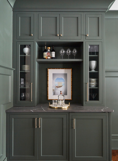
Pewter Green in Kitchens
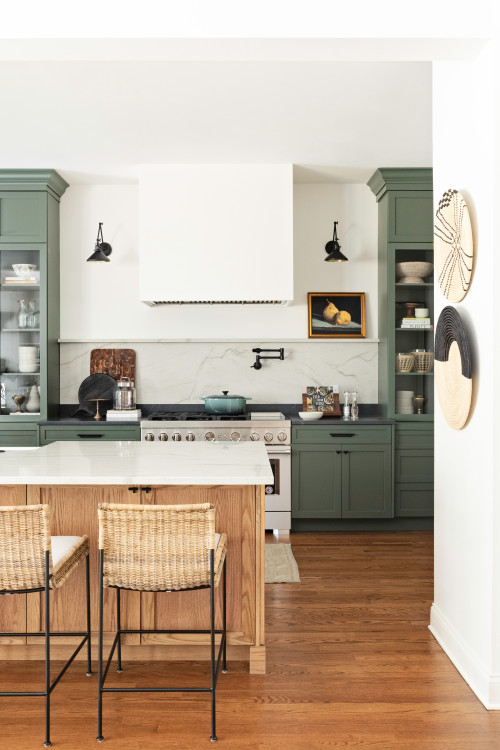
SW Pewter Green is most commonly used on the kitchen cabinets – and that’s what it’s famous for.
You can use a clean white paint color for the backdrop, white backsplash tiles, and a white marble countertop.

Don’t hold back from using brushed brass or rich gold on the knobs and pull handles.
And lastly, for organizing your cups and dishes – make use of wooden floating shelves that will complete your palette.
Using on Exteriors
Especially for the Coastal, Caribbean, and ranch-style homes, this paint on the exteriors is bound to add an eye-catchy and organic appeal.
You can play with gray Spanish interlocking tiles on the roof and crisp white paint for the trims and moldings, door and window frames.
Furthermore, if you have porches and columns – either choose white paint or natural stone wainscotting.
If you don’t plan to use this color on the major facade – try incorporating it on the entryway door, shutters, and window frames and let the wall be light gray or white.
An Easy Way to Sample This Color!
Instead of picking up a small can, or worse, an entire gallon can, to “”test”” out Pewter Green, you can order a peel-and-stick sample of it from Samplize.
The company is genius – they provide a 12″” x 12″” stick-on square you can put up anywhere in your home to try out a paint color.
For a few bucks, it’s definitely worth the small investment so you can see what the color will do in YOUR unique space, with your own lights and shadows.
So, how do you want to use this color in your homes? Interiors or Exteriors?
Now that you have all the secrets – are you excited about painting your home in Pewter green?
Should there be any questions or thoughts, let us know in the comments below!
My 7 Key Tips for SW Pewter Green
1. Test Pewter Green in different lighting before committing
Pewter Green has subtle gray undertones that shift dramatically between natural and artificial light.
I always test a large swatch on multiple walls and check it at different times of day!
This prevents surprises, especially if a sunny south-facing room suddenly makes it look more muted than expected.
2. Pair Pewter Green with warm wood floors for cozy contrast
This color shines against medium-toned oak or walnut floors.
I love how the warmth of the wood balances the cool undertones, creating a welcoming, layered look.
It works beautifully in living rooms and dining areas where you want a calm, grounded vibe.
3. Match Pewter Green with white or cream cabinetry for freshness
In kitchens, it pairs best with light cabinetry to avoid feeling heavy.
I often combine it with shaker-style cabinets in white or soft cream for a timeless, airy feel!
This combination is especially lovely when accented with brass or matte black hardware.
4. Consider Pewter Green for exterior doors or trim
The color adds subtle sophistication without being overwhelming outside.
I’ve found it looks striking on front doors paired with neutral siding like beige, taupe, or soft gray.
A matte finish helps it endure weather while maintaining a refined appearance.
5. Avoid painting large rooms without anchoring accents
Pewter Green can feel vast in open spaces if left unbroken.
I like to incorporate rugs, furniture, or even a statement wall in complementary tones to give dimension!
This keeps the space from feeling cold or flat, especially in rooms with minimal natural light.
6. Use Pewter Green in bathrooms for a spa-like feel
The muted green brings a soothing, restorative vibe perfect for small or large bathrooms.
I pair it with white tiles and matte brass fixtures for a fresh, contemporary touch.
It helps a tiny powder room feel surprisingly spacious and elegant!
7. Prep surfaces carefully to avoid uneven color depth
Pewter Green can show streaks if the wall isn’t smooth or primed properly.
I always sand lightly and use a quality primer to ensure the color goes on evenly.
This step saves headaches later and ensures a clean, polished finish that lasts.