
White paints are a necessity in your home these days.
From helping the adjacent colors protrude their true hue to making the home feel spacious and airier – whites have truly come a long, long way.
However, sometimes, the major concern can be the undertones.
Since some whites incline towards greens, blues, and some grays – finding that true white can be challenging!
So, to make it easier for you, let me introduce you to a super clean white – the whitest of them all – Behr Ultra Pure White!
Yes, it is very closely related to SW High Reflective White.
Trust me, your ceilings, trims, and moldings are craving a tone of this true crisp white.
But remember, this is primarily a great option if you have a cool color palette in your space.
With cool grays, blues, and greens – this white color is quite good to go.
And even if you plan to use it on the exterior and interior walls, I wouldn’t be stopping you.
And since this true white tops my list of favorites – here is an elaborated color guide to help you make informed decisions.
Post-reading this, you will know exactly where and how to use this paint color at home.
Behr Ultra Pure White 1850 Details and Specifications

Every color is associated with hidden scientific terms, values, and specifications.
After all, that is what differs this particular true white from the other whites that have considerable undertones.
Well, I would like to ask you – what do you first observe when you look at a paint color?
I am sure it’s the aesthetics and the feel of the color!
But more than that, it’s of utmost importance to know what this color is composed of and the associated details that help define the true hue of this paint.
So, first and foremost, let me introduce you to the concept of Light Reflectance Values or the LRV’s that determine how light or dark the paint color is.
You can easily find that value on the Behr website.
Here, in this case, the LRV of Behr Ultra Pure White is 94.
And that is too darn white! That’s why I want to name this color super, clean white.
(Remember, greater the value, lighter the paint – on a scale of 1-100)
Also, just in case if you wonder where to find the Behr decks – well, simply visit your nearest Home Depot store!
Secondly, other important associated terms are the RGB and the HEX Values.
Red = 248
Green = 248
Blue = 243
HEX Value = #F8F8F5
Since we have discussed the technical and scientific information, let’s get started with the practical aspects of this true white Behr paint.
How Does This Color Feel in a Space?
This color is so white that it is quite likely to prick your eyes!
Well, just kidding.
But truly, this super white Behr paint is bound to make your space look extra clean, extra-crisp, and quite large and airy.
Of course, it pushes the walls away to enhance and create an illusion of a larger space.
Also, you have to be very careful since this color can truly feel quite cool and crisp.
Thus, a great option to be used in warmer and tropical regions (Coastal interior design style loves the use of this color)!
Another tricky game this color plays is by pushing your ceilings away.
So, in case you’re struggling with a low-heightened room that feels dingy – use this paint to give a feeling of taller height.
How Does Light Affect the Color?
Frankly, you don’t need a lot of light when you have this paint color onboard!
It truly has a shine and spark of its own.
But regardless of the situation, the light will always play a role in the paint colors.
In this case, entering natural light will further make your space look lighter and airier.
But the vibe is all dependent upon the saturation of light or the compass direction of your room.
For instance, in the south and west-facing rooms, the true white paint is quite likely to feel warm. On the other hand, when used in the north-facing rooms, expect an extra cool and cold vibe.
Secondly, you always have the opportunity to play with artificial light here – in the form of warm whites!
What are the Best Coordinating Colors?

One of the easiest to pair – however, note that you’re pairing cooler tones with this super white paint.
Choosing a cohesive color palette is necessary. And do you know why?
If you don’t take into consideration the undertones, reflectivity, and values of the color – you might end up messing up with your space.
So, to make it easier for you, you have the option to choose from either a monochromatic or contrasting color palette!
So, here are a few of the colors I would recommend for a monochromatic palette!
- 780E-3 Sterling
- 780F-5 Anonymous
- N500-6 Graphic Charcoal
On the other hand, here are a few of the colors I would recommend for a contrasting color palette!
- 790C-3 Dolphin Fin
- PPU18-16 Elephant Skin
- PPU14-20 Starless Night

For your ceilings, trims, and moldings – what better option to choose than this color itself, right?
Behr Ultra Pure White Vs Similar Colors
Looking for similar alternatives? Well, it’s quite normal to have an eye on other similar paint colors that behave likewise!
Although some might differ in the undertones and some reflectivity!
But when you see through a bigger picture, the differences wouldn’t be much of an issue!
So, the two colors closely related are OC-65 Chantilly Lace and SW 7757 High Reflective White!
Ultra Pure White Vs Chantilly Lace

Not as white as the former, BM Chantilly Lace has very tiny cool gray undertones.
With an LRV of 92.2 – this white paint is even slightly darker than Behr Ultra pure white.
Lastly, you must know that even Chantilly Lace is good to go for ceilings, trims, and moldings!
Ultra Pure White Vs High Reflective White

Now that you closely observe, even SW High Reflective White is not as white as Ultra Pure White.
It is quite likely to detect a slightly green undertone here.
However, don’t worry because it isn’t prominent at all.
With an LRV of 93 – this color pretty much is next in line to the former paint color.
Where to Use Behr Ultra Pure White?
Behr Ultra pure white can be used everywhere in your home – from kitchen cabinets to bathroom walls.
It makes a great statement in the Coastal, Scandinavian, Minimalist, and Modern interior design styles.
One valuable tip is to make sure you use a wall paint primer if you’re using this light color on top of anything darker!
So, let’s see where and how to incorporate it in your home!
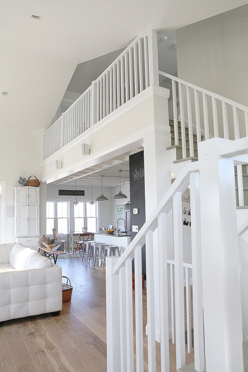
Ultra Pure White in Living and Dining Rooms
Struggling with a tiny living and dining space?
Well, in such a case, a true white paint like Ultra Pure White is bound to do wonders.

It will create an airier aura and meanwhile, make your space look cooler than ever.
The best complementary colors to go would be deeper blues, charcoal grays, and lighter grays.
You can even add tinges of sage greens for a refreshing vibe.
Using in Bedrooms
A super clean white paint is a great recommendation for the bedrooms.
You can choose to paint all the walls in this color or pair it with gray or blue on the accent wall.
In terms of metallic accents, you have the option to choose gold, black, or even chrome.
Lastly, if you have a north-facing bedroom – this color is an absolute no-no!
It will make the space feel unwelcoming and extremely cool. I would go with the warmer Behr Polar Behr instead.
Ultra Pure White in Kitchens
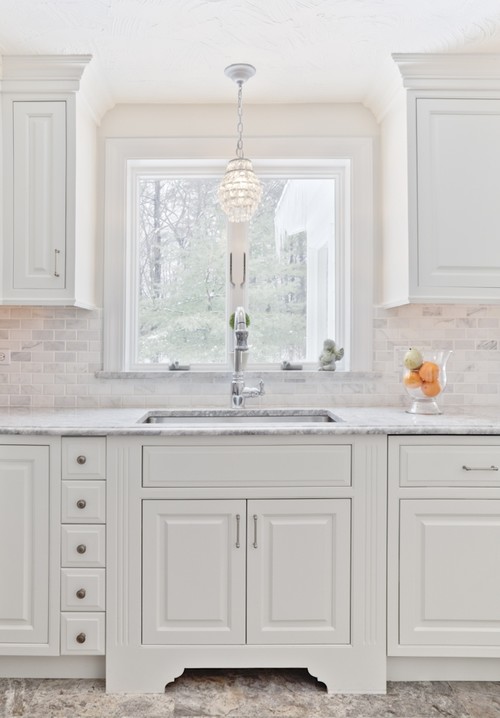
Your kitchen cabinets would look flabbergasting with this paint.
Truly! And moreover, expect your kitchen to look airier and brighter with this color onboard.
To create a sense of contrast, you can paint blues, greens, or grays on the lower cabinet whereas whites on the upper.
For metallic accents, choose brushed brass or even polished chrome.
Lastly, ensure to pick white glossy hexagonal tiles for backsplash and black granite for countertop.
Using on Exteriors
Whether you have a Caribbean, Coastal, Ranch-style, Mid-Century Modern, Contemporary, or Modern style, this white paint is the way to achieve a majestic look.
You can either add bold grays or even a tinge of wooden-themed textures as an accent or go vice versa for the trims, moldings, and door and window frames.
Generally, this white paint is a great option for exterior trims, door and window frames.
In the case of columns on the patio and porch – you can use natural stone wainscotting to add an authentic detailed character to this facade!
So, how do you plan to use this color in your home – apart from the trims? Interiors or Exteriors? Bedrooms or Living rooms? Or doors or walls?
Now that you know everything about this color – are you excited about painting your home in Ultra Pure White?
Should there be any questions or thoughts, let me know in the comments below!
My 7 Key Tips for Behr Ultra Pure White
1. Treat Ultra Pure White like a true blank canvas, not a soft white
Behr Ultra Pure White has virtually no undertones, so it reflects light very directly.
I always sample it on multiple walls because it can look stark in rooms with lots of daylight.
In low-light spaces, it can read cooler than expected, especially next to warmer finishes.
This honesty is powerful, but it also means flaws in walls and trim will show quickly.
I prep and patch more carefully with this color than I would with a creamier white!!!
2. Choose your finish carefully to avoid glare and texture issues
Ultra Pure White in higher sheens can bounce light aggressively.
I usually recommend eggshell for walls to soften reflections while keeping things cleanable.
On trim, satin or semi-gloss works well, but only if the surface is very smooth.
Any roller lines or brush marks will be more visible here than with tinted whites.
Slow, even application saves a lot of frustration later.
3. Pair it intentionally with flooring so it does not feel unfinished
This white looks especially crisp with medium to dark wood floors like walnut or espresso oak.
I am cautious using it with pale gray LVP or light maple, where everything can blur together.
Concrete floors also work beautifully, giving a modern gallery feel.
The key is enough contrast so the white feels intentional, not builder-basic.
I always look at the floor sample directly against the wall paint before committing.
4. Use cabinetry color to anchor the space
Ultra Pure White shines next to deep cabinet colors like navy, charcoal, or forest green.
I also like it with natural wood cabinetry that has clear or matte finishes.
Bright white cabinets against Ultra Pure White walls can feel flat if undertones do not match.
I often offset that with darker hardware or a strong backsplash.
That little bit of contrast makes the room feel finished!!!
5. Be strategic in south-facing and west-facing rooms
In strong sun, this color can feel almost glowing.
I sometimes limit it to walls and keep ceilings a softer white in these rooms.
This reduces eye strain and keeps the space comfortable.
Window coverings and nearby furnishings will also influence how intense it feels.
I always view it at different times of day before final approval.
6. Exterior use demands thoughtful surroundings
On exteriors, Ultra Pure White reads very bright and modern.
I like it best on homes with dark roofing, black windows, or stone accents.
Without contrast, it can feel overly stark in full sun.
Matte or low-sheen exterior finishes help soften the look.
I avoid it on heavily textured siding unless you love a bold statement.
7. Plan for decor and art early
This white makes color pop, but it also exposes sparse decorating.
I think ahead about artwork, rugs, and furniture so rooms do not feel empty.
Warm metals, textiles, and wood tones keep it from feeling clinical.
Even small decor choices matter more with a true white like this.
When styled thoughtfully, it feels crisp, confident, and timeless!!!
Delia
Saturday 15th of January 2022
Hi ! Thanks so much for this as was so helpful. Just one question ..I would want it for my outdoor trims around and around the house trim as well but the house paint on the wall is a tiny bit warm?
Nishtha Sadana LEED, WELL AP
Friday 8th of April 2022
Hi Delia, what color do you have on the walls?